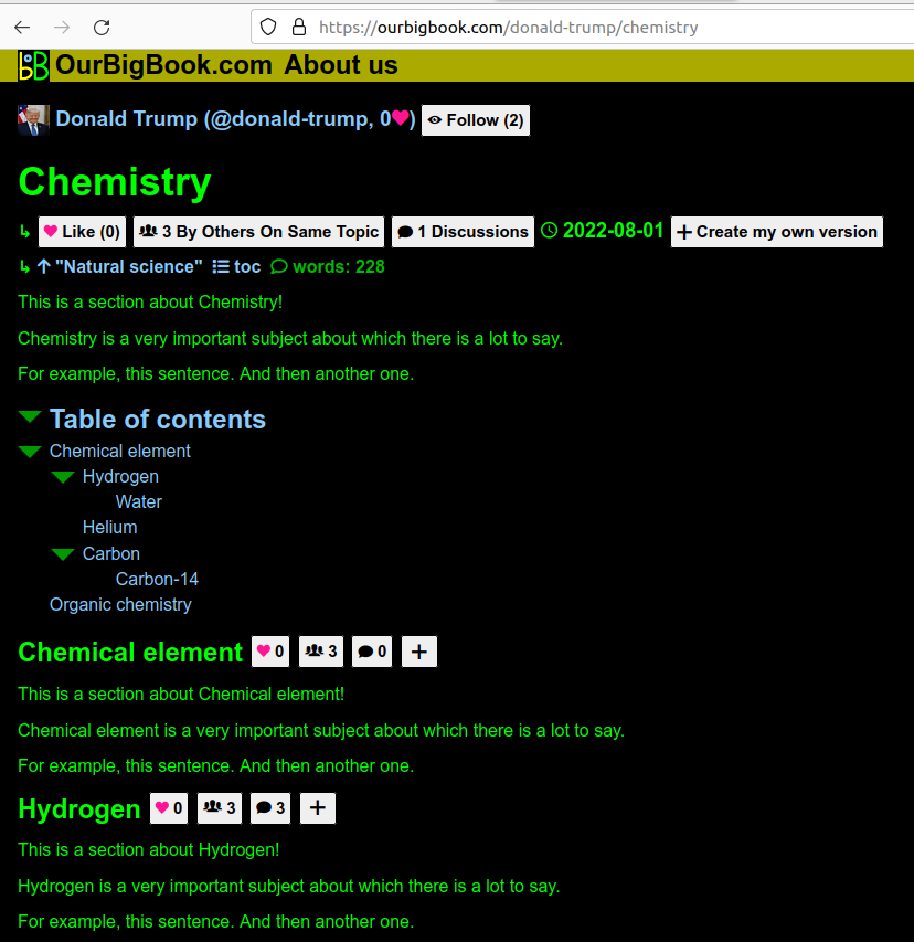
This is a major feature: we have now started to inject the following buttons next to every single pre-rendered header:
This crucial feature makes it clear to every new user that every single header has its own separate metadata, which is a crucial idea of the website.
Screenshot showing metadata next to each header
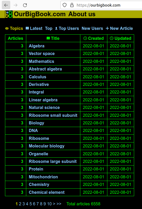
. The page is: ourbigbook.com/donald-trump/chemistry. Note how even the subheaders "Chemical element" and "Hydrogen" show the metadata.The new default homepage for a logged out user how shows a list of the topics with the most articles.
This is a reasonable choice for default homepage, and it immediately exposes users to this central feature of the website: the topic system.
Doing this required in particular calculating the best title for a topic, since it is possible to have different titles with the same ID, the most common way being with capitalization changes, e.g.:would both have topic ID
JavaScript
Javascriptjavascript.The algorithm chosen is to pick the top 10 most upvoted topics, and select the most common title from amongst them. This should make topic title vandalism quite hard. This was made in a single SQL query, and became the most complext SQL query Ciro Santilli has ever written so far: twitter.com/cirosantilli2/status/1549721815832043522
Screenshot showing the list of topics
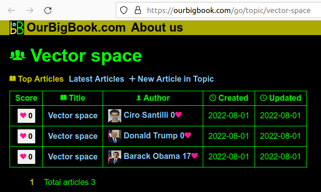
. The page is: ourbigbook.com for the logged out user, ourbigbook.com/go/topics for the logged in user.Screenshot showing a topic page
. The page is: ourbigbook.com/go/topic/vector-space. Before this sprint, we didn't have the "Vector Space" at the top, as it wasn't necessarily trivial to determine what the preferred title would be.Limited the number of articles, and the size of article bodies. This, together with the reCAPTCHA setup from Email verification and reCAPTCHA signup protection should prevent the most basic types of denial-of-service attacks by filling up our database.
The limits can be increased by admin users from the web UI, and will be done generously when it is evident that it is not a DoS attack. Admin users are also a recently added feature.
I guess ended up doing all the "how things should look like" features because they clarify what the website is supposed to do, and I already have my own content to bring it alive via
ourbigbook --web upload.But now I honestly feel that all the major elements of "how things should look like" have fallen into place.
I was really impressed by Trillium Notes. I should have checked it long ago. The UI is amazing, and being all Js-based, could potentially be reused for our purposes. The project itself is a single-person/full trust notetaking only for now however, so not a direct replacement to OurBigBook.
Articles by others on the same topic
There are currently no matching articles.


