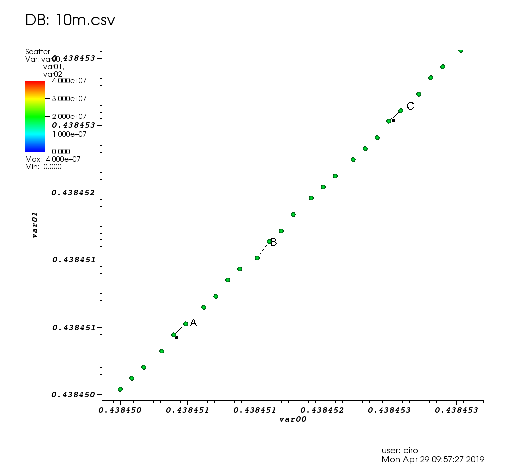
Ciro's large dataset survey: Section "Survey of open source interactive plotting software with a 10 million point scatter plot benchmark by Ciro Santilli".
E.g. showing live data from a scientific instrument! TODO:
- superuser.com/questions/825588/what-is-the-easiest-way-of-visualizing-data-from-stdout-as-a-graph
- unix.stackexchange.com/questions/190337/how-can-i-make-a-graphical-plot-of-a-sequence-of-numbers-from-the-standard-input
- stackoverflow.com/questions/44470965/how-can-you-watch-gnuplot-realtime-data-plots-as-a-live-graph-with-automatic-up
- stackoverflow.com/questions/14074790/plotting-a-string-of-csv-data-in-realtime-using-linux
- stackoverflow.com/questions/11874767/how-do-i-plot-in-real-time-in-a-while-loop-using-matplotlib
By Ciro Santilli.
Tends to be Ciro's pick if gnuplot can't handle the use case, or if the project is really really serious.
Couldn't handle exploration of large datasets though: Survey of open source interactive plotting software with a 10 million point scatter plot benchmark by Ciro Santilli
Examples:
- matplotlib/hello.py
- matplotlib/educational2d.py
- matplotlib/axis.py
- matplotlib/label.py
- Line style
- Subplots
- matplotlib/two_lines.py
- Data from files
- Specialized
Tends to be Ciro Santilli's first attempt for quick and dirty graphing: github.com/cirosantilli/gnuplot-cheat.
When it doesn't, you Google for an hours, and then you give up in frustration, and fall back to Matplotlib.
Couldn't handle exploration of large datasets though: Survey of open source interactive plotting software with a 10 million point scatter plot benchmark by Ciro Santilli
CLI hello world:
gnuplot -p -e 'p sin(x)' Articles by others on the same topic
There are currently no matching articles.