Topics (384k) Articles (398k) Users (410) Discussions (242) Comments (383) Files (13k) New article

The CSS transform reference box supplies the geometrical reference used to interpret a CSS transform and its CSS transform origin. The
transform-box property selects that reference. Its size supplies percentage bases, and its position can add an offset to the specified origin.[ref]CSS Transforms Module Level 1 by World Wide Web Consortium. §6, Transform reference box: transform-box
For an own ordinary-box example, use a -by- CSS pixel content box, zero borders, twenty pixels of left padding, ten of top padding and zero padding on the other sides. Assume the content dimensions are definite and unaffected by competing constraints. The CSS border box is by , while the CSS content box begins at border-box coordinates .
With
transform-box: border-box, a transform-origin: 50% 50% point is in those coordinates. With transform-box: content-box, the same percentage declaration instead givesThe difference comes from both the reference size and its offset. Asymmetric padding makes that distinction visible; two centered symmetric boxes could conceal it.The function
translateX(50%) likewise uses the selected reference width. Its translation component is sixty pixels for the border-box choice and fifty for the content-box choice. Percentage translation and percentage origin therefore require a stated reference rectangle before they can be converted into lengths.[ref]CSS Transforms Module Level 1 by World Wide Web Consortium. §6, reference-box use by transforms and origin; §9.1, percentage translation
The property has additional reference choices for SVG, including object bounds and viewport-based geometry. Their used-value mappings differ depending on whether an SVG element has an associated CSS layout box. The ordinary-box example does not establish a universal default for every SVG element.[ref]
CSS Transforms Module Level 1 by World Wide Web Consortium. §6, fill-box, stroke-box, view-box and used-value mappings
Reference-box selection does not itself assign a new content width or padding. It tells the transformation calculation which existing rectangle to use. Keeping it separate from layout sizing and from the chosen origin prevents two distinct percentage bases from being conflated.
A CSS pseudo-class matches an element using a condition beyond an ordinary type, class or attribute selector. Conditions can concern interaction state, control state or position among siblings. Its syntax uses a colon, as in
:hover, :focus or :nth-child(2n). It refines matching of the element rather than creating another ordinary DOM node.[ref]Selectors Level 4 by World Wide Web Consortium. Pseudo-classes, User Action Pseudo-classes and Tree-Structural pseudo-classes
For example,
button:focus matches a button with focus, while button:hover concerns the pointing-device interaction state defined by that pseudo-class. A focused button need not be hovered. A control's :checked state can also change through interaction, so matching is not limited to the exact attribute spelling in the original source.For a structural example,
li:nth-child(2n) matches list-item elements in even positions among element siblings. Text nodes and comments do not occupy counted positions. However, another kind of element sibling does count, so the expression is not automatically equivalent to selecting every second li while ignoring all other element types.[ref]Selectors Level 4 by World Wide Web Consortium. The :nth-child() pseudo-class, indexing of element siblings
Most CSS pseudo-classes contribute to the class component of CSS specificity, but functional forms have explicit exceptions.
:where(...) contributes zero, while :is(...) uses the greatest specificity in its argument list. Matching semantics and priority rules must therefore both be checked when a functional pseudo-class changes a rule's behavior.A CSS pseudo-element represents an abstract styling target associated with an element, such as a typographic portion or generated content. Examples include
::first-line, ::before and ::after. It allows CSS to style parts of the rendering that need not be separate HTML elements in the ordinary document tree.[ref]CSS Pseudo-Elements Module Level 4 by World Wide Web Consortium. Abstract and introductory pseudo-element model
For example,
p::before { content: "Note: "; font-weight: bold; } can generate a bold prefix before a paragraph's content. The prefix participates in the rendering under the pseudo-element's rules, while the paragraph's ordinary text nodes remain unchanged. Reading the paragraph's textContent is therefore not a general way to recover every word a user sees on screen.A typographic example is
p::first-line. Which characters belong to the first rendered line depends on layout width, fonts and wrapping. Changing the width can move text into or out of that pseudo-element without inserting or deleting any DOM text nodes. Pseudo-elements also differ in which properties apply to them.[ref]CSS Pseudo-Elements Module Level 4 by World Wide Web Consortium. Typographic pseudo-elements, ::first-line; Generated Content, ::before and ::after
A CSS pseudo-class instead adds a matching condition such as focus or sibling position. The visual similarity of their names does not make the two mechanisms interchangeable. Modern pseudo-element syntax uses a double colon; some older single-colon spellings persist for compatibility, so a spelling alone should be interpreted using the specified selector rules.
A CSS combinator specifies a structural relationship between parts of a CSS selector. A descendant space permits any depth,
> requires an immediate child, + requires the next element sibling, and ~ permits a later element sibling. These operators determine which elements match; they contribute no CSS specificity of their own.[ref]Selectors Level 4 by World Wide Web Consortium. Combinators: descendant, child, next-sibling and subsequent-sibling combinators
Consider
<section><h2>Title</h2><p>A</p><div><p>B</p></div><p>C</p></section>. The selector section p matches all three paragraphs. section > p matches A and C, since B has the div as its immediate parent. h2 + p matches A, the next element sibling of the heading. h2 ~ p matches A and C, the paragraph siblings following that heading.Whitespace text between tags does not count as an intervening element sibling for the
+ relation. Likewise, ~ stays within one parent; it does not search arbitrarily far through the document for any later paragraph. This makes the distinction between document order and sibling relationships concrete.A change in a combinator can therefore change a rule's scope without changing its selector counts.
article p.warning and article > p.warning have the same CSS specificity but can match different paragraphs. Debugging a style rule requires checking the relationship it requests as well as the priority of the declarations it contains.A CSS property value is a value considered or assigned for a CSS property. Its representation changes through value processing: declarations supply candidates, the CSS cascade chooses among applicable candidates, defaulting supplies missing values, and computation and layout resolve further details. The CSS computed value and CSS used value consequently describe different stages.[ref]
CSS Cascading and Inheritance Level 5 by World Wide Web Consortium. Value Processing, declared, cascaded, specified, computed, used and actual values
Take
width: 50%. In a simple block layout, its computed representation can retain a percentage, while the used width depends on the containing width. A 400-CSS pixel containing block gives 200 pixels; changing that block to 600 pixels gives 300. Copying the source string alone would miss why the physical layout changed.Inheritance can resolve another value before that stage. If a parent's computed font size is
20px and its child specifies font-size: 150%, the child can compute to 30px. That child's descendant inheriting the font size receives the computed result, rather than repeatedly multiplying by the original percentage merely because it is further down the tree.[ref]CSS Cascading and Inheritance Level 5 by World Wide Web Consortium. Computed Values and Inheritance: inherited values are generally computed values
Validity is property-specific. A syntactically readable
width: blue is not a valid width value, and its failure does not establish a used width of blue or zero. Initial values, CSS inheritance and other applicable declarations determine the result under the relevant rules. Stating the value stage prevents a source token, a computed representation and a measured rendering from being conflated.CSS clearance is the spacing introduced by the
clear rules when a block's border edge must be placed below relevant earlier CSS floats. The calculation considers its hypothetical position and the floats to be cleared. It is a layout effect rather than a replacement for the block's declared margin.[ref]For a simple horizontal-text example, take a left float whose bottom outer edge is at vertical coordinate CSS pixels. A following block would normally have its top border edge at coordinate . With
clear: left and zero vertical margins, the needed displacement ispixels. If a relevant right float instead extends to , clear: both requires the border edge to reach that lower boundary, giving pixels in the same simplified geometry.The relevant edge includes the float's margin geometry; its content height alone is not always the correct reference. Clearing also concerns floats in the applicable CSS block formatting context, rather than every floated element anywhere in the document.
Margins make the general rule subtler. Introducing clearance inhibits the relevant CSS margin collapsing, so one cannot universally calculate it by adding an ordinary positive gap after all margins have already been collapsed. CSS2.2 explicitly permits zero or negative clearance. Its negative-clearance example separates previously collapsing margins and computes the correction needed for the final border-edge position.[ref]
CSS specificity ranks selectors by their components when the CSS cascade reaches its specificity comparison. In the Selectors Level 4 by World Wide Web Consortium convention, the triple counts ID selectors, class/attribute/pseudo-class selectors, and type/pseudo-element selectors respectively. The comparison uses lexicographic order: compare first, then if needed, then .[ref]
For example,
p.warning has specificity , .warning.urgent has and #notice has . The ID selector outranks either class-based selector at this stage. The triple is not a base-ten number: sufficiently many classes do not carry into the ID component. A descendant CSS combinator such as the space in article p contributes no count of its own.Some functional CSS pseudo-classes have explicit exceptions.
:where(#notice) contributes zero specificity, while :is(.warning, #notice) takes the maximum specificity of its argument list, here . This is not necessarily the specificity of whichever individual alternative happened to match.[ref]Selectors Level 4 by World Wide Web Consortium. §17, special specificity rules for :is(), :not(), :has() and :where()
Specificity is not the whole priority system. Origin, importance and CSS cascade layers can decide before selector counts are compared; later source order can decide a remaining tie. Consequently, an author can override a highly specific normal declaration with a lower-specificity important declaration in the appropriate cascade context.[ref]
CSS Cascading and Inheritance Level 5 by World Wide Web Consortium. Cascade Sorting Order, origin/importance, layers, specificity and order of appearance
A CSS cascade layer groups style declarations into an explicit ordering within the CSS cascade. Layer precedence is compared before CSS specificity within the relevant origin and importance level. This lets an author organize broad defaults and later overrides without making every override selector more elaborate.[ref]
CSS Cascading and Inheritance Level 5 by World Wide Web Consortium. Cascade Layers, layer ordering and relation to the cascade
For example, declare
@layer base, theme;. Put #notice { color: red; } in base and p { color: blue; } in theme. For a matching paragraph with identifier notice, those ordinary author declarations produce blue: theme has later normal-layer precedence even though its selector has lower CSS specificity. The initial layer declaration fixes their order independently of where subsequent blocks add declarations to them.Important declarations reverse that ordering. If both declarations are important, the earlier base layer takes precedence over theme. Ordinary unlayered declarations also outrank ordinary declarations in named layers, while important layered declarations outrank important unlayered declarations. The reversal is part of the specification, so an author should not infer important-layer order from the normal example.[ref]
CSS Cascading and Inheritance Level 5 by World Wide Web Consortium. Layer Ordering and the reversed order for important declarations
Layers do not change which elements a CSS selector matches or make invalid values usable. They change the comparison among applicable declarations. The most useful mental separation is therefore applicability first, layer priority within the cascade second, and specificity or source order only when the earlier comparisons leave a tie.
CSS inheritance propagates property values from a parent element to a child when the property's defaulting rules call for it. For an inherited property, the child normally receives the parent's CSS computed value if it has no applicable declaration supplying another value. A property that is not inherited instead normally uses its CSS initial value. The root has no parent from which to inherit.[ref]
CSS Cascading and Inheritance Level 5 by World Wide Web Consortium. Defaulting, Inheritance and Initial Values
Suppose a parent has
font-size: 20px and a child specifies font-size: 150%. The child computes to 30 CSS pixels. If a grandchild merely inherits font size, it receives 30 pixels; it does not multiply the original 150 percent again. This is why inheriting a computed value differs from copying the parent's source text.The keyword
inherit can request inheritance even for a property that does not normally inherit. Thus a width declaration with that keyword is a deliberate instruction, whereas omitting width does not automatically copy the parent's width. The exact result still depends on that property's value-processing rules.[ref]CSS Cascading and Inheritance Level 5 by World Wide Web Consortium. The inherit and unset keywords; computed values and inherited values
Importance does not spread down the tree as selector priority. If a parent obtains red from an important color declaration, a child with its own ordinary blue color declaration can be blue. The parent contributed a possible inherited value; it did not create an important declaration on the child. Distinguishing CSS inheritance from the CSS cascade explains both shared styling and local overrides.
A CSS block container is a box whose contents are laid out as block-level boxes or in an CSS inline formatting context, under the ordinary flow rules. The term describes how the box contains its contents, which is different from whether the box itself participates as a block-level or inline-level item in its parent.[ref]
Visual formatting model in CSS 2.2 by W3C. §9.2.1, distinction between block-level and block-container boxes
A normal non-replaced div can contain paragraphs arranged as blocks. An inline-block can also be a block container, although it participates as an inline-level item outside. For example, two inline-block cards can sit beside each other in a line while each card contains its own block paragraphs. Their internal layout and external placement answer different questions.
For mixed ordinary content, the formatting rules can generate anonymous block boxes to organize inline runs around block-level children. These generated boxes are part of layout rather than additional DOM nodes. Inspecting the document tree alone therefore does not list every box used by the formatter.[ref]
Likewise, an element being displayed as a block is not sufficient to establish that its replaced content becomes an ordinary block-container layout. State the box's content model, whether it is replaced, and its inner and outer formatting roles. This keeps the terms block, container and inline from being treated as interchangeable labels.
A CSS inline formatting context lays out inline-level content along lines. The generated CSS inline boxes and other inline-level items are arranged into CSS line boxes, whose widths depend on the available space and whose heights account for text metrics and vertical alignment.[ref]
For a synthetic wrapping example, suppose three words each occupy 60 pixels and the spaces between them occupy ten. Two words need 130 pixels; all three need 200. With 140 pixels available and ordinary breaking opportunities at the spaces, two fit on the first line and the third moves to another. With 220 pixels available, all three can fit together.
One HTML element can then generate fragments on several lines. A styled span containing a long phrase need not correspond to one unbroken rectangular painted box. Conversely, an inline replaced image or a CSS inline-block box can participate as a single inline-level item whose own dimensions affect the line.
Vertical placement is handled within that context. CSS vertical alignment and text metrics can change a line's required extent even when its words and available horizontal width remain unchanged. The inline formatting context therefore combines line breaking with placement; knowing only the element tree or only the font size does not fully specify the result.
A CSS replaced element represents content whose internal rendering lies outside the ordinary CSS formatting of the element's descendants. An image element displaying its image is a standard example. CSS can size and position the element's surrounding box, while the image's own dimensions or aspect ratio can help determine that size.[ref]
Suppose an image has intrinsic dimensions and no extra padding or borders. With
width: 200px; height: auto, preserving its intrinsic ratio gives a content height of 100 CSS pixels. The source image's pixel counts and the rendered CSS dimensions therefore have distinct roles. Choosing both dimensions explicitly can instead impose a different box ratio.Replaced content is not synonymous with block layout. The same image can participate as an inline-level box in a line or be given a block-level display role. The distinction also matters to CSS vertical alignment, because an inline replaced box is aligned as a unit rather than as a run of ordinary text.
A broken or unavailable image can have specified fallback behavior, so an element's tag name alone is not a complete description of every rendering state. For a concrete sizing calculation, state what content is being replaced, which intrinsic information is available and which CSS dimensions constrain the resulting box.
The CSS margin box is the box bounded by the outer margin edges, outside the border, padding and content regions. It describes the margin contribution around a generated box. Margins are not part of the CSS border box sized by
box-sizing: border-box.[ref]Box model in CSS 2.2 by W3C. §8.1, margin edge and margin box
For a simple box with border-box width 100 CSS pixels and left/right margins of ten pixels each, the margin-box width is 120 pixels. A declaration
width: 100px does not automatically include those margins, even when border-box sizing is selected.The margin area is also not a painted extension of the element's background. Visible background and border geometry should therefore not be used to infer that all surrounding layout space belongs to the same painted area. Auto and negative margins have their specified layout effects as well, so a margin is not restricted to a fixed positive gap.
Vertical relationships require particular care. Two adjoining margins can participate in CSS margin collapsing, where the resulting separation is not simply their sum. For instance, eligible adjoining positive margins of 20 and 30 pixels collapse to 30 pixels under the applicable rules, rather than yielding 50.[ref]
CSS vertical alignment concerns the
vertical-align property in its applicable formatting contexts. For inline-level content, it aligns boxes relative to the line and neighboring text metrics; on table cells, it controls alignment of cell content under the table rules. The relevant reference is therefore determined by context.[ref]Visual formatting model details in CSS 2.2 by W3C. §10.8, vertical-align definition and applicable contexts
For an inline image with zero margins,
vertical-align: middle aligns the image's vertical midpoint with the parent's text baseline plus half the parent's x-height. It does not generally place the midpoint on the baseline itself.A numerical example makes that offset visible. Measure height upward from a parent baseline at zero, and let the parent's x-height be ten pixels. A 20-pixel-high image aligned middle has its centre at , its top at and its bottom at CSS pixels. Aligning its centre at zero would produce a different placement.
A positive length such as
vertical-align: 4px raises the applicable inline box from its baseline-aligned position; keywords such as top and bottom use specified line-box relationships instead. These placements contribute to the extent required by a CSS line box, so changing alignment can affect the line as well as one item.A CSS preferred size is a size requested by a preferred-size property such as
width or height. The final layout also depends on the applicable sizing algorithm, the CSS containing block and any CSS minimum size or CSS maximum size. Preferred therefore identifies an input to sizing, not an unconditional measurement of the final box.[ref]CSS Box Sizing Module Level 3 by World Wide Web Consortium. §3.1, Preferred Size Properties; minimum and maximum size properties
For a simple content-box block with no padding or borders, consider
width: 300px; max-width: 100% in a 200-CSS pixel containing block. The maximum constraint limits the used width to 200 pixels. With a sufficiently wide containing block, the same preferred width can instead yield 300 pixels. The example assumes no other minimum constraint.Values such as
auto, percentages and content-based sizing keywords have context-dependent meanings. A percentage can depend on whether the relevant containing dimension is definite, and auto sizing can use different rules for ordinary blocks and CSS replaced elements. The word auto is not a universal synonym for one numeric width.The properties also have applicability limits. A non-replaced inline box is not made into a fixed-size rectangle merely by assigning width and height. Relating a CSS preferred size to a CSS used value requires identifying the box kind and the layout rules that resolve its constraints.
A CSS non-replaced element has content formatted through the normal CSS document layout machinery, rather than supplied as replaced external content. A paragraph containing text and child elements is a typical example. The classification is separate from whether the element participates as inline or block-level content.[ref]
Visual formatting model in CSS 2.2 by W3C. §9.2, box generation and non-replaced elements
For example, text inside a paragraph can wrap into several CSS line boxes as the available width changes. Its descendant text and elements contribute to layout. Adding a background image does not by itself turn that paragraph into a CSS replaced element; the paragraph's content is still formatted by CSS.
Applicability of sizing properties then depends on the generated box. On an ordinary non-replaced inline span, declaring
width: 100px does not make its inline box a fixed-width block. Changing its display to an inline-block or an applicable block box changes the sizing rules, even though the underlying element remains non-replaced.[ref]CSS Box Sizing Module Level 3 by World Wide Web Consortium. §3.1.1, applicability of preferred-size properties
This distinction helps explain why two elements with the same width declaration can behave differently. Whether content is replaced, the outer display role and the formatting context must all be specified before treating a declaration as a CSS used value.
The CSS content box is the innermost box region bounded by the content edges, inside padding, border and margins. It is the area assigned for the box's content by the applicable layout rules.[ref]
Box model in CSS 2.2 by W3C. §8.1, content edge and content box
Suppose the content width is CSS pixels, with eight-pixel left/right padding and two-pixel left/right borders. Then the CSS padding box width is and the CSS border box width is pixels. Six-pixel margins on both sides increase the CSS margin box width to pixels. These are different measurements of the same simple box, not competing answers to one unspecified width question.
With
box-sizing: content-box; width: 120px, the declared width requests that content dimension. With box-sizing: border-box; width: 120px and the same padding and borders, the requested border dimension instead leaves pixels for content, before any further constraints.A content area is not a guarantee that all painted content fits inside it. A long unbroken item or a descendant can cause CSS overflow. Also, an ordinary inline element can fragment across CSS line boxes; its geometry should not be reduced to one fixed-width rectangle merely because a width declaration appears in its style. Read the content region together with CSS box-sizing, box kind and the layout context.
The CSS padding box is the rectangle enclosed by the outer padding edges. It contains the CSS content box and padding, but excludes the border and margins.[ref]
Box model in CSS 2.2 by W3C. §8.1, padding edge and padding box
For content dimensions by CSS pixels and eight-pixel padding on all sides, the padding dimensions areA further two-pixel border on each side makes the CSS border box by pixels. Padding is thus space inside the border rather than an external gap between neighboring boxes.
This distinction explains a common design change. Increasing padding while keeping a fixed content width enlarges the outer box. Increasing padding inside a fixed border-box width instead leaves less room for content, subject to the zero floor and other sizing constraints of CSS box-sizing. The same padding declaration can therefore have different consequences for text wrapping depending on the sizing edge.
The CSS padding box can also serve as a reference in particular layout rules, such as some cases of CSS absolute positioning. Use the applicable rule rather than assuming all geometric references mean the CSS content box. Padding geometry alone likewise does not define every painted or interactive boundary; those depend on their own properties and behavior.
The CSS border box is the rectangle bounded by the outer border edges in the CSS box model. It includes the content area, padding and borders, while excluding margins.[ref]
For a simple unfragmented box, let the CSS content box be by CSS pixels, padding be pixels on every side, and borders be pixels on every side. The border dimensions areAdding six-pixel left and right margins would give a CSS margin box width of , without changing the -pixel CSS border box width.
The sizing edge matters when reversing this calculation. With
box-sizing: border-box; width: 140px and the same padding and borders, the content width is pixels. With content-box sizing, a declaration width: 140px would instead produce a -pixel CSS border box width, assuming no other constraint.A CSS border box is a layout region, not a claim that every point inside it is opaque or that nothing paints outside it. Border style and color affect appearance, and CSS overflow concerns content extending beyond a box. Distinguishing geometry from painting avoids treating a screenshot's visible ink as a complete measurement of layout size.
CSS box-sizing is the
box-sizing property that selects which box edge applicable length and percentage sizes refer to. With content-box, such sizes describe the CSS content box; with border-box, they include padding and borders in the CSS border box. Margins remain outside both.[ref]CSS Box Sizing Module Level 3 by World Wide Web Consortium. §3.3, Box Edges for Sizing: content-box and border-box
For example, use
width: 200px; padding: 16px; border: 2px solid, with no other constraints. Under content-box sizing, the content width is and the CSS border box width isCSS pixels. Changing only to box-sizing: border-box makes the CSS border box width and the content widthpixels. This is why a width declaration cannot be interpreted independently of its sizing edge.The content width cannot become negative. If the declared border-box width is only pixels but total horizontal padding and borders require , the content width floors at zero and the actual border box is pixels wide. Border-box sizing does not make arbitrarily thick padding disappear.[ref]
CSS Box Sizing Module Level 3 by World Wide Web Consortium. §3.3, zero floor on inner size and padding-plus-border overflow example
CSS box-sizing changes size interpretation rather than making every property apply to every box. A CSS non-replaced element generating an ordinary inline box still has its width applicability rules. CSS minimum size, CSS maximum size and the surrounding layout also remain relevant to the final CSS used value.
Pinned article: Introduction to the OurBigBook Project
Welcome to the OurBigBook Project! Our goal is to create the perfect publishing platform for STEM subjects, and get university-level students to write the best free STEM tutorials ever.
Everyone is welcome to create an account and play with the site: ourbigbook.com/go/register. We belive that students themselves can write amazing tutorials, but teachers are welcome too. You can write about anything you want, it doesn't have to be STEM or even educational. Silly test content is very welcome and you won't be penalized in any way. Just keep it legal!
Intro to OurBigBook
. Source. We have two killer features:
- topics: topics group articles by different users with the same title, e.g. here is the topic for the "Fundamental Theorem of Calculus" ourbigbook.com/go/topic/fundamental-theorem-of-calculusArticles of different users are sorted by upvote within each article page. This feature is a bit like:
- a Wikipedia where each user can have their own version of each article
- a Q&A website like Stack Overflow, where multiple people can give their views on a given topic, and the best ones are sorted by upvote. Except you don't need to wait for someone to ask first, and any topic goes, no matter how narrow or broad
This feature makes it possible for readers to find better explanations of any topic created by other writers. And it allows writers to create an explanation in a place that readers might actually find it.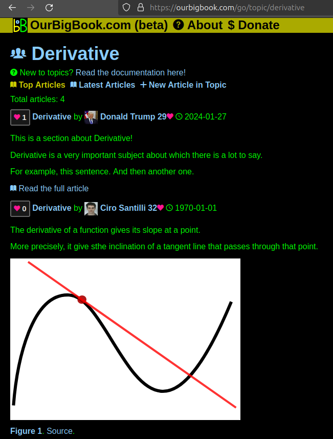
Figure 1. Screenshot of the "Derivative" topic page. View it live at: ourbigbook.com/go/topic/derivativeVideo 2. OurBigBook Web topics demo. Source. - local editing: you can store all your personal knowledge base content locally in a plaintext markup format that can be edited locally and published either:This way you can be sure that even if OurBigBook.com were to go down one day (which we have no plans to do as it is quite cheap to host!), your content will still be perfectly readable as a static site.
- to OurBigBook.com to get awesome multi-user features like topics and likes
- as HTML files to a static website, which you can host yourself for free on many external providers like GitHub Pages, and remain in full control

Figure 2. You can publish local OurBigBook lightweight markup files to either OurBigBook.com or as a static website.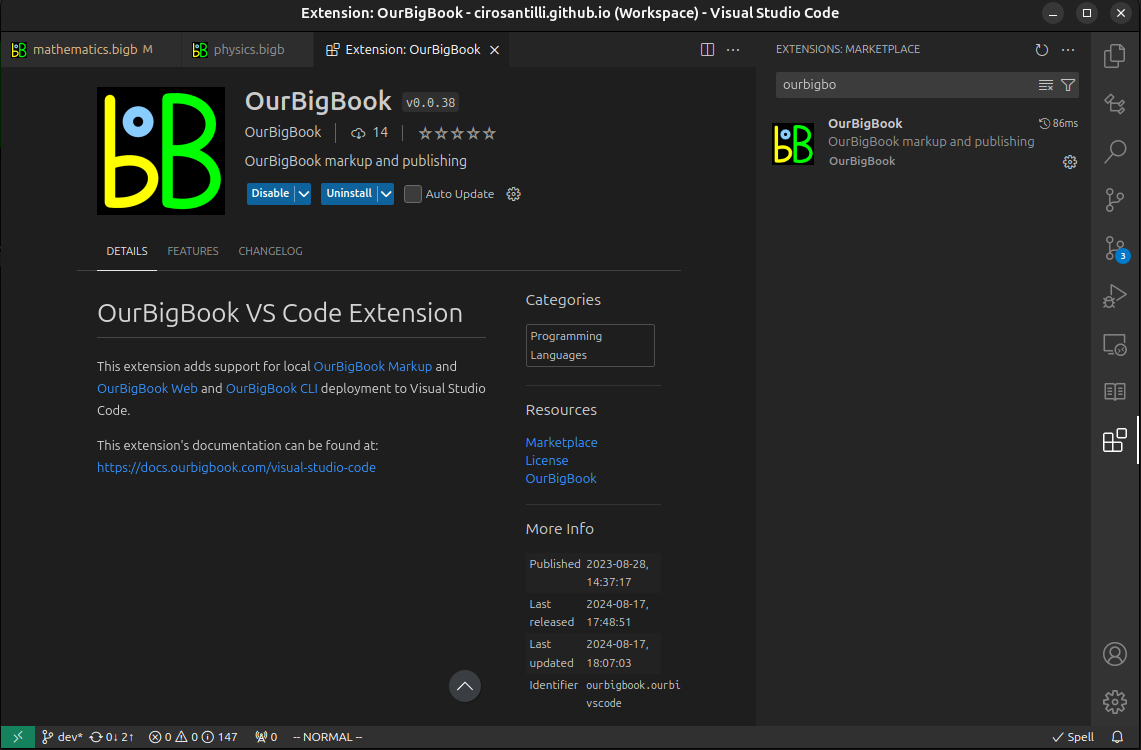
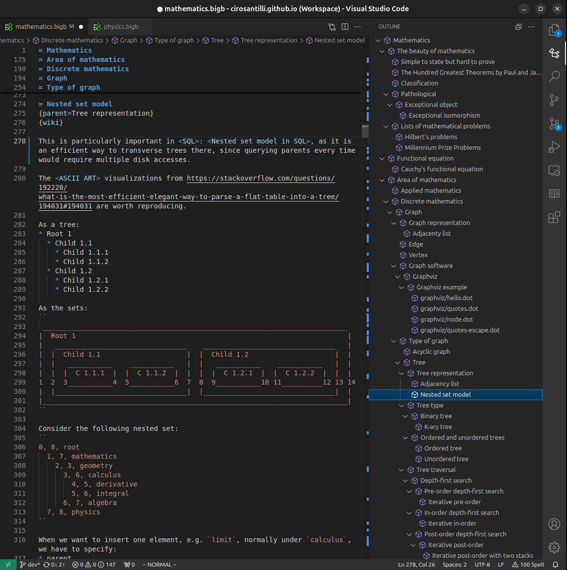
Figure 3. Visual Studio Code extension installation.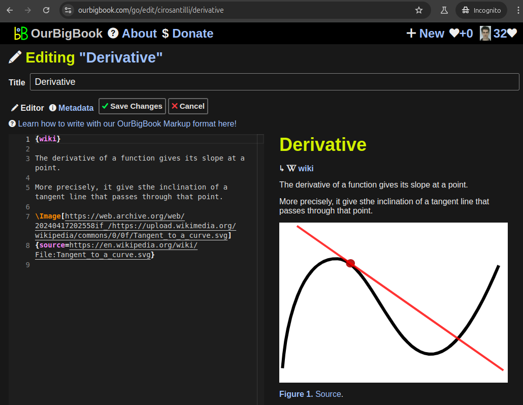
Figure 5. . You can also edit articles on the Web editor without installing anything locally. Video 3. Edit locally and publish demo. Source. This shows editing OurBigBook Markup and publishing it using the Visual Studio Code extension. 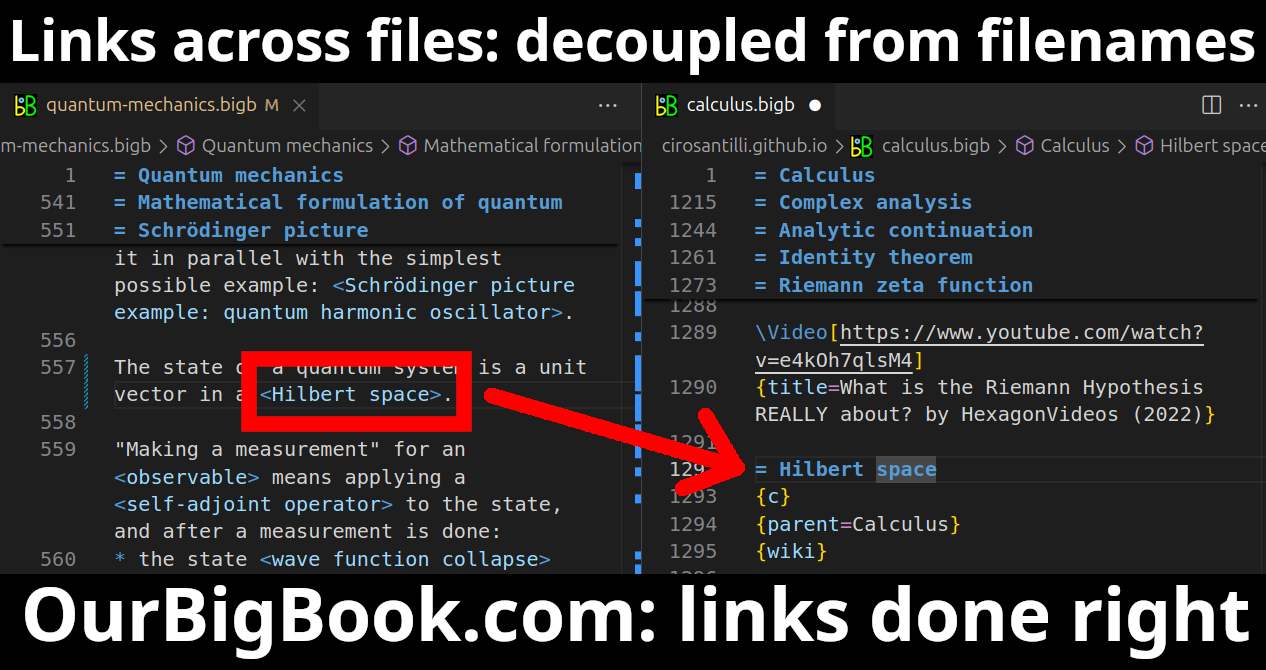
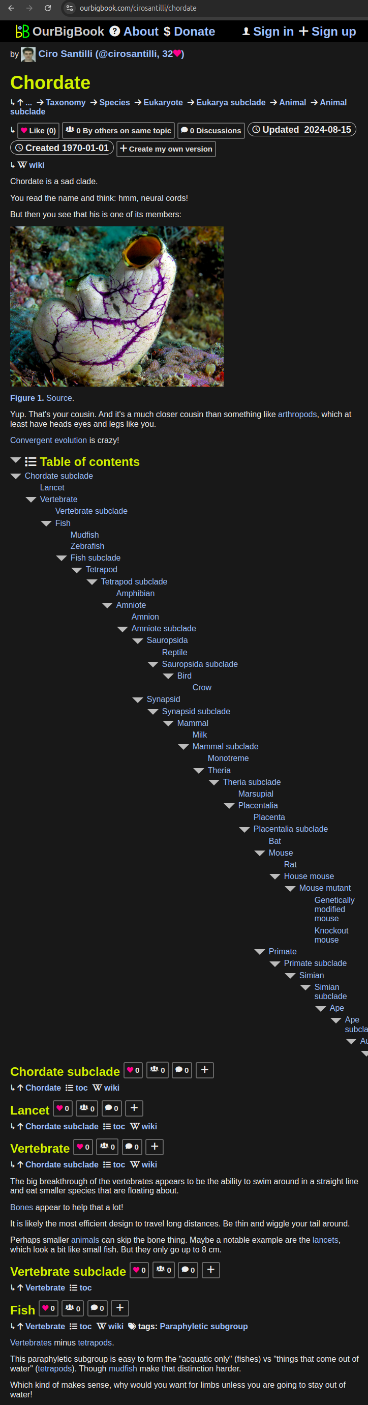
- Infinitely deep tables of contents:
All our software is open source and hosted at: github.com/ourbigbook/ourbigbook
Further documentation can be found at: docs.ourbigbook.com
Feel free to reach our to us for any help or suggestions: docs.ourbigbook.com/#contact