Erik Selvig is a fictional character in the Marvel Cinematic Universe (MCU), portrayed by actor Stellan Skarsgård. He is a renowned astrophysicist and a professor who has appeared in several Marvel films. Selvig first appears in "Thor" (2011) and later appears in "The Avengers" (2012), "Thor: The Dark World" (2013), and other related media.
Atom, also known as Ray Palmer, is a fictional superhero appearing in American comic books published by DC Comics. The character was created by writer Gardner Fox and artist Gil Kane, first appearing in "Showcase" #34 in 1961. Ray Palmer is a brilliant physicist who discovers a way to shrink in size and gain the ability to manipulate his own mass, allowing him to shrink to subatomic levels while retaining his strength.
Geometric graph theory is a branch of mathematics that studies graphs in the context of geometry. It combines elements of graph theory, which is the study of graphs (composed of vertices connected by edges), with geometric concepts such as distances and shapes. The primary focus of geometric graph theory is on how graphs can be represented in a geometric space, typically the Euclidean plane or higher-dimensional spaces, while examining properties that arise from their geometric configurations.
Integral geometry is a branch of mathematics that focuses on the study of geometric measures and integration over various geometric objects. It combines techniques from geometry, measure theory, and analysis to explore properties of shapes, their sizes, and how they intersect with each other. One of the key concepts in integral geometry is the use of measures defined on geometric spaces, which allows for the formulation of results about lengths, areas, volumes, and higher-dimensional analogs.
Measure theory is a branch of mathematics that deals with the systematic way of assigning a numerical "size" or "measure" to subsets of a given space. It provides a foundational framework for many areas of mathematics, particularly in integration, probability theory, and functional analysis.
Classical geometry refers to the study of geometric shapes, sizes, properties, and positions based on the principles established in ancient times, particularly by Greek mathematicians such as Euclid, Archimedes, and Pythagoras. This field encompasses various fundamental concepts, including points, lines, angles, surfaces, and solids.
Technical drawing, also known as drafting, is the process of creating detailed and precise representations of objects, structures, or systems for the purposes of communication, planning, and construction. It involves using various tools and techniques to produce drawings that convey specific information about dimensions, materials, fabrication methods, and assembly processes.
Non-Archimedean geometry is a branch of mathematics that arises from the study of non-Archimedean fields, particularly in the context of valuation theory and metric spaces. The term "non-Archimedean" essentially refers to certain types of number systems that do not satisfy the Archimedean property, which states that for any two positive real numbers, there exists a natural number that can make one number larger than the other.
Noncommutative projective geometry is a branch of mathematics that extends the concepts of projective geometry into the realm of noncommutative algebra. In classical projective geometry, we deal with geometric objects and relationships in a way that relies on commutative algebra, primarily over fields. However, in noncommutative projective geometry, we consider spaces and structures where the coordinates do not commute, often inspired by physics, particularly quantum mechanics and string theory.
Calculus is a branch of mathematics that deals with the study of change and motion. It focuses on concepts such as limits, derivatives, integrals, and infinite series. Calculus is primarily divided into two main branches: 1. **Differential Calculus**: This branch focuses on the concept of the derivative, which represents the rate of change of a function with respect to a variable.
Complex analysis is a branch of mathematics that studies functions of complex numbers and their properties. It is a significant area of mathematical analysis and has applications in various fields, including engineering, physics, and applied mathematics.
Microlocal analysis is a branch of mathematical analysis that studies the properties of partial differential equations (PDEs) by examining their behavior at a more refined level than the traditional pointwise analysis. Specifically, it involves analyzing solutions and their singularities in both the spatial and frequency (or oscillatory) domains. The main tools of microlocal analysis include: 1. **Wavefront Sets**: The wavefront set of a distribution captures both its singularities and the directions of those singularities.
"Alien vs. Predator" is a science fiction action film released in 2004, directed by Paul W.S. Anderson. It serves as a crossover between the "Alien" and "Predator" franchises, which are both well-known in the science fiction and horror genres. The film features characters from both series, including the iconic Alien Xenomorphs and the technologically advanced Predators.
"Aliens vs. Predator: Requiem" is a science fiction action horror film released in 2007. It is the sequel to the 2004 film "Alien vs. Predator" and is based on the popular "Alien" and "Predator" franchises. Directed by the Brothers Strause, the film continues the story of the interspecies conflict between the titular aliens and predators.
"Athisayan" is a Malayalam-language fantasy film released in 2007, directed by Vinayan and featuring actors such as Prithviraj Sukumaran, Riya Sen, and Bhavna Pani. The film revolves around a man who gains superhuman powers after an encounter with a supernatural being. The story combines elements of fantasy, adventure, and romance, and is characterized by its focus on themes of good versus evil.
"Flashman" is a 2023 film directed by Luuk van Dijk, starring architect and filmmaker Kees de Groot. It is based on the character Harry Flashman, originally created by George MacDonald Fraser in a series of historical novels. The films depict the exploits of this anti-hero, who is known for his cowardice, charm, and involvement in various historical events.
"Hollow Man" can refer to a few different concepts, primarily in film and literature. The most prominent references include: 1. **Film**: "Hollow Man" is a 2000 science fiction horror film directed by Paul Verhoeven. The story follows a brilliant but deeply unethical scientist, Sebastian Caine, who discovers a way to make himself invisible.
Aeromechanics is a branch of engineering that deals with the study of the behavior of air and other gases in motion, and their interactions with solid objects, particularly those that are designed to move through the atmosphere, such as aircraft, missiles, and spacecraft. It encompasses a range of disciplines, including aerodynamics, fluid mechanics, and propulsion. Key areas of focus within aeromechanics include: 1. **Aerodynamics**: The study of the forces and resulting motion of objects through the air.
"Looney Tunes: Rabbits Run" is an animated film featuring characters from the classic "Looney Tunes" series. Released in 2015, it centers on Bugs Bunny and Lola Bunny as they embark on a comedic adventure. The plot involves Lola discovering a magical potion that grants her the ability to teleport, leading to a series of misadventures as various classic Looney Tunes characters, including Daffy Duck and Porky Pig, get involved.
"Mosaic" is a mystery thriller film that was released in 2017, directed by Steven Soderbergh. The film stars Sharon Stone as the main character, along with a cast that includes Garrett Hedlund, Beau Bridges, and Frederick Weller. The story revolves around a murder mystery centered on a wealthy author and her relationships, with the narrative unfolding in a non-linear fashion.
Pinned article: Introduction to the OurBigBook Project
Welcome to the OurBigBook Project! Our goal is to create the perfect publishing platform for STEM subjects, and get university-level students to write the best free STEM tutorials ever.
Everyone is welcome to create an account and play with the site: ourbigbook.com/go/register. We belive that students themselves can write amazing tutorials, but teachers are welcome too. You can write about anything you want, it doesn't have to be STEM or even educational. Silly test content is very welcome and you won't be penalized in any way. Just keep it legal!
Intro to OurBigBook
. Source. We have two killer features:
- topics: topics group articles by different users with the same title, e.g. here is the topic for the "Fundamental Theorem of Calculus" ourbigbook.com/go/topic/fundamental-theorem-of-calculusArticles of different users are sorted by upvote within each article page. This feature is a bit like:
- a Wikipedia where each user can have their own version of each article
- a Q&A website like Stack Overflow, where multiple people can give their views on a given topic, and the best ones are sorted by upvote. Except you don't need to wait for someone to ask first, and any topic goes, no matter how narrow or broad
This feature makes it possible for readers to find better explanations of any topic created by other writers. And it allows writers to create an explanation in a place that readers might actually find it.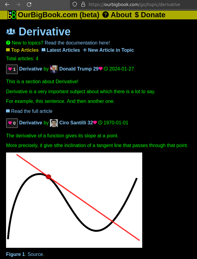
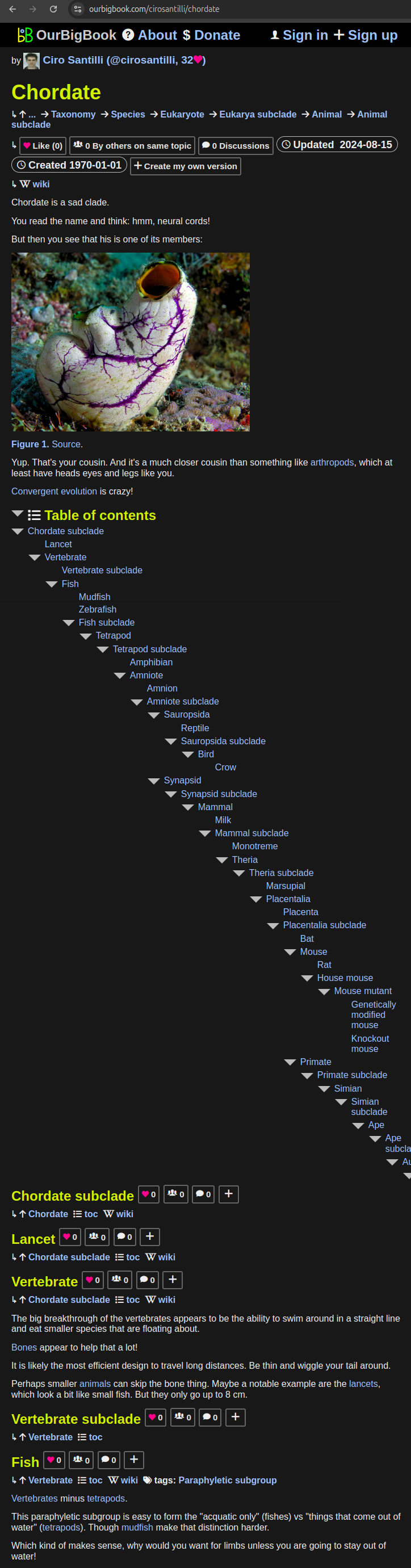
Figure 1. Screenshot of the "Derivative" topic page. View it live at: ourbigbook.com/go/topic/derivativeVideo 2. OurBigBook Web topics demo. Source. - local editing: you can store all your personal knowledge base content locally in a plaintext markup format that can be edited locally and published either:This way you can be sure that even if OurBigBook.com were to go down one day (which we have no plans to do as it is quite cheap to host!), your content will still be perfectly readable as a static site.
- to OurBigBook.com to get awesome multi-user features like topics and likes
- as HTML files to a static website, which you can host yourself for free on many external providers like GitHub Pages, and remain in full control
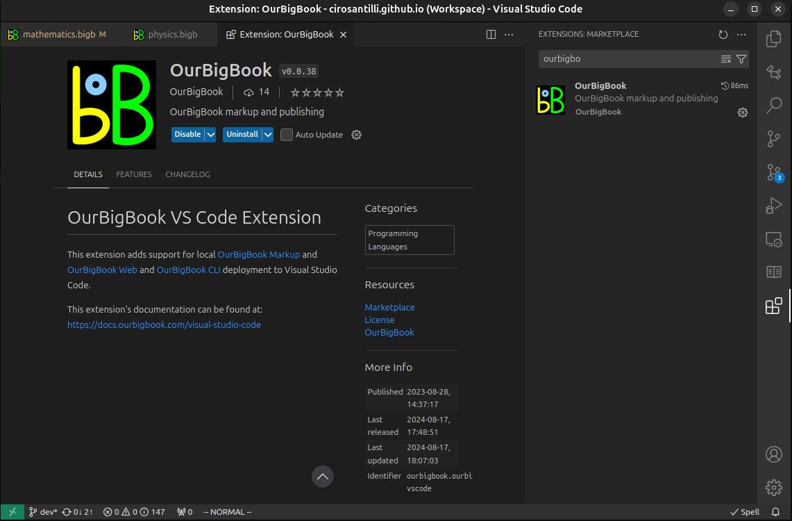
Figure 3. Visual Studio Code extension installation.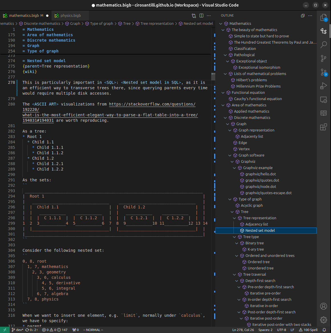
Figure 4. Visual Studio Code extension tree navigation.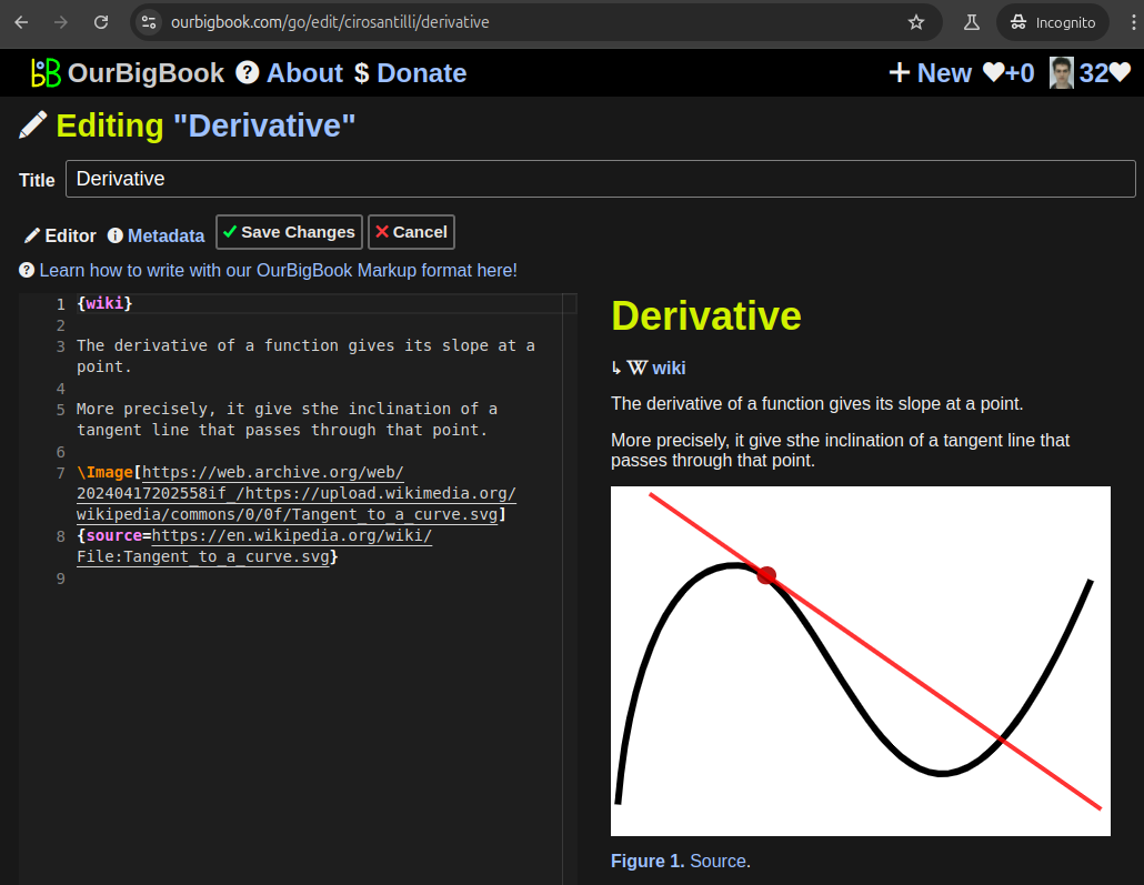
Figure 5. Web editor. You can also edit articles on the Web editor without installing anything locally.Video 3. Edit locally and publish demo. Source. This shows editing OurBigBook Markup and publishing it using the Visual Studio Code extension.Video 4. OurBigBook Visual Studio Code extension editing and navigation demo. Source. 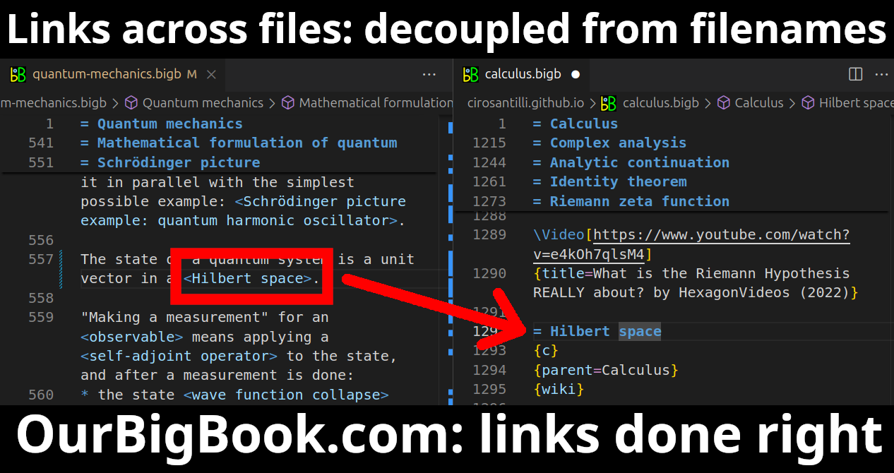
- Infinitely deep tables of contents:

All our software is open source and hosted at: github.com/ourbigbook/ourbigbook
Further documentation can be found at: docs.ourbigbook.com
Feel free to reach our to us for any help or suggestions: docs.ourbigbook.com/#contact