Typography concerns the selection and arrangement of written forms. In digital systems, the visible result depends on several distinct operations: interpreting text characters, selecting glyphs from a computer font, positioning them, and converting their geometry into pixels through rasterization.
This distinction matters when a document looks wrong. Missing glyphs, incorrect glyph substitutions and poorly rendered pixels can produce different failures even when the underlying Unicode text is unchanged.[ref]
OpenType Layout Overview by Microsoft. Characters versus glyphs and OpenType Layout terminology: abstract characters, visual glyphs, substitution and positioning
First-line indentation shifts the beginning of the first formatted line of a text paragraph relative to its normal starting edge. In a left-to-right layout, a positive indent reserves space on the left; the corresponding starting edge is on the right in a right-to-left layout. In CSS,
text-indent controls this placement.[ref]Text in Cascading Style Sheets Level 2 Revision 2 by World Wide Web Consortium. §16.1: first formatted line, starting edge and indentation
In a simple left-to-right column of width with indentation , the first line begins at and has available typesetting line width . Later lines can begin at and use all 40 units. A negative indent instead places the start at , extending into the margin if no other layout constraint intervenes.
This changes the first line's geometry without adding printable glyphs. Replacing the indent by several stored spaces would couple the result to word spacing, white-space processing and the chosen computer font. A line breaking model can represent the change explicitly through its sequence of typesetting line widths.
Typographic alignment places a line's content relative to its available horizontal space. Common choices align its left edge, align its right edge, centre it or apply text justification. In CSS,
text-align specifies alignment within the line's container, rather than positioning the entire container in the page.[ref]Text in Cascading Style Sheets Level 2 Revision 2 by World Wide Web Consortium. §16.2: alignment within line boxes and text-align values
For a rigid line with natural line width , no indentation, and a left boundary at , the starting positions areThus and give starts 0, 8 and 16. These three choices preserve the internal word spacing. Text justification can instead change that spacing through typesetting glue so the content reaches the intended edges. The alignments therefore solve different geometric tasks even when the same words and computer font are used.
Letter spacing, also called typographic tracking, adjusts spacing within a run of text. It is distinct from word spacing and from context-sensitive kerning. In CSS, the
letter-spacing property controls additional spacing, with rules that respect the writing system rather than blindly separating every stored character.[ref]Text in Cascading Style Sheets Level 2 Revision 2 by World Wide Web Consortium. §16.4: letter-spacing and distinction from kerning
[ref]CSS Text Module Level 3 by World Wide Web Consortium. §7.2: typographic character units and cursive scripts
A simple model illustrates the geometry. Suppose four already shaped units have combined advance , and three selected internal gaps each receive an extra . ThenThis is an explicitly chosen three-gap model. A glyph need not correspond to one stored character, so counting source characters is generally insufficient to determine those gaps. Text shaping, typographic ligatures and the script's joining behaviour must be considered when deciding where spacing may change.
Mathematical typesetting arranges symbolic expressions in two dimensions. It must coordinate computer fonts, glyph positioning, typesetting boxes and text baselines while preserving the expression's visible structure. A typeset fraction positions its components above and below a bar; superscripts, subscripts, square roots and mathematical delimiters impose other geometric relationships.[ref]
MATH - The Mathematical Typesetting Table by Microsoft. Overview: hierarchical formulas, recursive layout and component boxes
For example,contains a superscript inside the upper component and a square root inside the lower component. Their dimensions help determine the height of the complete typeset fraction. A larger expression may then require larger surrounding mathematical delimiters. Laying out the smallest parts first makes this a recursive geometric construction.
An OpenType MATH table supplies font-specific information such as placement constants and suitable glyph variants. The table supplies data for layout; different implementations can use those data in different algorithms. TeX and LaTeX provide established authoring systems for expressing such mathematical structure.[ref]
MATH - The Mathematical Typesetting Table by Microsoft. Overview and MATH table structures: font data rather than a complete layout algorithm
The mathematical typesetting axis, or Math axis, is a horizontal alignment reference for a formula. Its offset from the text baseline is a mathematical font constant, represented by
axisHeight in an OpenType MATH table.[ref]MATH - The Mathematical Typesetting Table by Microsoft. MathConstants: axisHeight and baseline offset
For an invented coordinate example, choose upward-positive coordinates, put the text baseline at , and set the axis offset to font units in a computer font with 1000 font units per em. At 20 pixels per em, the axis is pixels above that baseline. A symmetric enclosing shape spanning to has midpoint , so its centre lies on the axis.
The typeset fraction bar is another useful alignment cue. The reference fixes relative placement; translating the whole formula also translates its baseline and axis.
A mathematical typesetting style selects layout conventions appropriate to a formula's context, including compact inline material and more spacious displayed material. In MathML,
math-style distinguishes normal and compact, while math-depth participates in nested size selection.[ref]Compare two presentations of the same expression:Both represent the same quotient, but reserve different vertical space. In TeX,
\displaystyle and \textstyle request these contexts. The choice matters when fitting a typeset fraction into a line without making neighbouring text baselines unnecessarily far apart.For a hypothetical computer font with first- and second-level script scales 80 and 60 percent, a base font size of 20 units gives script sizes 16 and 12. The second value is relative to the base, so it is not . Actual percentages come from the computer font's mathematical font constants.[ref]
MathML Core by World Wide Web Consortium. §4.5: ScriptPercentScaleDown and ScriptScriptPercentScaleDown
A mathematical delimiter is a symbol used to enclose or separate parts of a mathematical expression, such as parentheses, brackets or vertical bars. Its visible size should suit the enclosed material. Mathematical typesetting can select a larger mathematical glyph variant or construct a mathematical glyph assembly when a default glyph is too small.[ref]
MATH - The Mathematical Typesetting Table by Microsoft. MathVariants and MathGlyphConstruction: ready-made variants and assemblies for growing shapes
For example, compare the grouping inThe parentheses enclose the complete typeset fraction, so its height and depth inform their layout. The superscript applies to the grouped expression. In TeX,
\left( and \right) request paired size-sensitive delimiters around the enclosed material. The stored parenthesis characters can therefore yield different glyphs in different formula contexts.The Math axis provides a useful alignment reference for symmetric enclosing shapes. A font's choice of larger variants or assembly parts can preserve appropriate stroke weights and proportions while the expression grows.
A typeset fraction is a two-dimensional layout that places one expression above another, commonly with a horizontal rule between them. The components are laid out as typesetting boxes before they are assembled. In MathML, an
mfrac element supplies the two components; mathematical typesetting style affects their presentation.[ref]For example,has a superscript in its upper component and a square root in its lower component. Their dimensions influence the space above and below the fraction rule. The expression's algebraic meaning and its geometry are related but distinct: the layout can contain arbitrary expressions, including ones whose values are not rational numbers.
A simple own box model makes the horizontal placement explicit. Suppose the component widths are and , and the layout adds a chosen side allowance . If both components are centred in widththeir left offsets are and . This is an illustrative centring model; real layouts also use vertical clearances, rule thickness and font data from an OpenType MATH table.
A subscript is a component placed below the usual baseline of a base expression, commonly at a smaller size. It can label a term of a sequence, as in , or identify a matrix entry, as in . Its position does not by itself determine the mathematical meaning of the label.
In TeX,
x_i attaches a single-token subscript, while x_{i+1} groups a compound subscript. In MathML, msub supplies a base and subscript as separate children. Their layout uses baseline shifts and clearances rather than putting both components on the ordinary text baseline.[ref]MathML Core by World Wide Web Consortium. Subscripts and superscripts: msub child layout and shift calculations
For example, keeps together as one attached component. A mathematical typesetting style controls the treatment of the smaller expression. An OpenType MATH table can supply the font-specific placement data. This is why adding an underscore as an ordinary printed glyph would not reproduce the layout.
A superscript is a component raised relative to a base expression, commonly also reduced in size. An exponent in is one use. The superscript in can instead denote a derivative when that convention has been specified. The typographic position supports several meanings.
In TeX,
x^2 supplies one token as the superscript and x^{n+1} groups a longer expression. In MathML, msup lays out the base and superscript separately, with vertical placement and gap constraints.[ref]MathML Core by World Wide Web Consortium. Subscripts and superscripts: msup layout
For example, the base and raised expression inhave different local baselines. A mathematical typesetting style determines how the raised expression is presented. When subscripts and superscripts are both attached, their mutual clearance also matters; independently moving each one without considering the other could cause a collision. An OpenType MATH table provides font-specific data used for these choices.
A text paragraph is a group of text treated as one unit for paragraph layout. Its line breaking may change when the available typesetting line width or computer font changes, while its underlying paragraph boundary remains the same. A line in the source file therefore need not be a line of displayed output.[ref]
CSS Text Module Level 3 by World Wide Web Consortium. §3: white-space processing, wrapping and preserved versus collapsed segment breaks
For example, a sequence of four typesetting boxes may occupy two lines in a narrow container and one line in a wider container. Reflow changes the grouping of boxes without requiring a new paragraph. In TeX,
\par ends the current paragraph; in HTML, a p element marks a paragraph. Those mechanisms let the layout system work with a semantic group instead of relying on the writer to insert each visible line break.The Knuth-Plass line-breaking algorithm uses this grouping to compare costs across the whole paragraph. Its typesetting demerits can depend on both individual lines and changes between neighbouring lines, which cannot be evaluated by inspecting each source line in isolation.
TeX is Donald E. Knuth's programmable system for typography, particularly mathematical typesetting. A document supplies text and instructions; TeX macros and TeX primitives build material whose dimensions determine the eventual page layout. Computer fonts supply glyphs and font metrics, while line breaking selects how a text paragraph is divided. The Knuth-Plass line-breaking algorithm is one of the system's central layout methods.[ref]
Breaking paragraphs into lines by Donald E. Knuth and Michael F. Plass. pp.1119–1122 and 1175–1176: paragraph optimization and development in TeX
A TeX format supplies a prepared collection of definitions. Plain TeX and LaTeX provide different document interfaces built on TeX technology. For example, in Plain TeX the input
$\sqrt{2}$\bye requests a square root expression, , and ends the document. The computer font, glyph positioning and mathematical typesetting rules determine the printed geometry; the source characters alone are not a picture of the result.The TeXbook by Donald E. Knuth is the system's user and reference manual. TeX source code by Donald E. Knuth exposes the implementation as a documented computer program, making the paragraph algorithm and its numerical conventions inspectable.[ref]
The TeXbook by Donald E. Knuth. Author’s official bibliography: Volume A as user/reference manual, Volume B as documented program
The TeX input processor converts input characters into TeX tokens using their current TeX category codes. Its whitespace handling is described by TeX input states: new line N, skipping spaces S and middle of line M.[ref]
Under ordinary conventions, the invented input
A B produces an A character token, one space token and a B character token. After A, state M allows the first space through and switches to S; the next two spaces disappear. Reading B returns to M. A space-only line begins in N and its end produces \par, whereas the end of an ordinary text line in M supplies a space.[ref]TeX source code by Donald E. Knuth. get_next: Handle situations involving spaces, braces, changes of state
This explains why source indentation and repeated spaces need not survive as visible word spacing. The complete scanner also handles comments, TeX control sequences and character-code conversions; the N/S/M diagram describes the whitespace part of the process.
A TeX input state is the N, S or M state used by the TeX input processor while reading character input: new line, skipping blanks or middle of line. It helps determine whether a space or end-of-line character becomes a TeX token.[ref]
TeX source code by Donald E. Knuth. Input stacks: mid_line, skip_blanks and new_line; get_next whitespace cases
Assume ordinary TeX category codes. In N, leading spaces are ignored. An ordinary letter emits its character token and enters M. The first space in M emits one space token and enters S; further spaces in S are ignored. An end-of-line character emits a space from M, emits
\par from N and emits nothing from S. The next line starts in N.[ref]TeX source code by Donald E. Knuth. Cases where character is ignored; Handle situations involving spaces, braces, changes of state
For an original trace, take a line containing two leading spaces,
A, three spaces and B, followed by a space-only line. The first two spaces disappear in N. A enters M; one space survives and the next two disappear in S; B returns to M. The first line end supplies another space. The blank line then supplies \par. The resulting sequence is A, space, B, space, \par.Thus source whitespace is processed before word spacing and text paragraph layout. This state records part of scanning, not whether TeX is currently building a text line or a mathematical formula; TeX control sequences, comments and changed TeX category codes have further scanning rules.
TeX expansion replaces expandable TeX tokens with other tokens according to their current meanings and the scanning context. TeX macros provide replacement lists; some TeX primitives also expand. Subsequent processing can execute commands or build typesetting boxes.[ref]
For example,
\def\firstdemo{AB}\def\seconddemo{\firstdemo} establishes two macros. Expanding \seconddemo first produces the token for \firstdemo; expanding that yields the character tokens A and B. The intermediate result is a token stream. The printed shapes are determined later by computer fonts and layout.Meaning can change between definition and use. With
\def\value{A}\def\callvalue{\value}, redefining \value to expand to B changes the later expansion of \callvalue to B. The stored TeX control sequence still identifies the same name, while its current definition supplies the replacement. This makes the distinction between token identity and current meaning practically useful.A TeX token is an internal syntactic unit used by TeX. Ordinary character tokens pair a TeX character code with a TeX category code; TeX control sequence tokens identify commands. Macro processing also uses TeX parameter tokens.[ref]
For example, an
a read with category 11 and an a read with category 12 are different character tokens, even though both can select the same printed glyph in ordinary text. Changing a category assignment later does not retokenize a previously stored TeX macro replacement list. A stored control-sequence token can, however, acquire a different current meaning through redefinition.The TeX input processor performs the relevant lexical analysis. The later TeX expansion stage operates on the resulting tokens. This separation explains why changing the spelling of input and changing the meaning of an existing command are different operations.
A TeX parameter token marks an argument position in a TeX macro definition. With ordinary category assignments,
#1 through #9 name the available positions. During TeX expansion, the supplied argument tokens replace the corresponding placeholders.[ref]For an original example,
\def\twice#1{#1:#1} followed by \twice{ab} expands to ab:ab. The braces delimit one argument containing two character tokens; they are not copied into the replacement at each placeholder. Calling \twice7 instead gives 7:7. Thus #1 identifies an argument slot rather than instructing TeX to print the digit 1.The definition's replacement list can be inspected before execution. Its placeholders remain distinct from ordinary digit tokens, even when an actual argument happens to be a digit. This separation makes token substitution useful for reusable notation.
A TeX character code is the numerical component identifying a character in TeX's character model. An ordinary character TeX token combines that code with a TeX category code. Classic TeX uses an eight-bit character-code range, 0–255.[ref]
For example, under the usual ASCII mapping,
a has code 97. Reading it once with category 11 and again with category 12 produces the pairs and . The first component stays the same; the syntactic classification changes. This is why a TeX macro can distinguish inputs that look alike on the page.The number does not identify a universal glyph. A computer font supplies the printed form, and a glyph index belongs to that font. The classic range should also not be treated as a restriction on every extended TeX engine.
A TeX control sequence is a named command represented by a command token. With ordinary category conventions, a TeX control word begins with the escape character and continues through letters; a TeX control symbol uses a single nonletter after the escape.[ref]
Thus
\demo is normally a control word and \% a control symbol. The name does not require a particular implementation: its current meaning may be a TeX primitive or a TeX macro. For example, \def\demo{A}\let\saved=\demo\def\demo{B} leaves \demo expanding to B and \saved expanding to the saved definition A.Spaces also illustrate why the tokenization rules matter. Under the usual conventions, the space after a control word delimits its name and is ignored by input processing. Printing a space may therefore require an explicit command or another appropriate input construction. The TeX category code assignments determine which characters count as letters during this scan.
A TeX control symbol is a TeX control sequence formed by an escape followed by one character whose TeX category code is not letter. Under ordinary conventions,
\% is one such command.[ref]For an invented example, define
\def\!{Q} and then read \! X. The resulting replacement starts with Q, one ordinary space token and X. The nonletter ends the command name immediately; the first following space is processed in state M and survives. Compare \def\word{Q} followed by \word X, which produces QX.Control space, written as an escape followed by a space, has special handling: it enters state S. Thus a rule that discards every space after every command would predict the wrong result for the
\! example.[ref]TeX source code by Donald E. Knuth. Scan a control sequence: state selection for spacer and letter; get_next whitespace cases
A TeX control word is a TeX control sequence scanned from an escape followed by a maximal run of characters with TeX category code 11. The scanner then enters the space-skipping TeX input state S.[ref]
For example, after
\def\word{Q}, the input \word X yields QX; the spaces terminate the name and are skipped. The input \word X does the same. By contrast, \wordX names a single different command, so removing the separator does not preserve the token sequence.Token identity and current meaning are separate. Define
\def\call{\word}, then redefine \word to yield R. Expanding \call now yields R, because its stored command token still names word. This is useful when reading TeX macros: the spelling identifies the command, while its current definition controls expansion.A TeX category code tells the TeX input processor how to treat an input character syntactically. Categories include escape 0, beginning-group 1, ending-group 2, letter 11, other 12 and active 13. The usual backslash and brace conventions are assignments of these categories, rather than immutable properties of the printed characters.[ref]
For example, suppose
a initially has category 11. Defining \def\demo{a} stores that character token. The assignment \catcode 97=12 changes how a subsequently read character with code 97 is classified. It does not change the earlier character token inside \demo. The example assumes the ordinary character-code mapping for a and leaves the letters of demo unchanged.The distinction matters for reusable TeX macros: a definition can preserve syntax that would be read differently under later category assignments. It also explains how changing letter categories can alter the scanning of a TeX control word without changing the visible spelling of the source.
A TeX primitive is an operation supplied by TeX itself, such as defining a TeX macro, changing a register or constructing a typesetting box. A TeX control sequence can name a primitive or a macro. The distinction concerns the current meaning of the command, rather than the appearance of its name.[ref]
For example,
\hbox constructs a horizontal typesetting box. The assignment \let\mkbox=\hbox gives another name to its current meaning. Defining a macro with \def\label{sample} creates a replacement list instead. Some primitives participate in TeX expansion, while others perform operations during later processing; primitive does not mean unexpandable. This distinction helps explain why a command can appear in an expansion trace without immediately drawing a glyph.A TeX format is a prepared collection of definitions and initialization state used with TeX. A TeX format file, conventionally ending in
.fmt, stores internal structures so they can be loaded efficiently instead of reconstructed from the original initialization input.[ref]Plain TeX supplies one such foundation; LaTeX supplies another, with document-level conventions and facilities. The same mathematical input
$x^2$ can be embedded in either system, but an authoring command defined by one format need not be available in the other.Keeping the layers separate helps diagnose a failed document. The TeX implementation provides TeX primitives; the format makes further TeX macros and defaults available; a document invokes those definitions. Loading a different format can change the meaning or availability of commands without changing their spelling in the input file.
A TeX format file stores initialized internal structures for a TeX format, usually under a
.fmt filename. Loading it reconstructs prepared definitions and related state more quickly than rereading the initialization input. Creating it uses the initialization facility and the \dump command.[ref]TeX by Topic by Victor Eijkhout. §33.1.2, pp.257–258: compact internal dump, load and initialization
This is an example of serialization. Suppose an initialization input defines
\def\banner{First} and its state is saved. Changing the original input to define Second does not by itself replace the already saved state. The format must be regenerated, or the loaded definition explicitly changed, for subsequent processing to use that new initialization.A loaded TeX format file initializes future document processing. The document can then add further TeX macros, change parameters and request mathematical typesetting. The relevant implementation must be able to read the saved representation; a
.fmt suffix alone does not establish compatibility between different implementations.LaTeX is a document preparation system built on TeX technology. It lets an author specify structure such as sections and references while reusable definitions control presentation. Its facilities support mathematical typesetting, figures, bibliographies and cross-references.[ref]
An introduction to LaTeX by the LaTeX Project. Introduction and LaTeX Features: document structure and scientific publishing
For example, a minimal mathematical article can contain
\documentclass{article}\begin{document}$x^2+1$\end{document}. The source describes the document class and content; the selected LaTeX definitions and computer fonts help determine the resulting geometry. The same separation lets one change a document's design while retaining its logical section structure.Leslie Lamport developed the system; his LaTeX: A Document Preparation System by Leslie Lamport is listed in his bibliography as an Addison-Wesley publication from 1986.[ref]
LaTeX: A Document Preparation System by Leslie Lamport. Author’s bibliography, entry 69: title and 1986 publication
A TeX format makes the system's definitions available to a compatible TeX implementation.Plain TeX is Donald E. Knuth's foundational collection of TeX macros, parameters and conventions, described in The TeXbook by Donald E. Knuth. It makes a usable document interface from the lower-level facilities of TeX.[ref]
Plain TeX in the Comprehensive TeX Archive Network. Official package description: format-building files and relation to The TeXbook
For example,
$x^2+1$\bye requests an inline mathematical expression and ends the document. The \bye macro handles paragraph completion and final output before ending the run.[ref] The example uses the format's existing definitions together with TeX primitives and mathematical typesetting rules.Plain TeX is useful when studying how relatively small definitions control layout. LaTeX provides a different TeX format with more document-level structure. Choosing a format determines which definitions an input file can expect to find already loaded.
A TeX macro associates a TeX control sequence with a replacement list of TeX tokens, possibly containing parameters. During TeX expansion, arguments are substituted into that list. Character tokens retain their TeX category codes, so this mechanism has more structure than unrestricted replacement of raw text strings.[ref]
TeX by Topic by Victor Eijkhout. §§11.2,11.5 and12.1: definitions, parameters and token-stream expansion
For a simple example,
\def\dup#1{#1+#1} defines a macro with one parameter. In mathematics, $\dup{x}$ yields the token sequence for . With $\dup{u+v}$, the expansion gives . The replacement duplicates the supplied tokens; it does not evaluate or simplify the mathematical expression.This makes TeX macros useful for reusable notation. A document can express an intention through one command and change the associated presentation centrally. The actual printed result still depends on subsequent execution, computer fonts and mathematical typesetting.
Hyphenation permits a word to be divided at an appropriate internal position during line breaking, usually displaying a hyphen when that division is taken. A hyphenation opportunity is a permitted choice, rather than an instruction to break every occurrence. The choice can help a narrow text paragraph fit without excessive word spacing.
A soft hyphen, Unicode U+00AD, marks such an optional position: in a suitable context,
ex followed by a soft hyphen and ample can display as example on one line or as ex- followed by ample on the next. The soft hyphen normally remains invisible when no split is taken. An always-visible hyphen already present in the word has different display behaviour.[ref]CSS Text Module Level 3 by World Wide Web Consortium. §5.3: conditional hyphens, visible hyphens and language-sensitive hyphenation
In CSS,
hyphens: manual uses explicit opportunities; hyphens: auto also permits opportunities supplied by a resource for the text's known language. The hyphenation resource and the line breaking algorithm answer different questions: where a split is linguistically allowed, and which allowed split best fits the layout. A discretionary break can also account for material inserted or replaced at the chosen split.[ref]CSS Text Module Level 3 by World Wide Web Consortium. §5.3: manual/auto values and content-language requirement
A discretionary break describes an optional line breaking choice whose printed material may depend on whether the break is selected. In TeX,
\discretionary{pre}{post}{none} supplies material before a chosen break, after it, or in the unbroken case.[ref]TeX source code by Donald E. Knuth. disc_node: pre_break, post_break and replacement material
For a purely mechanical example,
ab\discretionary{-}{X}{Y}cd can produce abYcd without the break, or ab- followed on the next line by Xcd when it is selected. The arbitrary strings make all three branches visible. A common hyphenation case simply inserts a hyphen before the break and supplies no material afterward.Each alternative has its own geometry. A typesetting box used only in the pre-break branch must contribute its width when that branch is tested. The natural line width, typesetting glue and typesetting penalty calculation must therefore use the selected representation. Treating the choice merely as an invisible marker could miss the width of the inserted hyphen.
A soft hyphen, or SHY, is the Unicode character U+00AD. It marks a preferred optional division inside a word and normally has no visible shape when that division is unused. Selecting it invokes the language-appropriate presentation for an intraword break, which can involve more than adding one hyphen.[ref]
Unicode Line Breaking Algorithm by the Unicode Consortium. §5.4: invisible format character and language-dependent break presentation
For example, a suitable renderer can show
ex followed by SHY and ample as example on one line, or as ex- and ample on successive lines. The visible hyphen then belongs to the chosen layout. In languages with spelling changes at a division, the layout implementation may also need to modify the divided parts.[ref]Unicode Line Breaking Algorithm by the Unicode Consortium. §5.4: spelling changes and responsibility of the line-breaking implementation
A soft hyphen supplies a hyphenation opportunity; it does not force the line breaking algorithm to use it. The algorithm can retain the unbroken word when its typesetting line width and paragraph cost permit that choice.
A hyphenation opportunity is a position where the language and chosen hyphenation rules permit a word to be divided across lines. An explicit soft hyphen can supply one; automatic hyphenation can find others using a language-appropriate resource. These permitted positions become choices for line breaking.[ref]
CSS Text Module Level 3 by World Wide Web Consortium. §5.3: explicit and automatic language-appropriate hyphenation opportunities
Two tests must then be applied. First, is the division permitted by the linguistic rules? Second, does the resulting geometry and cost make it a useful choice? If the material before a break has width 20, an inserted hyphen adds 2, and the available typesetting line width is 21, the resulting 22-unit line fails the rigid-width fitting test despite the linguistic permission.
A discretionary break represents the alternative printed material. The Knuth-Plass line-breaking algorithm can compare that option with later or earlier permitted breaks using typesetting badness and typesetting penalties.
Word spacing is the separation between adjacent words in a line of text. Its nominal value comes from the computer font and layout settings; text justification can adjust it through typesetting glue. Letter spacing instead changes spacing within the text's sequence of letters. A script without visible word separators needs a different spacing strategy from an English sentence.[ref]
CSS Text Module Level 3 by World Wide Web Consortium. §§6.4 and 7.1–7.2: script-dependent justification and word/letter spacing
Suppose three typesetting boxes have widths 8, 6 and 10, and the two intervening spaces each have width 3. The natural line width isAdding 1 to each space gives width 32. Adding 1 to every glyph advance would generally produce a different layout, because there need not be one glyph per word or per stored character. Word spacing must therefore be applied to the intended separators rather than inferred from a count of glyphs.
In CSS,
word-spacing: 1px specifies additional spacing at the relevant word separators; it does not set every interword gap to exactly one CSS pixel.[ref]CSS Text Module Level 3 by World Wide Web Consortium. §7.1: additional spacing and affected separator characters
A word separator is a text unit whose primary role is to separate words. Unicode SPACE U+0020 and non-breaking space U+00A0 are common examples. In CSS, the word-separator classification helps determine where word spacing is applied after white-space processing.[ref]
CSS Text Module Level 3 by World Wide Web Consortium. §7.1: word-separator characters and extra spacing
Separation and line breaking are related but distinct. In a suitable ordinary text context, a normal space between
10 and kg provides a possible break. Using a non-breaking space there keeps the number and unit together at that boundary. Both characters can still provide visible separation.[ref]Unicode Line Breaking Algorithm by the Unicode Consortium. Line-breaking properties: GL class and rules LB12/LB12a
A language can also write words without visible separators, so a count of space characters is not a universal word-counting method. Text shaping, word spacing and permitted breaks must follow the appropriate text-processing rules. A separator's stored character and the selected glyph advance jointly participate in the geometry.
A non-breaking space is a separating character intended to keep adjacent text together during ordinary line breaking. The common Unicode character is U+00A0 NO-BREAK SPACE. It has line-break class GL; the surrounding rules determine which boundaries are prohibited.[ref]
Unicode Line Breaking Algorithm by the Unicode Consortium. §5.1, GL class; rules LB12 and LB12a
For an example,
25\u00a0µm is a visible spelling of an escape notation for a number, U+00A0, and a micrometre symbol. The actual text 25 µm keeps the number and unit together at that separator. Ordinary 25 µm instead uses U+0020 SPACE and can provide a wrap opportunity there. Neither choice fixes the physical width of the gap in every computer font.The rule is local. In the sequence
A\u0020\u00a0B, a break after the ordinary space can still be allowed, leaving the non-breaking space on the following line. Thus inserting U+00A0 does not make an entire text paragraph unbreakable.[ref]Unicode Line Breaking Algorithm by the Unicode Consortium. GL description: SPACE before NO-BREAK SPACE; LB12a exception
Text justification adjusts the contents of a line to occupy its available typesetting line width, often aligning both ends of the text. Changing word spacing is one method; permissible adjustments depend on the writing system. Typographic alignment more generally includes leaving the opposite edge ragged or centring a line.[ref]
CSS Text Module Level 3 by World Wide Web Consortium. §6: alignment versus justification; §6.4: script-sensitive expansion and compression
In an illustrative line with natural line width and target width , two equally flexible spaces can each gain 1. If their stretch coefficients are instead 1 and 3, proportional adjustment allocates the required extra 2 asBoth choices reach the same width; their internal spacing differs. Typesetting glue expresses that flexibility, and the line adjustment ratio computes the common proportional change.
Line breaking and text justification interact: a different break changes the number of spaces available to absorb the width difference. A good paragraph layout therefore considers spacing quality when choosing breaks, rather than merely stretching an already chosen set of lines. The Knuth-Plass line-breaking algorithm makes that interaction explicit.
Typesetting glue represents adjustable space between pieces of typeset material. In a finite, single-order model, describe a glue item by a nominal width , stretch coefficient and shrink coefficient . A shared line adjustment ratio givesThus a negative reduces the gap. The coefficients describe relative flexibility; they need not be identical for all spaces. This model is a useful part of text justification.[ref]
Breaking paragraphs into lines by Donald E. Knuth and Michael F. Plass. pp.1123–1127: glue widths, stretch, shrink and adjustment ratios
For example, two nominal gaps of width 3 with stretch coefficients 1 and 3 become and when . Their total extra width is 2. With shrink coefficients 1 and 1, makes both gaps width 2. The same natural line can therefore reach different targets by using the appropriate coefficients.
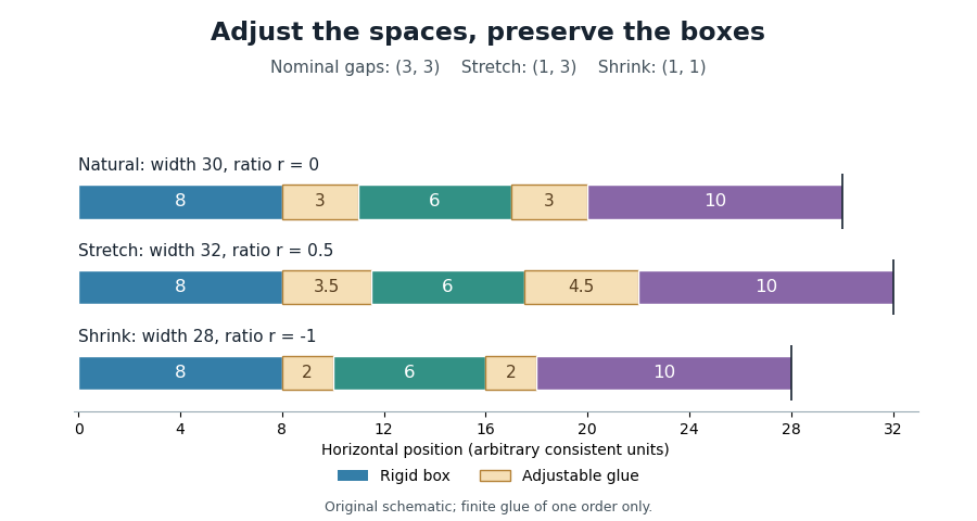
Proportional stretching and shrinking of typesetting glue
. Original finite-glue example: boxes of widths 8,6,10; two gaps with nominal width 3, stretch coefficients 1 and 3, and shrink coefficients 1 each. The generator computes the adjustment ratios and resulting widths. Details.TeX also distinguishes typesetting glue orders, so the finite model above does not describe every glue setting. In a horizontal line, typesetting glue changes gaps rather than stretching the outlines of the glyphs.
A typesetting glue order assigns a priority to stretch or shrink in TeX. The orders are normal finite flexibility,
fil, fill and filll, in increasing priority. With nonnegative coefficients, the highest present order absorbs the adjustment; lower-order flexibility is left unused.[ref]TeX source code by Donald E. Knuth. glue_spec fields and hpack/vpack: highest nonzero order for glue setting
For example, suppose a line has natural width 22 and must reach width 34. Two zero-width glue items have stretch coefficients
1fil and 2fil. Their added widths areA finite-order glue item in the same line keeps its nominal width during this adjustment. The symbols define priorities for distributing a finite width difference. Within the selected order, the coefficients still determine proportional sharing.The simple finite model in typesetting glue uses only the normal order. Higher orders make it possible to place flexible space at selected locations, such as before or after a line's content, without requiring the ordinary word spacing to absorb that particular adjustment.
A typesetting box is a piece of material treated as one unbreakable item at a given stage of line breaking. The simple paragraph model assigns it a width. A word already assembled from glyphs, or a small diagram placed within text, can be represented by such an item.[ref]
Breaking paragraphs into lines by Donald E. Knuth and Michael F. Plass. pp.1123–1125: boxes as rigid-width items
For example, three boxes of widths 8, 6 and 10 separated by two spaces of width 3 occupy . Keeping the boxes fixed while changing only the spaces is the model used by typesetting glue. If hyphenation makes an internal split available, the word must instead be represented with that discretionary break; a single indivisible box would hide the choice.
A box's width describes layout advance, which need not equal the exact ink extent of its glyphs. A more complete TeX box also has height and depth relative to a text baseline. These measurements allow boxes to be combined while maintaining baseline geometry.[ref] The CSS box model uses its own rules for content, padding, borders and margins; interpreting every CSS box as an indivisible paragraph item would lose those distinctions.
Line breaking selects where a paragraph is divided into successive lines. The choice combines the widths of words and spaces with a measure of acceptable layout. A glyph advance supplies part of the underlying geometry, while the chosen breaks determine which content shares a CSS line box in a web layout.
A greedy algorithm can put as much content as possible on each line before proceeding. Greedy line breaking is easy to compute, but an early choice can leave an awkward short line later. Line breaking with squared slack cost gives a small, explicit example. Suppose four word widths are , each internal space has width 1, and the permitted line width is 7, all in arbitrary consistent units. Greedy grouping produces line lengths . An alternative grouping produces . Charging squared unused width on every line except the last givesAn immediately fuller first line can therefore produce a worse paragraph under this particular cost.
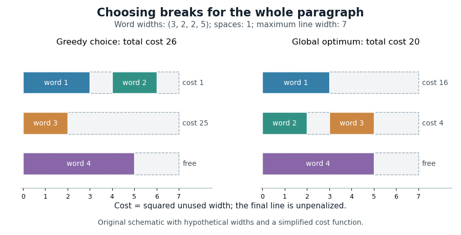
Dynamic programming makes the global choice systematic. Let be the minimum cost for the first words, and let include words through and their internal spaces. For feasible lines, set , except that for the final line. ThenPossible break positions form a directed acyclic graph; a feasible line is an edge, so the same calculation finds a shortest path from the start to the end of the paragraph.
Donald E. Knuth and Michael F. Plass developed a richer paragraph-wide method using boxes, adjustable glue and penalties. Their Knuth-Plass line-breaking algorithm accommodates typographic choices beyond the fixed spaces and squared costs in the illustrative model above.[ref]
Breaking paragraphs into lines by Donald E. Knuth and Michael F. Plass. 1981 paper, summary and introduction; paragraph-wide optimization and dynamic programming
The typesetting line width is the horizontal measure that a layout assigns to a particular line. It supplies a target for text justification and a fitting constraint for line breaking. Write it as when it can depend on line number . The Knuth-Plass line-breaking algorithm permits a sequence of target widths, rather than requiring the entire text paragraph to be rectangular.[ref]
Breaking paragraphs into lines by Donald E. Knuth and Michael F. Plass. pp.1155–1156: line-number dependence and supplied positive line lengths
For example, suppose a text column is 40 units wide and first-line indentation reserves 10 units on its first line. ThenWith a fixed gap of width 2, three typesetting boxes of widths 12, 10 and 8 use units. They exceed the first line's available width, although they fit a later line in the fixed-space model. When typesetting glue can shrink, feasibility must also account for that permitted shrinkage.
Width and line height measure different directions. Changing the font size can alter both the widths of the typesetting boxes and their vertical metrics, so preserving the same column width does not preserve the same breaks.
The natural line width is the width a candidate line occupies before any stretch or shrink of its typesetting glue. In a simple horizontal model with fixed typesetting box widths and nominal glue widths ,Additional fixed positioning adjustments must be included when the model contains them. If a discretionary break inserts a hyphen at the chosen endpoint, its width belongs to that candidate's natural width.
For example, boxes of widths 8, 6 and 10 and two nominal gaps of width 3 give . To reach a typesetting line width , the glue must absorb . A total finite stretch coefficient gives line adjustment ratio . The typesetting glue diagram shows the resulting adjustment.
Computing the natural width first separates the dimensions of the selected material from its later spacing adjustment. This also lets a line breaking algorithm compare several endpoints before committing to a final line. In the fixed-space model, prefix sums make repeated width calculations efficient.
Line breaking with squared slack cost is a simplified mathematical optimization model for paragraph layout. Treat the input as indivisible typesetting boxes with nonnegative widths , keep their order, use fixed word spacing , and require each line to fit a common typesetting line width . This model isolates the choice of breaks from adjustable spacing and hyphenation.
Let be the prefix sum, with . Placing items through on one line usesA line is feasible when . Charge for a nonfinal line and zero for the final line. If are the breaks, the objective isThe free final line is an explicit modelling choice. The convex function makes a doubled slack cost four times as much. For two slacks with fixed total,so greater imbalance increases their sum of squares. Actual break choices can also alter the line count and total slack; the whole paragraph still needs to be optimized.
Apply dynamic programming with andAn endpoint with no feasible predecessor has cost . The same recurrence finds a shortest path through the directed acyclic graph of feasible line choices. The principle of optimality explains the recurrence. Once the final breakpoint of a prefix is chosen, replacing its preceding layout by a cheaper layout with the same endpoint would improve the whole candidate. Conversely, each feasible predecessor and final line produces a valid candidate. Induction over therefore gives the optimum. Prefix states with charge their last line; only the final state gets the paragraph's free-last-line convention.
For widths , spacing 1 and capacity 7, the states areFollowing minimizing predecessors gives line lengths and cost 20. The line breaking diagram compares this with the cost 26 of greedy line breaking. With prefix sums, each candidate length takes constant time; at most candidates give time complexity and space complexity for costs and predecessors. The big O notation describes this fixed-space model; the Knuth-Plass line-breaking algorithm includes additional typography-specific choices.
Greedy line breaking commits each line after filling it with the longest available fitting prefix of the remaining input. In a fixed-width model, the input consists of ordered, indivisible typesetting boxes, a common typesetting line width , and nonnegative fixed word spacing. Assume every individual box fits. The greedy algorithm scans forward, adds the next item if it fits, and otherwise starts a new line. Incrementally maintaining the used width gives time complexity for input boxes.
This rule minimizes the number of lines under these assumptions. To see why, let be the last item covered by the first greedy lines, and the last item covered by the first lines of any feasible alternative. After a layout finishes, take its endpoint to remain for subsequent indices. The first greedy line reaches at least as far as the alternative's first line. Suppose . If the greedy layout has already reached , the next inequality is immediate. Otherwise, removing the alternative's already covered items from its next line leaves a fitting suffix, because widths and gaps are nonnegative. The next greedy line can reach at least that endpoint. By mathematical induction,Thus an alternative cannot finish in fewer lines.
Line count and paragraph appearance are different objectives. With widths , gap 1 and width 7, greedy grouping has lengths . The alternative also uses three lines. The line breaking with squared slack cost model assigns cost 20 to this alternative and 26 to the greedy layout when the final line is free. The line breaking diagram shows the two layouts. Global paragraph costs can justify dynamic programming even when greedy packing already uses the minimum line count.
The fixed-width assumptions matter when applying this result. Hyphenation introduces additional break opportunities, while adjustable typesetting glue changes how a candidate line fits. Those choices belong to richer layout models such as the Knuth-Plass line-breaking algorithm.
The Knuth-Plass line-breaking algorithm chooses paragraph breaks using dynamic programming over a representation of the material as typesetting boxes, typesetting glue and typesetting penalties. Boxes supply unbreakable widths; glue supplies normal spacing together with stretch and shrink allowances; penalties express preferences about permitted breaks and can account for a hyphen added when a break is taken.[ref]
Breaking paragraphs into lines by Donald E. Knuth and Michael F. Plass. pp.1119–1122, summary and formulation
Text justification makes the glue geometry useful. In an illustrative line, suppose box widths total 24 and two glues each have normal width 3 and stretch allowance 2. To fill width 32, the line adjustment ratio isEach glue then becomes , giving . This example demonstrates proportional stretching; it is one ingredient of paragraph optimization.
The dynamic programming state retains information needed to score later choices. In particular, a line-breaking fitness class records a spacing category, allowing an abrupt change between neighbouring lines to affect the cost. Break position alone would discard that relevant history. The original active nodes include line number and fitness class, with the best accumulated demerits stored as their value.[ref]
Breaking paragraphs into lines by Donald E. Knuth and Michael F. Plass. pp.1158–1159, active nodes, line numbers and fitness classes
The line breaking with squared slack cost example isolates break selection with fixed word spacing. Here, adjustable typesetting glue and typesetting penalties participate in the paragraph optimization. Donald E. Knuth and Michael F. Plass's 1981 paper documents the method and its development in the TeX project.[ref]
Breaking paragraphs into lines by Donald E. Knuth and Michael F. Plass. pp.1175–1176, authors' historical account
A typesetting demerit is a contribution to the paragraph cost minimized by the Knuth-Plass line-breaking algorithm. It combines spacing quality with break preferences and, when applicable, costs involving neighbouring lines. Thus typesetting badness is one input to the cost rather than the entire objective.[ref]
TeX source code by Donald E. Knuth. try_break: line_penalty, badness, break penalties and adjacent/hyphen demerits
Consider the ordinary finite-penalty case in TeX, away from its integer saturation and recovery cases. Let be the TeX line penalty, the typesetting badness and the typesetting penalty, with and . The base contribution isCharges for incompatible line-breaking fitness classes or consecutive hyphenated lines can then be added.
For an illustrative choice , and , the base is . Changing only to gives . If an adjacency charge of 100 applies, those become 1025 and 975. These are chosen example parameters, not asserted defaults.
Dynamic programming compares accumulated costs while retaining the dynamic programming state needed by future charges. The lowest-cost break considered alone need not produce the lowest-cost complete text paragraph.
The TeX line penalty, set by
\linepenalty, enters the per-line base used to calculate typesetting demerits. In the ordinary finite calculation, a line with typesetting badness contributes before breakpoint and neighbour-dependent terms, where denotes the chosen line penalty.[ref]TeX source code by Donald E. Knuth. try_break: line_penalty+b is squared before other contributions
The algebra shows how it affects a candidate with lines:Changing therefore changes both the line-count term and the way spacing costs enter the comparison.
For a chosen example, assume two feasible layouts have badness profiles and , with all other costs zero and values below saturation. At ,At ,The preferred candidate changes. These are illustrative profiles and parameter values. Actual line breaking must also account for feasible endpoints, typesetting penalties and possible line-breaking fitness class changes.
Typesetting badness scores the spacing strain needed to fit a line. For ordinary finite stretch or permitted finite shrink, a useful smooth guide iswhere is the line adjustment ratio. Doubling the required ratio multiplies this guide by eight, so it strongly penalizes large adjustments. The convex function on nonnegative ratios rewards more evenly distributed spacing strain.
TeX computes an integer approximation with saturation rather than evaluating that real-valued expression exactly. With stretch coefficient in the routine's internal units, excess widths give ratios and routine outputs . In particular, the first differs from the smooth guide value 12.5.[ref]
TeX source code by Donald E. Knuth. badness(t,s): fixed-point approximation, rounding constants and inf_bad; chosen input values evaluated directly
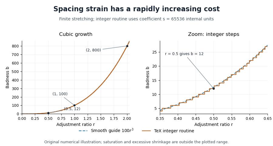
Cubic spacing cost and integer typesetting badness
. Original calculation comparing the smooth guide with TeX's badness routine at chosen finite stretch coefficients. The right panel enlarges the integer steps near r=0.5. All plotted ratios describe stretching. Details.The sentinel 10000 represents saturated badness in the routine. Excessive shrinking is tested separately in paragraph breaking; higher-order stretch has its own treatment. A paragraph's typesetting demerits also include typesetting penalties and possible neighbour-dependent charges, so choosing solely by badness can miss the best layout.
The line adjustment ratio measures the stretch or shrink required to make a candidate line fit. In the finite-glue model, let be its natural line width, its target typesetting line width, and and the total stretch and shrink coefficients of its typesetting glue. DefineIt is a dimensionless quantity: numerator and denominator are widths measured in the same units. Each glue item uses the same , scaled by its own appropriate coefficient.[ref]
Breaking paragraphs into lines by Donald E. Knuth and Michael F. Plass. pp.1125–1127: adjustment ratio and feasible stretching/shrinking
For , and , targets 32 and 28 give and respectively. If a nonzero width difference requires a coefficient total of zero, this model cannot make the adjustment. With ordinary bounded shrinkage, asks the glue to shrink beyond its total allowance and is infeasible. Positive stretch is usually limited by an acceptable-quality threshold rather than by treating as an absolute geometric limit.
The typesetting badness scores spacing quality from the required adjustment, while a line-breaking fitness class records a coarser category for comparison with neighbouring lines. Neither measure alone incorporates every typesetting penalty.
A line-breaking fitness class is a coarse description of how tightly or loosely a line is spaced. The Knuth-Plass line-breaking algorithm distinguishes tight, normal, loose and very loose lines. A transition between sufficiently different classes adds typesetting demerits, even when each line's own spacing is individually acceptable.[ref]
Breaking paragraphs into lines by Donald E. Knuth and Michael F. Plass. p.1155: four fitness classes and penalties for contrasting adjacent lines
For example, imagine one feasible line has line adjustment ratio and the next has . One compresses its spaces substantially, while the other expands them. That contrast can be more conspicuous than two lines with similar spacing. A paragraph objective can express this using an added termwhere indexes the classes. The indicator function adds the charge only for a sufficiently large class change.
Consequently, the dynamic programming state needs the previous fitness information. Suppose two routes to the same break cost 10 and 12, but the cheaper route's class would add a transition charge of 5 to the next line while the other adds none. Their relevant totals become 15 and 12: discarding the second route solely because would be premature. The principle of optimality applies to states that retain the information the future cost needs.
TeX computes its categories using integer typesetting badness thresholds and handles special glue cases explicitly. Its implementation should therefore be consulted for exact boundary behaviour rather than inferring it from rounded decimal adjustment ratios.[ref]
TeX source code by Donald E. Knuth. try_break: fit_class, badness thresholds 12 and 99, and adj_demerits
A typesetting penalty expresses how desirable a candidate break is. In the Knuth-Plass line-breaking algorithm's paragraph representation, a penalty item can also have a width that is included only if that break is taken. This lets the model account for a hyphen introduced by hyphenation without printing it in the unbroken word.[ref]
Breaking paragraphs into lines by Donald E. Knuth and Michael F. Plass. pp.1123–1125: penalty values, widths and flags
For example, suppose the material before an optional break uses 29 units and taking the break introduces a hyphen of width 2. At a typesetting line width of 30, the broken line needs units before any permitted adjustment of typesetting glue. Testing only the pre-hyphen width would wrongly declare it a fit. A finite penalty can discourage a break while still leaving it available when other choices are worse.
In TeX, values prohibit a penalty break and force it. Intermediate positive values discourage and negative values encourage it. These are control conventions of the implementation, not physical lengths.[ref]
TeX source code by Donald E. Knuth. penalty_node definition: inf_penalty and eject_penalty thresholds
The penalty value is an input to the typesetting demerit calculation. It is not the entire paragraph cost: typesetting badness, line-breaking fitness classes and consecutive hyphenated breaks can contribute too. Comparing two penalties alone therefore cannot choose the best text paragraph layout.
A typographic point is a unit used for font size, line height and other typographic distances. In the modern digital convention,Here the inch is 25.4 millimetres. The equation describes the digital convention; historical typographic point systems have not all used that same length. The modern
pt relation also appears among the absolute-length units defined for CSS.[ref]CSS Values and Units Module Level 3 by World Wide Web Consortium. Section5.2: absolute lengths and the pt, in and px equivalences
For example, a font size of 12 typographic points corresponds to a nominal em of one sixth of an inch, approximately 4.2333 millimetres. That sets the outline's scale, rather than the exact ink height of every glyph. A particular x-height or glyph advance can be a different fraction of an em.
The CSS conversion also gives 12 typographic points as 16 CSS pixels. A CSS pixel is a layout unit, so this equality does not promise 16 hardware pixels or a ruler-measured physical height on every screen. Zoom and the mapping to device pixels must be accounted for separately; the device pixel ratio records one part of that mapping.
Text shaping turns a sequence of Unicode text characters into a layout of glyphs from a chosen computer font. The result includes glyph indices, positions and glyph advances. A text character therefore does not determine a visible shape independently of its neighbors, writing system and selected computer font.[ref]
Shaping concepts in the HarfBuzz Manual. Text shaping: Unicode input, font-dependent two-dimensional glyph layout and shaping models
For example, the stored sequence
f followed by i can become a single typographic ligature. Contextual Arabic forms illustrate a different requirement: a letter's neighbors influence the selected glyph. Glyph substitution chooses forms, while glyph positioning places the chosen forms; kerning adjusts their spacing. These operations can preserve the original Unicode text, so copying text should not be implemented by reading glyph indices as if they were code points.[ref]Glyph Substitution Table by Microsoft. Overview: Arabic contextual forms, Latin ligatures and the character/glyph distinction
Text shaping precedes rasterization: first determine what shapes to draw and where; then determine the pixels that represent those shapes at the requested size.
Glyph positioning assigns locations to the glyphs selected during text shaping. It specifies how each glyph is placed and how the logical pen position progresses through the text. A text baseline supplies a common reference for placing the shapes. An OpenType GPOS table can adjust horizontal and vertical placement, glyph advances and attachment between selected glyphs.[ref]
Glyph Positioning Table by Microsoft. Overview, ValueRecords and positioning/attachment lookup types
A simple coordinate model separates the two effects. Let be the pen position, a placement offset and the glyph advance. Draw glyph with its origin atthen update the logical position byChanging moves the current shape; changing moves the starting position of subsequent shapes.
For example, a combining character can select an accent glyph that must be positioned above an earlier base glyph. The accent's placement and its glyph advance answer different questions. Kerning similarly changes spacing according to context, while glyph substitution changes which forms are selected. These choices precede the rasterization of the placed outlines into pixels.
A text baseline is the reference line used to align glyphs in a run of text. It supplies a placement reference rather than the edge of every visible shape. In a horizontal coordinate system with the baseline at , a descender can extend below the line, while an ascender extends above the main body of a lowercase letter. Aligning ink bounding boxes at their bottom edges would therefore fail to align the writing.[ref]
Glyph Metrics in the FreeType documentation. Section 1: baseline, pens and layouts
The reference depends on the writing system and layout. OpenType distinguishes an alphabetic baseline (
romn), a hanging baseline (hang) and a mathematical baseline (math), among others. The last is the reference about which mathematical forms are centred; it need not coincide with the alphabetic baseline. Vertical layout also requires an appropriate baseline convention.[ref]Baseline Tags by Microsoft. Registered baseline tags and their meanings in horizontal and vertical axes
For a simple horizontal run, start the logical pen position at on the chosen text baseline. A glyph advance moves the next pen position to . A vertical placement adjustment can move an accent glyph while leaving that baseline and the subsequent logical positions intact. This distinction lets glyph positioning align the run while placing individual forms precisely.
The line height governs the vertical spacing allocated to a line of text. For a simple repeated run with fixed metrics, it sets the distance from one text baseline to the next. The gap between visible ink is a separate quantity, because different glyphs need not fill their allocated vertical region.
In an elementary single-font model, let be the positive font ascent, the positive magnitude of the font descent, and an added font line gap. ThenFor hypothetical metrics , and font units, font units. With 1000 font units per em and 20 pixels per em, the text baselines are 24 pixels apart. The line height can thus exceed the nominal font size.
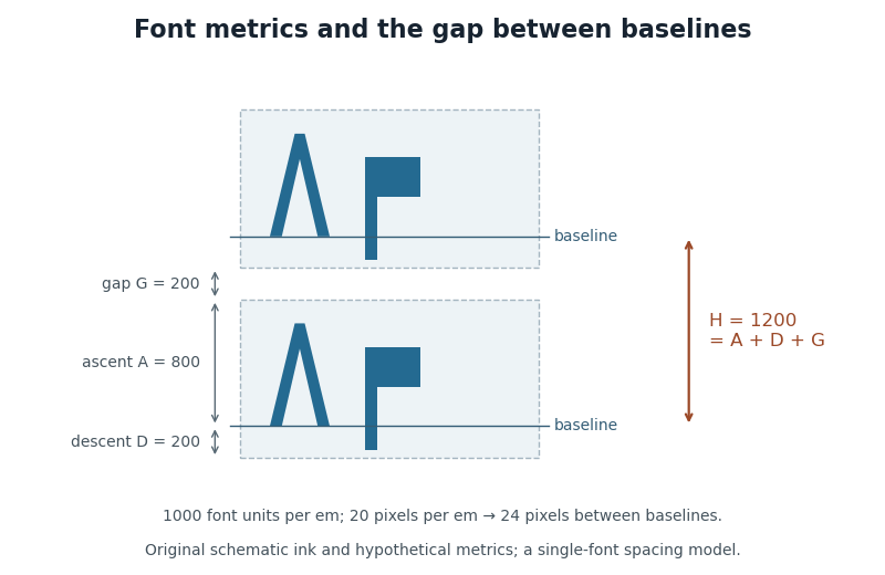
CSS lays out inline content through line boxes. Its
line-height participates in that calculation, and a block's declared value sets a minimum rather than guaranteeing that every mixed-content line has exactly that height. A taller inline object or a different alignment can enlarge a line box. The specification also describes how extra typographic leading is split above and below the chosen font metrics.[ref]Visual formatting model details in CSS 2.2 by W3C. Sections10.8–10.8.1: line-box construction, leading and the block-container minimum
The useful distinction is between the nominal font size, the font ascent and font descent used for layout, and the actual ink bounding boxes. They answer different geometric questions even when they are expressed in the same units.
A CSS line box is the rectangular region containing the inline content of one line in a CSS inline formatting context. The browser fits successive inline content into lines, using line breaking when necessary, then uses CSS vertical alignment to determine each line's extent. A CSS inline box supplies one contribution to this enclosing region.[ref]
For ordinary baseline-aligned text, the CSS leading calculation supplies each contribution's height above and depth below the text baseline. Include the CSS strut among those contributions. Enclosing them requiresFor example, extents and CSS pixels produce a line of CSS pixels, although the individual extents sum to 14 and 20. The largest upper extent and largest lower extent can come from different contributions. The CSS leading diagram illustrates the same geometry with another pair of hypothetical metrics.
A CSS replaced element, such as an inline image, contributes according to its CSS margin box; it need not follow the text's line height. Other settings of CSS vertical alignment require additional positioning rules. These effects explain why a line's final height can exceed the
line-height declared on its surrounding CSS block container.[ref]Visual formatting model details in CSS 2.2 by W3C. §10.8, sizing and vertical alignment of inline-level boxes
A CSS strut is the imaginary zero-width CSS inline box used to represent a CSS block container's own font and line height when a CSS line box is constructed. It supplies minimum extents on both sides of the text baseline, even when the actual text uses smaller metrics.[ref]
Visual formatting model details in CSS 2.2 by W3C. §10.8.1, imaginary strut and block-container line-height
Suppose the container has font ascent , font descent magnitude and line height CSS pixels. Its CSS leading is , so the strut contributes 14 above and 6 below the text baseline. A small text contribution with extents 7.5 above and 2.5 below still produces a line 20 CSS pixels high because the strut dominates both directions.
The minimum is geometric rather than merely a comparison of total heights. If another contribution extends 18 above and 2 below the same text baseline, the enclosing CSS line box becomes CSS pixels. Both the strut and the other contribution individually total 20. Keeping the separate upper and lower extents explains the extra height.
This construction concerns a CSS line box that participates in layout. CSS also specifies conditions under which empty line boxes are treated as nonexistent, so
line-height:20px alone does not make every otherwise empty block 20 CSS pixels high.[ref]A CSS inline box is the box generated by an inline CSS non-replaced element, such as a text element styled with
display:inline. It participates in a CSS inline formatting context. When line breaking splits its content, fragments can occur on several CSS line boxes.[ref]For vertical line layout, its
line-height and the CSS leading calculation determine its allocated extent. A child can contribute a taller box to the same CSS line box without changing the parent's own allocated height. For example, take a parent with line height 14 CSS pixels and baseline extents 10 above and 4 below. A child with line height 24 and extents 17 above and 7 below enlarges the enclosing line to 24 CSS pixels, assuming the CSS strut adds no greater extent. The parent's 14-CSS pixel allocation and the final 24-CSS pixel line describe different boxes.[ref]Visual formatting model details in CSS 2.2 by W3C. §10.8.1, inline-box height and independent contributions of child boxes
The
height property does not supply a preferred height for a non-replaced CSS inline box; height:40px on such a text element therefore does not replace this line-layout calculation. The properties determining a CSS preferred size have different applicability from line-height.[ref]CSS Box Sizing Module Level 3 by World Wide Web Consortium. §3.1.1, applicability of preferred width and height properties
Typographic leading concerns vertical spacing between lines of type. The term comes from the thin lead spacers used to separate lines of metal type. In current discussion, one must establish whether a quoted value means the complete spacing between text baselines or an additional allowance beyond the chosen font ascent and font descent.[ref]
A Glossary of Typographic Terms by Adobe. Entry leading: line spacing and the historical lead spacers
CSS leading uses the additional-allowance convention. If a single font contributes ascent and descent magnitude , and the chosen line height is , thenThe elementary inline-box construction allocates half of above the ascent and half below the descent. These quantities are font-wide metrics, rather than the actual ink bounding box of each glyph.[ref]
For hypothetical metrics , and CSS pixels, the extra leading is 4 CSS pixels, with 2 on each side. If the same metrics use , then : the allocated line region is smaller than the metric extent. Negative CSS leading is allowed, so visible ink can extend outside its line allocation. A line height value must consequently be interpreted together with the font and the layout convention.
CSS leading is the extra allowance around the font ascent and font descent when CSS constructs the vertical extent associated with a glyph. Let be the positive ascent, the positive descent magnitude and the selected line height, all at the same font size and in the same units. The extra leading and the resulting extents above and below the text baseline areThe half-leading is a layout allocation. It need not be a visible blank strip, and may be negative.[ref]
This explains a subtle effect of mixing fonts. In a simple baseline-aligned line containing only ordinary text CSS inline boxes, include the block's CSS strut among the contributions indexed by . The CSS line box must extend far enough in each direction, givingThe two maxima can come from different contributions. Suppose one has CSS pixels, giving , while another has , giving . If the CSS strut adds no larger extent, the resulting CSS line box is CSS pixels high, exceeding both declared line heights. The assumption of a common text baseline matters: other vertical alignments and inline objects require the fuller layout rules.[ref]
Visual formatting model details in CSS 2.2 by W3C. §10.8, uppermost and lowermost box edges; §10.8.1, block-container strut
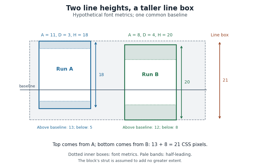
Thus a stored font line gap, an individual line height declaration and the final CSS line box height are distinct quantities. Comparing only nominal font sizes cannot explain the mixed-font result.
A font line gap is a font-wide metric giving an additional spacing allowance to combine with font ascent and font descent. For an elementary default line-spacing calculation using signed descent ,where is the ascent and the font line gap. OpenType's
sTypoLineGap is intended to be used with the matching sTypoAscender and sTypoDescender fields.[ref]OS/2 and Windows Metrics Table by Microsoft. sTypoLineGap and its relationship to the other typographic metrics
Suppose the chosen metrics are , and font units. The default spacing is 1100 font units. With 1000 font units per em at 18 pixels per em, that is 19.8 pixels between text baselines.
The stored font line gap provides an input to a spacing decision. An application can instead request a different line height, and CSS leading is then calculated from that requested height and the selected metrics. Nor does the font line gap measure the visible blank strip between every pair of lines: the ink bounding boxes vary with the particular glyphs. The line height diagram shows this distinction with schematic ink inside larger font-wide metric regions.
In glyph positioning, the pen position is the logical point from which the next glyph is placed. The word pen describes a layout convention: the renderer can draw an outline or a collection of pixels rather than trace a physical pen stroke. Simple horizontal layout places this reference point on the text baseline.[ref]
Glyph Metrics in the FreeType documentation. Section 1: the baseline and logical origin; section 3: advances
Let be the current pen position, a placement offset and the resolved glyph advance. The current glyph's drawing origin and the next logical point are, respectively,For example, in one horizontal coordinate system, , and draw at but leave the next logical point at . Moving the current shape and changing the progression of the run are separate operations.
A glyph's bounding box is therefore not a substitute for its pen position. A left side bearing can leave space between the logical origin and the ink, and a right side bearing records how the ink ends relative to the default advance. Kerning or attachment of a combining character can modify the placement or progression without changing the stored outline.
A glyph advance is the displacement of the logical pen position after a glyph is processed. In horizontal layout its main component is often called the advance width. The OpenType horizontal-metrics table records an
advanceWidth in font units, together with a left side bearing.[ref]Horizontal Metrics Table by Microsoft. Horizontal metrics, hMetrics records and advanceWidth
The advance need not equal the width of the visible glyph's bounding box. A spacing text character can select a glyph with a positive advance and no visible outline. Conversely, a drawn shape can extend beyond its nominal advance, or a positioned accent can have a zero advance. The geometry of the ink and the progression of the logical pen therefore require separate data. In a simple horizontal metric, the advance is the left side bearing plus the ink width plus the right side bearing; overhangs can make a bearing negative.
For a hypothetical pair with advances 600 and 600 font units, a pair adjustment of minus 80 gives a total advance of 1120 font units. The second origin moves 80 font units left of its unadjusted position. No glyph outline needs to change for this kerning operation. The final layout can therefore have different advances from the default values stored for isolated glyphs.
Kerning adjusts spacing for particular combinations of glyphs. For example, the open region beneath an overhanging “T” can allow a following round glyph to be placed closer than a uniform spacing rule would suggest. The OpenType
kern feature provides context-dependent adjustments for horizontal layout; the separate vkrn feature addresses vertical layout.[ref]Kerning in the OpenType Registered Features by Microsoft. Feature kern: function, To example and relation to vkrn
In a simplified horizontal pair model with default glyph advances and adjustment , the total advance is . A negative reduces the gap for that pair, while a positive increases it. The numerical value depends on the computer font, its scale and the applicable layout rules; a particular letter pair does not have one universal adjustment.
Kerning is one application of glyph positioning. It can preserve the same glyph indices while changing their arrangement. A typographic ligature instead selects a combined form through glyph substitution. Selecting an appropriate form and placing it well are complementary parts of text shaping.
A typeface is a coordinated visual design for written forms. It can include related regular, bold and italic styles; a computer font supplies digital data implementing a particular selection or instance of that design. Thus choosing a typeface and choosing the file format used to store its glyphs are different decisions.
For a hypothetical family “Example Sans”, regular and bold styles can share a typographic family name while having different subfamily names. OpenType records this distinction in its naming table: name IDs 16 and 17 identify the typographic family and subfamily. Older family-name fields can group styles differently for application compatibility, so a filename alone is not a reliable account of the intended family.[ref]
Naming Table by Microsoft. Name IDs 1, 2, 16 and 17; extended typographic families and legacy four-style groupings
A text character is an abstract unit of written information, distinguished from its visible glyph and from the bytes used to store it. A Unicode code point identifies an encoded character; UTF-8 specifies a byte representation. Neither counting bytes nor counting code points always counts what a reader perceives as individual characters.[ref]
For example, an accented letter can be represented by a base letter followed by a combining accent. The sequence can be treated as one grapheme cluster, while a computer font and text shaping determine its displayed form. Conversely, the two text characters “f” and “i” can remain distinct in stored text while appearing as one typographic ligature. This is why a text editor's cursor movement, a byte offset and a glyph index answer different questions.
A combining character is an encoded text character intended to combine with another character in its written presentation. A familiar case is
U+0301 COMBINING ACUTE ACCENT: the sequence e followed by that code point represents an accented letter without requiring a separate precomposed code point for the whole letter.[ref]Characters and Combining Marks by the Unicode Consortium. Which character should I use for a given diacritical mark?
The same acute-accent code point can mark a distinct letter, stress or tone in different languages. Those functions do not require a different encoding of the accent in every language. Text shaping determines how the selected glyph is attached to the base shape, and glyph positioning can place additional marks relative to earlier marks.
A combining sequence and a grapheme cluster are related but distinct notions. The default segmentation rules determine which code points an editor treats as one unit. Unicode normalization addresses equivalence between encodings, such as a precomposed accented letter and a base-plus-accent sequence; it does not perform the geometric placement of their glyphs.
A grapheme cluster is a sequence of Unicode code points treated as a unit by a text-segmentation rule. Default extended grapheme clusters approximate user-perceived characters, supporting operations such as moving a text cursor or deleting a visible unit. They are not a universal linguistic definition of a text character; boundaries can require language-specific tailoring.[ref]
Unicode Text Segmentation by the Unicode Consortium. Sections1,3 and3.1.1: purpose, extended clusters and default boundary rules
For example,
e followed by the combining character U+0301 COMBINING ACUTE ACCENT contains two code points, but forms one default extended grapheme cluster. Its UTF-8 representation has three bytes: 65 CC 81 in hexadecimal notation. The precomposed U+00E9 also forms one grapheme cluster, with two UTF-8 bytes, C3 A9. The two representations correspond under the canonical rules of Unicode normalization.[ref]Unicode Normalization Forms by the Unicode Consortium. Sections1.1–1.3: canonical equivalence, decomposition and composition
A glyph count answers another question: text shaping can represent the two text characters
f and i by one typographic ligature even though their default grapheme cluster boundary remains. Byte offsets, code point offsets, grapheme cluster boundaries and glyph indices therefore serve different purposes.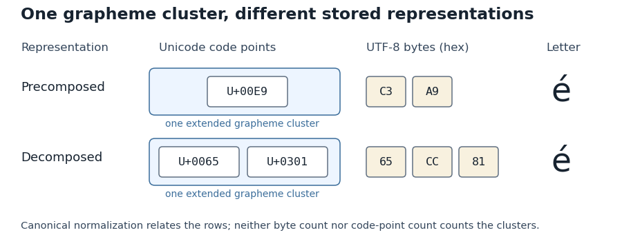
A glyph is a visual form used to display written content. A text character is the encoded abstract item; a glyph is the shape chosen for its presentation. One text character can have several glyphs, such as contextual forms in Arabic, while several text characters can be displayed by one typographic ligature.
For example, the two text characters “f” and “i” may be drawn separately or replaced by an “fi” typographic ligature. The underlying text can remain the same in both cases. A glyph index identifies a form within a particular computer font; it is not a portable Unicode code point.[ref]
The cap height is the reference height of ordinary unaccented capital letters above a text baseline. It describes uppercase letter design, while the x-height concerns the main lowercase body. A font ascent can reserve more space for accents or other tall forms than the cap height alone requires.
OpenType records a nominal cap height in the
sCapHeight field of its OS/2 metrics table, in font units. The metric is an approximation for the uppercase design, so taking the largest ink bounding box among every uppercase glyph need not give the intended value.[ref]OS/2 and Windows Metrics Table by Microsoft. sCapHeight: approximate height of unaccented uppercase letters
For a hypothetical computer font with cap metric 700 and 1000 font units per em, the reference height at 18 pixels per em is 12.6 pixels before grid fitting. An ascent metric of 800 font units would instead reserve 14.4 pixels above the text baseline. These describe different geometric features of the same design.
Aligning a capital heading against an icon can therefore require choosing which reference matters: the text baseline, the nominal cap height, or a measured ink bounding box. Keeping those quantities separate makes the alignment rule reproducible.
The x-height is the height of the main lowercase body of a typeface, conventionally associated with the letter “x”. It excludes the extra extent of ascenders and descenders; the cap height describes a different reference. Small optical overshoots mean that not every lowercase outline without an ascender has exactly the same ink height.[ref]
A Glossary of Typographic Terms by Adobe. Entry x-height: lowercase body, exclusions, variation and small overshoots
Write for the x-height as a fraction of an em. At nominal scale pixels per em, its ideal scaled height is pixels, before grid fitting. Equal font sizes do not force equal , so changing the typeface can alter the apparent lowercase size.
To preserve a target height while switching to a design with ratio , choose . If the original ratio was at scale , this becomesFor a hypothetical switch from at 16 pixels per em to , the matching scale is 20 pixels per em. Both lowercase bodies then have ideal height 8 pixels. This is the geometry behind metric-based font-size adjustment when a fallback font replaces another.[ref]
A descender is the portion of a glyph that extends below the text baseline. Lowercase “p”, “q” and “y” commonly have one; the exact form depends on the typeface. A descender describes the visible shape relative to the writing reference, rather than the distance through which the logical pen position advances.[ref]
A Glossary of Typographic Terms by Adobe. Entry descender
For an original coordinate example, take a text baseline at with positive upward. If a glyph's lowest ink point is font units, its downward extent is 180 font units. At a scale of 20 pixels per em with 1000 font units per em, this becomes 3.6 pixels before grid fitting. The extent is positive even though the lowest coordinate is negative.
The font descent is a related global layout metric, with sign conventions that depend on the format or API. It need not equal the downward extent of each individual descender. Line height and neighbouring ink extents together determine whether forms on successive lines collide; the nominal font size alone does not decide that.
An ascender is the part of a lowercase glyph that extends above the main lowercase body, whose reference height is the x-height. Familiar examples occur in “b”, “d” and “k”. It is a feature of a particular drawn form, rather than a promise that every glyph in the font reaches the same height.[ref]
A Glossary of Typographic Terms by Adobe. Entry ascender
In a hypothetical computer font, put the text baseline at , the x-height at 450 font units and the top of a chosen ascender at 730 font units. That part extends 280 font units above the lowercase reference. With 1000 font units per em and a scale of 20 pixels per em, the corresponding ideal heights above the text baseline are 9 and 14.6 pixels.
This local geometry is distinct from the global font ascent used by a text-layout system. That metric can also accommodate accents or other tall forms. Glyph positioning must preserve the chosen text baseline while allowing these different bounding boxes; simply aligning the tops of all glyphs would change the intended alignment.
Glyph substitution replaces selected glyph indices by other glyph indices while laying out text. In OpenType, the GSUB table specifies these replacements after the default character-to-glyph index mapping. A substitution can replace one glyph by another, several by a typographic ligature, or one by several; its application can depend on surrounding glyphs.[ref]
Glyph Substitution Table by Microsoft. Overview and Lookup Types1–6: input/output glyph indices, ligatures and contextual substitution
For a hypothetical computer font, suppose
f and i initially select indices17 and23. A matching ligature rule could replace the pair by index91. These numbers belong to that particular computer font; they do not change the stored Unicode sequence into code point91. The example also shows why substitution differs from kerning: replacing the pair selects a new shape, whereas adjusting the pair's positions can retain both original shapes.Lookup order matters when one substitution creates or removes the input pattern for a later substitution. Text shaping must therefore interpret the applicable OpenType rules, rather than independently choosing a default glyph for each text character.
A typographic ligature combines two or more written forms into a single glyph. A familiar example is an “fi” shape joining the end of “f” to the following “i”. Its use can improve spacing or avoid a collision between the two shapes.
An OpenType shaping system can first map the separate text characters “f” and “i” to their default glyph indices, then apply a glyph substitution that replaces that pair by one ligature glyph index. The stored text need not be replaced by a special ligature character. Selection and copying can therefore preserve the original two-character sequence even though the display contains one glyph.[ref]
Glyph Substitution Table by Microsoft. Overview, characters versus glyphs; Lookup Type 4, Ligature Substitution Subtable
A typographic ligature also need not be produced merely by moving two glyphs closer together: substitution changes the selected form, whereas positioning changes where selected forms are drawn.
A font supplies a coordinated collection of glyphs for displaying text. A typeface describes the visual design; a computer font is a digital resource implementing a selection of that design and the data needed to use it. The stored data can include glyph shapes, spacing measurements and rules for substituting or positioning glyphs.[ref]
The OpenType Font File by Microsoft. Opening description: glyph data, layout data and naming metadata
The font descent supplies the below-text baseline part of a font's vertical layout metrics. It must be distinguished from the descender of an individual glyph. The coordinate convention also matters: a downward extent can be represented as a negative coordinate in a system whose vertical axis points upward, or as a positive distance in another API.[ref]
Glyph Metrics in the FreeType documentation. Section2: descent sign in FreeType and other font formats
For example, a signed descent font units represents a downward extent font units. With 1000 font units per em and 20 pixels per em, its magnitude scales to 4 pixels. Calling that a negative height would confuse the coordinate with the distance being allocated.
Using a signed descent, an ascent and a font line gap in the same font units givesEquivalently, if is the positive downward extent, the same line height is . This is the elementary typographic spacing model; the rendering system's choice of metrics must still be respected.[ref]
Glyph Metrics in the FreeType documentation. Section2: linespace = ascent - descent + linegap
A computer font can contain several descent-related fields. For example, OpenType's
hhea header stores a typographic descender; an application must not infer the sign and purpose of every other API field merely from the word descent.[ref]Horizontal Header Table by Microsoft. descender and lineGap fields; remarks on platform-specific interpretations
The font ascent is an upward metric measured from a text baseline and used when allocating vertical space for a font. It describes the font's layout metrics as a whole, rather than the visible ascender of one particular glyph. A short letter, a tall letter and an accented form can therefore share the same font ascent while having different ink bounding boxes.[ref]
Suppose a computer font has a chosen font ascent of 800 font units and 1000 font units per em. At 20 pixels per em, the scaled upward metric is 16 pixels. This calculation allocates a reference extent; it does not assert that the letters being drawn actually reach 16 pixels above the text baseline.
The field used must be stated. OpenType provides
ascender in hhea and sTypoAscender in OS/2, while some older layout paths use other metrics. The sTypoAscender, sTypoDescender and sTypoLineGap fields are intended to work together for typographic line spacing. Their ascent-minus-descent need not equal unitsPerEm.[ref]OS/2 and Windows Metrics Table by Microsoft. sTypoAscender: default line spacing, legacy differences and independence from unitsPerEm
Combining a font ascent with the corresponding font descent and font line gap gives a consistent basis for choosing line height. Mixing fields chosen under different conventions can instead change the spacing even when the nominal font size is unchanged.
The font size sets the nominal scale at which a font is used. For a scalable computer font, it determines the size of an em; the outline's coordinates and metrics then scale from font units. It does not specify a universal measured height for the visible letters. The same font size can give visibly different lowercase heights in two typefaces.[ref]
CSS Fonts Module Level 4 by W3C. Section2.5: definition of font-size and the note about EM boxes and apparent size
For a concrete geometric example, suppose two computer fonts have x-heights equal to 0.45 and 0.60 of an em. At a nominal 16 pixels per em, the ideal scaled heights are 7.2 and 9.6 pixels, respectively. Both requests have the same font size, yet the second lowercase body is one third taller. These are hypothetical metrics, before grid fitting.
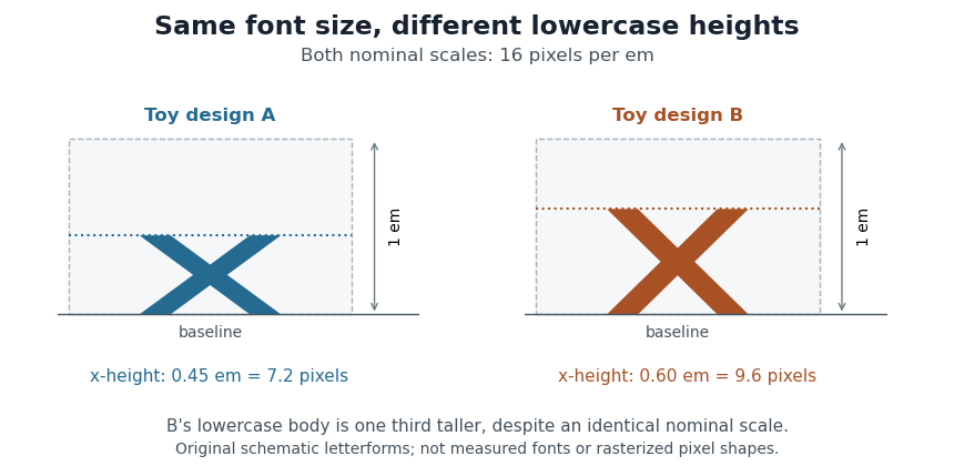
Equal font sizes can produce different x-heights
. Original toy letterforms with x-heights of 0.45 and 0.60 em at a nominal scale of 16 pixels per em. The ideal heights are 7.2 and 9.6 pixels; these are schematic shapes rather than measured computer fonts or a demonstration of rasterization. Details.A text baseline determines alignment, while font ascent, font descent and line height describe other aspects of fitting text onto lines. Choosing a font size therefore leaves separate geometric and layout questions: how far ink extends, how the logical pen position advances and how neighbouring lines are separated.
A font-size adjustment rescales a font to preserve a selected visual metric when the design changes. Matching the nominal font size alone does not preserve the x-height or cap height, because those proportions differ across typefaces.
The x-height calculation gives a direct rule. If a requested scale and desired lowercase ratio should be matched by a fallback design with ratio , useFor example, matching at 20 pixels per em with a fallback ratio requires 22 pixels per em. Both designs then have ideal lowercase body height 11 pixels. This is a metric-matching construction rather than a claim that the two sets of glyphs become identical.
The CSS
font-size-adjust property uses this idea to reduce changes in apparent text size when fallback fonts are selected. Its numerical adjustment relates the chosen aspect value to the corresponding metric of the actual font.[ref]Changing scale also changes glyph advances, left side bearings and other distances. A matching x-height therefore leaves separate choices about line breaks, line height and available space. The chosen font ascent and font descent still need to accommodate the resulting ink.
An em is a nominal typographic length set by the current font size. At a font size of typographic points, one em is typographic points long.[ref] A scalable computer font describes its geometry relative to this scale. In OpenType,
unitsPerEm specifies how many font units make one em.[ref]Font Header Table by Microsoft. head table, unitsPerEm
Suppose one em contains 2048 font units. A design length of 1024 font units is half an em. At a font size of 12 typographic points, that length is 6 typographic points; at 18 typographic points, it is 9 typographic points. The stored coordinate has not changed; the scale has.
The word em does not require the glyph for “M” to be exactly one em wide. Nor is an em the measured ink height of every glyph: a shape can occupy only part of the nominal square or extend beyond it.[ref]
CSS Fonts Module Level 4 by W3C. Section2.5, note about arbitrary glyph ink bounds relative to the EM box
Glyph advances, left side bearings and right side bearings must consequently be read from the computer font's metrics rather than inferred from the em alone.A computer font stores data used to display text: glyph descriptions, spacing measurements, and mappings from text characters to glyphs. An OpenType computer font organizes these into separate tables. Its
cmap table maps encoded text characters to default glyph indices; other tables can specify subsequent substitutions and positioning.The separation permits several representations of a glyph. An outline font stores scalable boundaries, whereas a computer font can also contain images already sampled into pixels. The rendering system uses the selected representation and placement data to produce the visible text. A file containing glyph outlines therefore supplies more than a list of Unicode numbers.[ref]
The OpenType Font File by Microsoft. Opening description; required tables, TrueType outlines and tables related to bitmap glyphs
A font metric is a numerical measurement used to position text from a computer font. Measurements include glyph advances, glyph bearings, bounding boxes and face-level quantities such as font ascent, font descent and font line gap. These describe both logical movement and the geometry of the visible shapes.[ref]
For a horizontal example, put the pen position at , let a glyph have advance 12, and let its ink extend from to . Its ink width is , while the next pen position is . The negative left glyph bearing describes an overhang; it does not imply a negative glyph advance.
A separate example illustrates vertical conventions. With font ascent , signed descent and font line gap , the metric-based baseline separation isSome font formats store the descent magnitude with the opposite sign, so the convention must be checked before using the formula.[ref]
Glyph Metrics in the FreeType documentation. §2: ascent, signed descent and linespace formula
These measurements inform layout before rasterization determines the actual pixels.A glyph bearing is a signed offset locating a glyph's ink relative to the reference used for layout. In a simple horizontal metric, the left side bearing measures the offset from the pen position to the left ink edge, and the right side bearing measures the remaining distance from the right ink edge to the advance endpoint.[ref]
Glyph Metrics in the FreeType documentation. §3: bearings and advances
Put the origin at , the glyph advance at , and the ink edges at . ThenFor , and , the bearings are and 3, while the ink width is 11. The negative left bearing records an overhang across the origin. The next nominal pen position remains at .
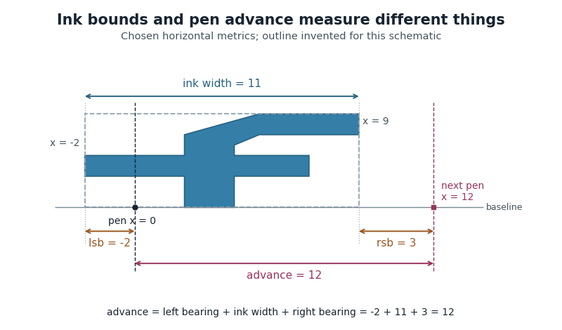
Ink bounds, side bearings and glyph advance
. Original horizontal schematic with an invented outline: left ink edge -2, right ink edge 9, advance 12. The plotted shape is not copied from a font. Horizontal measurements are in consistent arbitrary units. Details.These are measurements of a default horizontal arrangement. Subsequent glyph positioning and kerning can change the rendered relationship between neighbouring glyphs. The reference point and axes must also be checked when applying bearing conventions to vertical layout.
In a simple unpositioned horizontal layout, the left side bearing is the signed distance from a glyph's pen position to the left edge of its ink bounding box. Put the logical origin at and call the left ink edge . Then . A positive value leaves space before the ink; a negative value means that the ink overhangs the origin.[ref]
Glyph Metrics in the FreeType documentation. Section 3: bearings and advances
For example, a glyph whose ink occupies and whose glyph advance is 600 font units has left side bearing 40, ink width 500 and right side bearing 60. These are default metrics; subsequent glyph positioning can change the rendered arrangement.
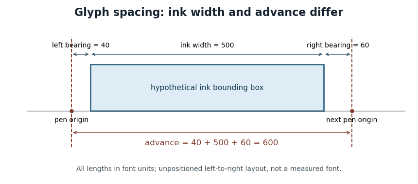
OpenType's horizontal-metrics table supplies the left side bearing and glyph advance. One must not assume that every outline's stored
xMin is already the left side bearing: the outline's own coordinate origin and the metrics' logical origin need not coincide in every supported format.[ref]Horizontal Metrics Table by Microsoft. Opening discussion of hmtx, glyf, head flags and the derivation of side bearings
The right side bearing measures the signed gap from the right edge of a glyph's ink bounding box to the point specified by its default horizontal glyph advance. If the origin is , the advance is , and the ink edges are , thenThus the advance splits into a left side bearing, an ink width and a right side bearing. OpenType uses this relation to derive the right side bearing from the horizontal metrics and outline bounds.[ref]
Horizontal Metrics Table by Microsoft. Deriving rsb from aw, lsb, xMin and xMax
For the hypothetical ink interval and advance 600 font units, the right side bearing is 60 font units. If a different glyph extends to with the same advance 600, its right side bearing is font units: ink crosses the next nominal origin. A negative bearing is therefore meaningful rather than an invalid width.
These are metrics of an individual default glyph. Kerning and other glyph positioning rules can change the actual gap between adjacent shapes, so the right side bearing alone does not determine the visual spacing of a whole run.
A font unit measures distances in a computer font's design coordinates. If one em contains font units, a coordinate difference represents of an em. OpenType stores in the
unitsPerEm field of its font-header table; its permitted range is 16–16384.[ref]Font Header Table by Microsoft. head table, unitsPerEm
The design coordinate is independent of a particular screen. Before grid fitting, an unrotated uniform scale with pixels per em sends a horizontal length toFor example, and send a length of 512 font units to 3 pixels. Doubling the requested font size doubles that ideal geometric length without changing the stored outline.
A font unit is consequently not itself a pixel. Grid fitting can further change a scaled outline or its glyph advance to suit the pixel grid. Nor does the height of every visible glyph equal one em: the em fixes a scale, while individual glyphs have their own bounding boxes.
Pixels per em specifies the raster scale of one em. If font units make an em and the requested scale is pixels per em, a design length becomes pixels before grid fitting. The value measures the nominal typographic scale rather than the ink height of an individual glyph.[ref]
For output with a stated physical raster resolution of pixels per inch, a font size of digital typographic points givesThe factor 72 comes from the digital typographic point convention. For example, and give 24 pixels per em; a hypothetical glyph advance of 0.6 em then scales to 14.4 pixels. Doubling doubles the pixel count while preserving the requested physical length.
Horizontal and vertical pixel density can differ, in which case the two directions have distinct pixels per em. An application can also impose its own screen-to-physical-unit mapping. One must state which scale is being used rather than infer the physical size from a pixel count alone. Rasterization and grid fitting then determine how the scaled geometry becomes a visible image.
TrueType is a computer font technology whose glyph outlines use quadratic Bézier curves and straight segments. The stored coordinates describe a scalable design in font units. Rendering scales that geometry to the requested size and applies rasterization to obtain pixels.
At small display sizes, geometrically accurate scaling can place important strokes between pixels. Font hinting supplies instructions that adjust the scaled outline relative to the output grid, helping preserve recognizable strokes and spacing. A small capital letter can therefore require more than shrinking a large image: the useful result depends on the relation between its geometry and the pixel grid.[ref]
TrueType Fundamentals by Microsoft. Outlines; Font units and scaling; Instructing outlines; Scan conversion
TrueType outlines can be stored in an OpenType computer font. The outline technology and the larger table-based file format describe different layers of the same rendering system.
OpenType is a table-based computer font format separating glyph representations, character mapping, measurements, naming metadata and optional layout rules. Its
cmap table selects default glyph indices for encoded text characters; substitution and positioning tables support more elaborate text shaping.An OpenType computer font can contain TrueType outlines or Compact Font Format outlines, and the specification also provides for bitmap and other glyph representations. The file format therefore does not prescribe a single kind of outline geometry. Extensions such as
.ttf and .otf are useful conventions, but the actual table contents determine the available representation.[ref]This organization lets one system answer separate questions: which glyph represents this text, how much space should it occupy, and how should it be drawn at this size? A language's contextual forms can change the first answer without changing the original Unicode text.
An OpenType MATH table stores font-specific information for mathematical typesetting. Its major components supply mathematical font constants, per-glyph placement information, and data for mathematical glyph variants or mathematical glyph assemblies.[ref]
MATH - The Mathematical Typesetting Table by Microsoft. MATH header: MathConstants, MathGlyphInfo and MathVariants
For example, a tall typeset fraction can require larger surrounding mathematical delimiters. The font may offer several ready-made parentheses and parts for assembling still taller ones. An implementation can use those data together with the expression's measured dimensions. Merely scaling one outline uniformly could change its stroke weight along with its height; the supplied variants and parts give the font designer more control over the result.
The same general division of labour applies to subscripts and superscripts: a font supplies relevant dimensions and placement information, while the layout process combines them with the actual expression. The table is a data interface used by layout algorithms. It does not uniquely prescribe the complete appearance of every formula.[ref]
MATH - The Mathematical Typesetting Table by Microsoft. Overview; MathVariants and GlyphAssembly
A mathematical font constant is a font-specific parameter used in mathematical typesetting. The
MathConstants portion of an OpenType MATH table supplies distances, percentages and other parameters, including the Math axis offset and script scaling.[ref]MATH - The Mathematical Typesetting Table by Microsoft. MathConstants table; MathValueRecord
For an invented distance example, suppose a computer font uses 1000 font units per em and specifies
fractionRuleThickness as 40 font units. At 25 pixels per em, the ideal typeset fraction bar thickness isAt 50 pixels per em, the same stored value gives 2 pixels before rasterization adjustments. A percentage value such as 80, however, is a ratio and must not be converted as though it meant 80 font units.Keeping the units explicit prevents plausible-looking scale errors. Suggested values in the specification guide font design; they are not universal dimensions shared by every computer font.
A mathematical glyph assembly constructs an extended mathematical shape from positioned glyph parts. An OpenType MATH table records each part's full advance and glyph connectors; extender parts may repeat, with overlaps joining neighbouring pieces.[ref]
MATH - The Mathematical Typesetting Table by Microsoft. GlyphAssembly table; GlyphPart records and minConnectorOverlap
For an invented vertical assembly, take bottom, middle and top parts with advances 500, 400 and 500 font units. Give each joining connector length 150 and require at least 80 font units of overlap. Choosing overlaps of 100 is then allowed. Starting at zero puts the parts at offsets 0, 400 and 700, giving total extentRepeating the middle part once, with another 100-unit overlap, adds and gives extent 1500. These are construction measurements along the growth direction, not a claim about a particular font's ink bounds. Positioning the assembled shape relative to the text baseline remains a separate layout choice.
A glyph connector is the end portion of a glyph part intended to overlap a neighbouring part in a mathematical glyph assembly. An OpenType MATH table gives start and end connector lengths along the extension direction: left/right for a horizontal assembly and bottom/top for a vertical one.[ref]
MATH - The Mathematical Typesetting Table by Microsoft. GlyphAssembly; GlyphPart startConnectorLength and endConnectorLength
Let adjacent parts have full advances , joining connector lengths , and minimum overlap . An allowed overlap must satisfyThe bounds come from the available connector material and
minConnectorOverlap.[ref]MATH - The Mathematical Typesetting Table by Microsoft. MathVariants minConnectorOverlap; GlyphAssembly overlap constraints
For invented dimensions in font units, choose , , , and . Then , giving . A target extent 1030 requires overlap 70 and is feasible. A target extent 1000 requires overlap 100, exceeding the second connector's length, so this pair cannot produce it.
These are construction advances, rather than measured ink bounds. Connector data permit controlled changes of extent while other geometry keeps the parts aligned. The mathematical glyph assembly still needs placement relative to the text baseline.
A mathematical glyph variant is an alternative ready-made glyph supplied for a mathematical shape at a different extent. In an OpenType MATH table, each
MathGlyphVariantRecord pairs a glyph index with its advanceMeasurement along the extension direction.[ref]MATH - The Mathematical Typesetting Table by Microsoft. MathVariants, MathGlyphConstruction and MathGlyphVariantRecord
Consider an invented set of vertical variants with construction measurements 900, 1300 and 1800 font units. A selection policy seeking the smallest variant at least 1200 units tall chooses 1300; a target of 1700 chooses 1800. A target of 2000 exceeds the set and may need a mathematical glyph assembly if the font supplies suitable parts.
This discrete choice is useful for growing mathematical delimiters around tall expressions. The numbers are an explanatory selection example, not measurements of an installed computer font. A separately drawn taller glyph can change proportions without requiring every stroke to undergo the same uniform enlargement.
A glyph index is a numerical identifier for a glyph inside a particular computer font. It identifies an entry in that font's own glyph collection, rather than a Unicode code point. In an OpenType computer font, the
cmap table maps character codes to default glyph indices; unavailable characters map to index zero, whose special .notdef glyph indicates missing coverage.[ref]Character to Glyph Index Mapping Table by Microsoft. Table overview: default glyph mapping and the required missing-character glyph at index zero
For a hypothetical example, one computer font might map
U+0041 to index 37 while another maps the same character A to index 9. Both can display the correct letter. Carrying index 37 from the first computer font into the second can select an unrelated form. A later glyph substitution can also change the selected glyph index while leaving the underlying text characters unchanged. This distinction matters in rendering caches and when exchanging shaped text between systems.An outline font stores glyph shapes as geometric boundaries that can be scaled before drawing. Bézier curves provide editable segments of these boundaries. TrueType outlines use quadratic Bézier curves; Type 2 charstrings used in Compact Font Format outlines use cubic Bézier curves. [ref]
https://learn.microsoft.com/en-us/typography/opentype/spec/ttch01. OpenType specification, TrueType fundamentals: outlines
[ref]https://adobe-type-tools.github.io/font-tech-notes/pdfs/5177.Type2.pdf. Adobe, The Type 2 Charstring Format, section 4.1
Scaling the boundary and choosing output pixels are separate operations. The rasterization step turns the scaled glyph geometry into a displayed image, so the same outline font can serve different output sizes without storing a separate image for every size.
Font hinting guides the adjustment of a scaled outline font to the target pixel grid before rasterization. In TrueType, instructions can control how outline points move at a particular size and resolution. Grid fitting can preserve important strokes when faithful geometric scaling would leave them awkwardly positioned between pixels.[ref]
TrueType Fundamentals by Microsoft. From Font File to Paper; Instructing Outlines: scaling, grid fitting and scan conversion
For an idealized example, two equal-width vertical strokes can overlap different fractions of neighboring pixels after scaling. Their rasterized darkness can then differ despite equal geometric widths. Coordinating the adjusted stroke positions and widths can make their displayed weights more consistent. The target depends on the requested size: a correction suitable for a small glyph need not be appropriate when many more pixels resolve its outline.
Font hinting changes the geometry used for rendering, rather than the underlying Unicode text or its grapheme clusters. Glyph substitution, glyph positioning and font hinting solve different parts of the path from encoded text to a visible image.
Grid fitting adjusts scaled glyph geometry relative to a target pixel grid before rasterization. TrueType font hinting can move outline points to preserve important strokes and alignment at small sizes. The result depends on the requested resolution and transformation.[ref]
TrueType Fundamentals by Microsoft. From Font File to Paper; instructions and grid-fitting distortions
A simple area-coverage antialiasing model shows the problem. A vertical stroke from horizontal coordinate 0.4 to 1.6 covers 60 percent of each of two neighboring pixel columns. An equal-width stroke from 3.9 to 5.1 covers 10 percent, 100 percent and 10 percent of three columns. Both geometries have width 1.2 pixels, yet their darkest columns differ. Snapping their boundaries to give each stroke one full column changes the outlines but gives consistent displayed stroke weights.
This is a tradeoff between geometric fidelity and small-size legibility, rather than a change to the stored Unicode text. Grid fitting operates on the geometry supplied to the rasterization step; glyph substitution and glyph positioning address the forms and layout that precede it.
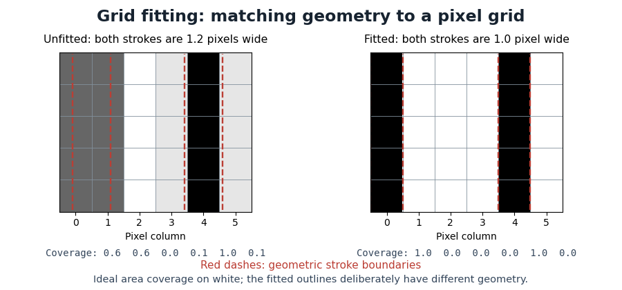
Pixel coverage before and after grid fitting
. Original ideal area-coverage antialiasing model of rectangular strokes, not measurements of a particular computer font. The unfitted strokes both have width 1.2 pixels, but their placements give different column coverage. The fitted strokes each occupy one full column; their changed geometry is explicit. Red dashed lines mark the geometric stroke boundaries. Details.