Topics (203k) Articles (205k) Users (303) Discussions (237) Comments (383) Files (715) New article

Erin is a shade of green that is often associated with the color of emeralds and the lush landscapes of Ireland, also known as the Emerald Isle. It typically has a vibrant yet soft quality, evoking feelings of nature and tranquility. Though not a standardized color in most palettes, Erin can be described as a mid to dark green, reminiscent of fresh foliage. In design and fashion, Erin is often used to signify themes of Irish heritage or to evoke a natural, organic aesthetic.
As of my last update in October 2023, "Ekta Space" is a platform that focuses on providing services and solutions related to the concept of decentralized virtual worlds and the metaverse. It aims to create an immersive digital environment where users can interact, create, and engage in various activities, often utilizing technologies like blockchain and decentralized protocols to offer users ownership and control over their digital assets and experiences.
Ecru is a color that is often described as a light beige or grayish-tan. It is a neutral shade that resembles the natural color of unbleached linen or the shade of certain types of kraft paper. The name "ecru" is derived from the French word for "raw" or "unbleached" and is commonly used in fashion, interior design, and art to denote a soft, subdued tone that pairs well with a variety of colors.
EciRGB, or Ecological RGB, is a color space designed for digital imaging and multimedia applications that prioritize ecological and sustainable practices. It was developed to provide a more accurate representation of colors for use in the print and digital industries, specifically with the needs of various devices and media in mind. The EciRGB color space is based on the RGB color model but includes a wider gamut and is optimized for high-quality color reproduction.
The Descriptive Color Names Dictionary is a resource that provides names for colors based on descriptive terms rather than standard color codes or technical specifications. These names are often more relatable and memorable, making them useful for a variety of applications such as art, design, fashion, and marketing. In such a dictionary, colors may be described using a combination of familiar terms that relate to nature, emotions, or objects (e.g., "sky blue," "rose red," "forest green").
Dark purple is a deep, rich shade of the color purple. It typically combines blue and red hues but with a greater emphasis on blue, which gives it a darker and more muted appearance compared to lighter shades of purple. Dark purple can evoke feelings of luxury, mystery, and sophistication. It is often used in design, fashion, and art to create a dramatic or elegant effect.
Cyclamen refers to a shade of pink that is often described as a vibrant, bright magenta or fuchsia. The color is named after the cyclamen flower, which typically blooms in this striking hue. Cyclamen can vary in tone but is generally associated with a lively, cheerful aesthetic. In design and fashion, it's used to evoke feelings of warmth, energy, and playfulness. The color is sometimes used in palettes to complement other bright or pastel shades.
Coyote brown is a shade of brown that is often used in military and tactical applications. It is characterized by its earth-tone appearance, which provides effective camouflage in various environments, particularly arid and desert settings. The color is typically a warm, muted brown that can also have slight reddish or yellowish undertones, making it versatile for blending into natural landscapes. Coyote brown is commonly seen in uniforms, gear, backpacks, and other equipment used by military and law enforcement personnel.
Cornflower blue is a medium-to-light shade of blue that is named after the cornflower plant (Centaurea cyanus), which features vibrant blue blossoms. The color is characterized by its bright, somewhat muted hue, reminiscent of the sky on a clear day. Cornflower blue is often associated with feelings of calmness and serenity and is commonly used in various design contexts, including fashion, interior design, and graphic design.
Cordovan is a color that is typically associated with a rich, deep shade of brown, often resembling the color of the hide derived from the shell of a horse's rear. It has warm, reddish undertones, which can give it a luxurious and sophisticated appearance. The name "cordovan" originally referred to the high-quality leather made from this hide, which has since influenced the color's designation.
A "colourant," or "colorant," refers to a substance that imparts color to another material or product. Colourants can be natural or synthetic and are used in a variety of applications across different industries, including: 1. **Food**: Colourants are added to food products to enhance their appearance. Natural colourants include beet juice, turmeric, and paprika, while synthetic options include artificial dyes.
The term "Color Quality Scale" (CQS) refers to a metric used to evaluate the color quality of light sources, particularly artificial lighting like LEDs and fluorescent lamps. It was developed as an alternative to the Color Rendering Index (CRI), which has limitations in assessing how well a light source reproduces colors in comparison to natural light. The CQS aims to provide a more comprehensive understanding of how light sources affect the appearance of colors in various settings.
Citron is a bright, vibrant yellow-green color that resembles the hue of the citron fruit, which is a large, yellow citrus fruit. The color is often associated with freshness and energy and is used in design and fashion to evoke a sense of warmth and cheerfulness. Citron can vary in shades from a more intense yellow to a softer green, but it always maintains that distinctive lively quality.
The CcMmYK color model is an extension of the traditional CMYK color model, which is often used in color printing. The CMYK model represents colors through the use of cyan (C), magenta (M), yellow (Y), and black (K) inks. These colors are subtractive, meaning that they subtract light from a white background to create various colors.
Capri is a bright, vibrant shade of blue. It is often associated with the colors of the Mediterranean Sea, particularly around the island of Capri in Italy, known for its stunning blue waters. The color typically has a lively and refreshing quality, reminiscent of summer skies and tropical environments. Capri can be used in various design contexts, including fashion, interior design, and graphic design, where it adds a sense of energy and cheerfulness.
The CIE 1964 color space, also known as CIE 1964 (or CIE 1964 10° Standard Observer), is a color space defined by the International Commission on Illumination (CIE) to describe how colors are perceived by the human eye under standard lighting conditions. It is a standard for color representation and is used in various applications such as color science, printing, and display technologies.
Byzantine blue is a color that is a rich, deep shade of blue often associated with the art and architecture of the Byzantine Empire. The name may evoke images of the vibrant hues seen in Byzantine mosaics, which frequently featured jewel tones. Byzantine blue can be characterized by its boldness and intensity, often resembling a blend of royal blue and indigo. It is sometimes used in design, fashion, and interior decoration to convey a sense of luxury and historical depth.
The term "brown ribbon" can refer to different things depending on the context. Here are a few possible interpretations: 1. **Awareness Campaign**: A brown ribbon is often associated with awareness campaigns, particularly for issues related to certain health and social causes, such as addiction, mental health awareness, and animal welfare.
The Blue Wool Scale is a standardized scale used to assess the lightfastness, or resistance to fading when exposed to light, of materials such as dyes and pigments. It primarily consists of a series of blue wool standards that are dyed with specific blue pigments and have a known resistance to fading when exposed to light. The scale typically ranges from 1 to 8: - **1** indicates very poor lightfastness (fades quickly).
Pinned article: Introduction to the OurBigBook Project
Welcome to the OurBigBook Project! Our goal is to create the perfect publishing platform for STEM subjects, and get university-level students to write the best free STEM tutorials ever.
Everyone is welcome to create an account and play with the site: ourbigbook.com/go/register. We belive that students themselves can write amazing tutorials, but teachers are welcome too. You can write about anything you want, it doesn't have to be STEM or even educational. Silly test content is very welcome and you won't be penalized in any way. Just keep it legal!
Intro to OurBigBook
. Source. We have two killer features:
- topics: topics group articles by different users with the same title, e.g. here is the topic for the "Fundamental Theorem of Calculus" ourbigbook.com/go/topic/fundamental-theorem-of-calculusArticles of different users are sorted by upvote within each article page. This feature is a bit like:
- a Wikipedia where each user can have their own version of each article
- a Q&A website like Stack Overflow, where multiple people can give their views on a given topic, and the best ones are sorted by upvote. Except you don't need to wait for someone to ask first, and any topic goes, no matter how narrow or broad
This feature makes it possible for readers to find better explanations of any topic created by other writers. And it allows writers to create an explanation in a place that readers might actually find it.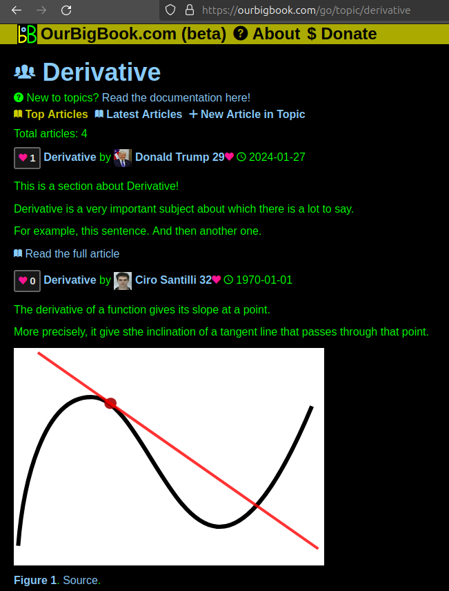
Figure 1. Screenshot of the "Derivative" topic page. View it live at: ourbigbook.com/go/topic/derivativeVideo 2. OurBigBook Web topics demo. Source. - local editing: you can store all your personal knowledge base content locally in a plaintext markup format that can be edited locally and published either:This way you can be sure that even if OurBigBook.com were to go down one day (which we have no plans to do as it is quite cheap to host!), your content will still be perfectly readable as a static site.
- to OurBigBook.com to get awesome multi-user features like topics and likes
- as HTML files to a static website, which you can host yourself for free on many external providers like GitHub Pages, and remain in full control
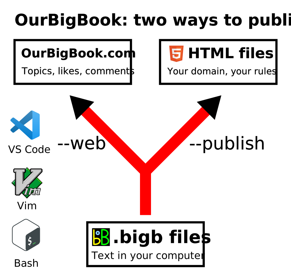
Figure 2. You can publish local OurBigBook lightweight markup files to either OurBigBook.com or as a static website.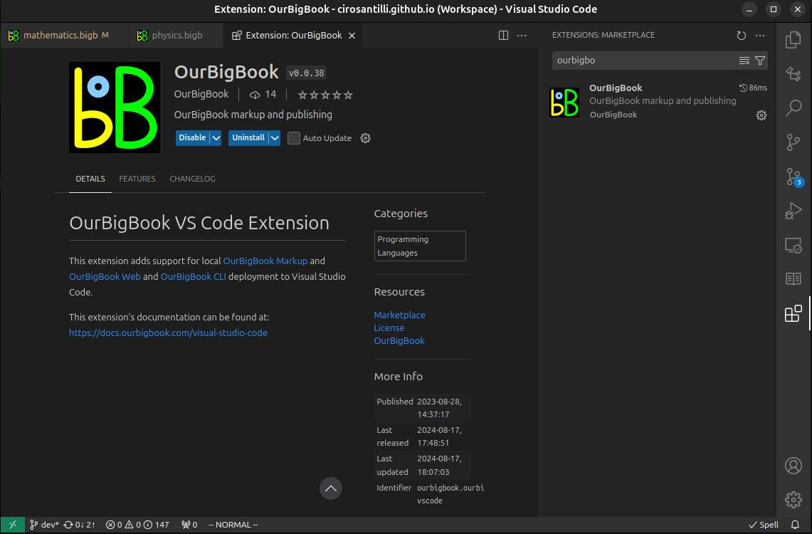
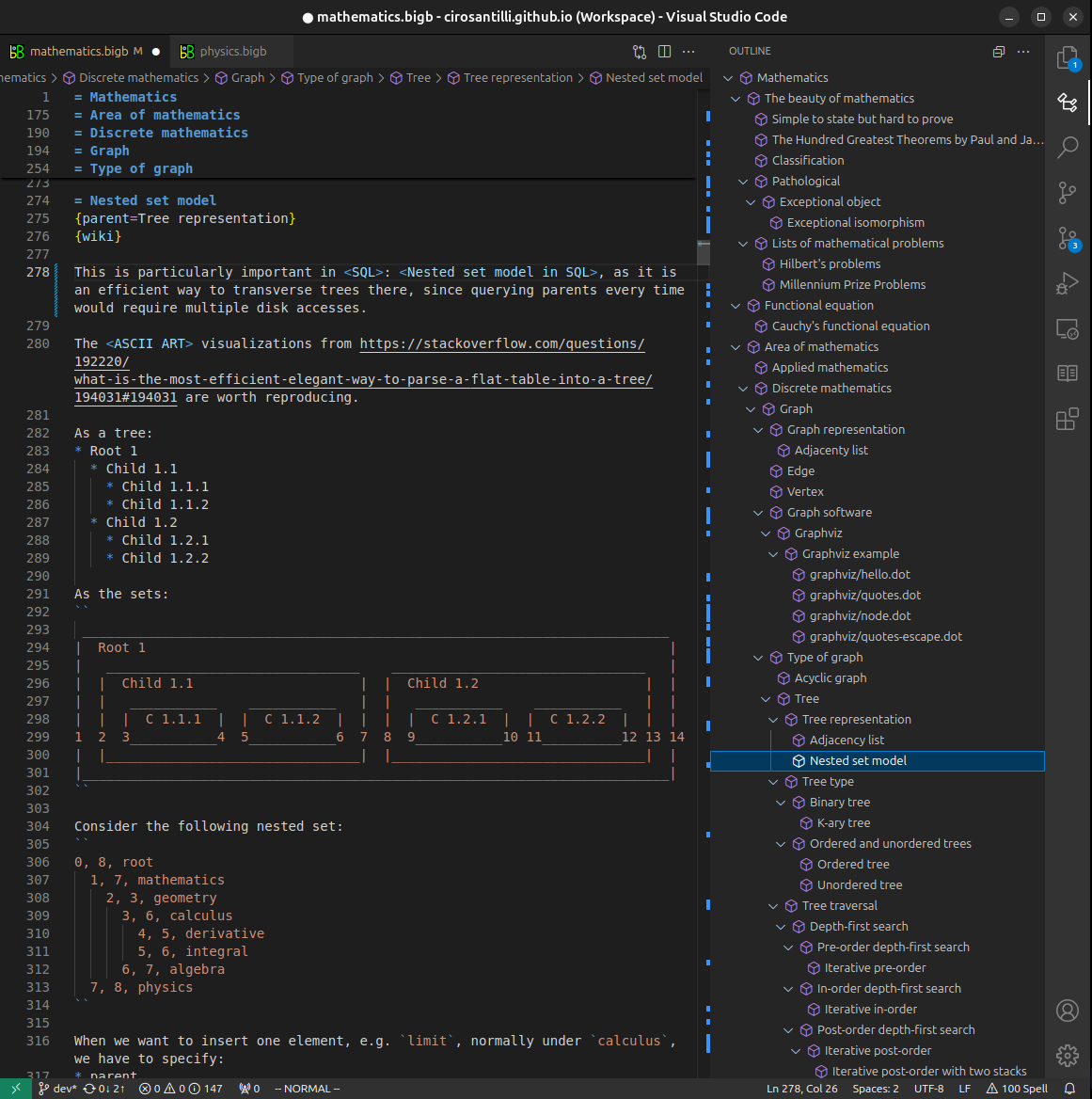
Figure 3. Visual Studio Code extension installation.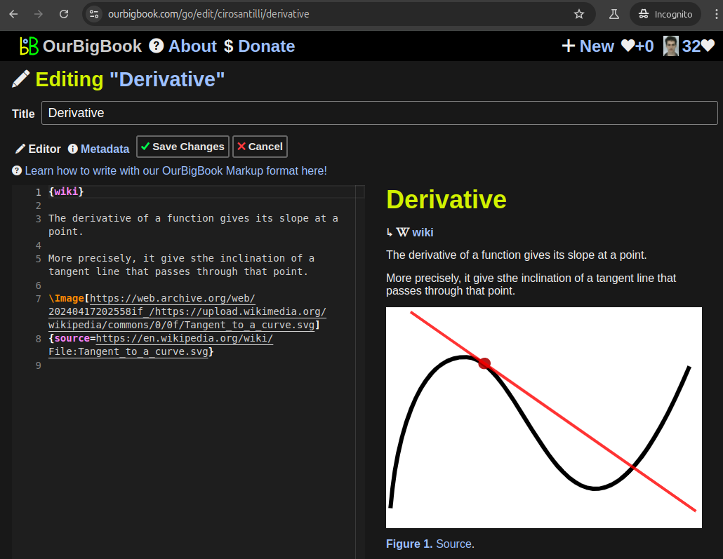
Figure 5. . You can also edit articles on the Web editor without installing anything locally. Video 3. Edit locally and publish demo. Source. This shows editing OurBigBook Markup and publishing it using the Visual Studio Code extension. 
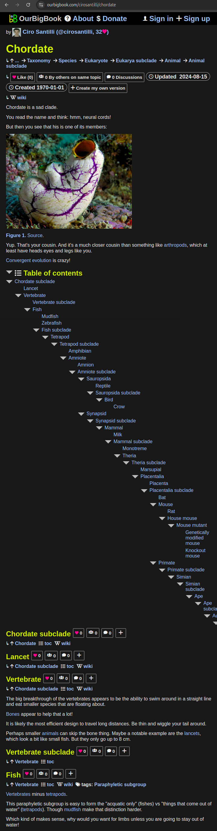
- Infinitely deep tables of contents:
All our software is open source and hosted at: github.com/ourbigbook/ourbigbook
Further documentation can be found at: docs.ourbigbook.com
Feel free to reach our to us for any help or suggestions: docs.ourbigbook.com/#contact