Topics (384k) Articles (398k) Users (410) Discussions (242) Comments (383) Files (13k) New article

The area rule is an aerodynamic design principle relating transonic wave drag to the longitudinal distribution of the total cross-sectional area of an aircraft, including its fuselage and aircraft wings. A wing-body combination can create a rapid area increase even when each part appears streamlined in isolation. Redistributing the fuselage area near the wing can smooth the combined distribution. This does not say that any reduction in frontal area guarantees lower total drag.[ref]
Richard T. Whitcomb by NASA. Area-rule account, combined cross-sectional-area distribution and wing-body model test
An original geometric model makes the redistribution explicit. Let increase along the fuselage, and let and denote body and added-wing areas, counting their overlap only once. Over a stipulated interval of length , takeIf the desired combined distribution on that interval is , the bookkeeping choice gives . For , and , the body's area is at the midpoint. Relative to a constant-area body, the removed volume isThis invented example exposes a design tradeoff: smoothing an area distribution can consume internal volume. It is not a calculation of wave drag, and the rest of the vehicle still needs smooth transitions.
Richard T. Whitcomb's motivating test used a specially built wing-body model in a wind tunnel, before applying the shape change to a fighter configuration. Comparing measured drag through the transonic range tests the proposed area-distribution effect; appearance alone does not. Viscous stress, lift-induced drag, loading and off-design conditions still matter to the complete aircraft.[ref]
Thermoacoustics studies coupling between thermal processes and acoustic motion. Oscillatory compression changes gas temperature; heat exchange at the right phase can amplify a sound wave or let sound transport heat.
In an engine, a maintained temperature difference can drive acoustic oscillations. In a refrigerator, externally supplied acoustic work can pump heat. The timing and location of heat exchange determine the energy transfer, so a temperature gradient alone does not guarantee self-sustained sound. Viscous and thermal boundary layers are important near the heat-exchanging structures.
Headphones are electroacoustic transducers worn at or near the ears that convert an electrical signal into local acoustic pressure variations. A two-channel pair can deliver different signals to the two ears. The relevant output is the sound pressure reaching the ear, which depends on the transducer, its placement and the surrounding acoustic geometry, not just the electrical input.
For a linear small-signal description, let be the input electric potential difference and the complex pressure amplitude at a specified ear location. A headphone transfer function describes both amplitude and phase. Two headphones can receive the same yet produce different ; even the same pair can produce different responses after being repositioned.[ref]
Variability in the characterization of the headphone transfer-function by Abhijit Kulkarni and H. Steven Colburn. Section I: transfer-function description from headphone input to a point in the ear canal.
Abhijit Kulkarni and H. Steven Colburn measured responses on a KEMAR acoustic mannequin with repeated placements of the headphone cushions. Placement-dependent variation complicated compensation by a fixed inverse filter. This experiment shows why a measurement needs a defined coupling arrangement: moving the device can change the acoustic system being calibrated.[ref]
Variability in the characterization of the headphone transfer-function by Abhijit Kulkarni and H. Steven Colburn. Abstract and introduction: tested supra-aural headphones, repeated placement and compensation problem.
For an illustrative amplitude example, if pressure doubles at a particular frequency while the reference pressure is unchanged, sound pressure level increases by decibels. That is a statement about pressure at the measurement point; it is not automatically a doubling of perceived loudness or a uniform change across frequencies. Headphone reproduction is therefore an electrical-to-mechanical-to-acoustic chain that must be assessed at its intended output location.
An electroacoustic transducer converts between an electrical signal and acoustic motion. A loudspeaker or a pair of headphones converts electrical input into sound; a microphone converts acoustic input into an electrical output. The name describes the conversion role, not one universal physical mechanism.
In an idealized moving-coil device, a current-carrying conductor in a magnetic field experiences a force. If the active conductor length is and the relevant field strength is , the perpendicular-component model gives . With and current , the force is . A diaphragm and its mechanical load turn that force into motion and sound pressure; force alone does not determine the complete acoustic output.
Conversion therefore has several linked stages: electrical drive, mechanical motion and acoustic coupling. A pressure transfer function of the complete device can depend on frequency and its surroundings. Headphone measurements on an acoustic mannequin, for example, varied when the cushions were repositioned, despite using the same nominal transducer. This demonstrates a change in the coupled system rather than requiring a change in the electrical recording itself.[ref]
The distinction is useful in calibration. A quoted electrical sensitivity, mechanical displacement or acoustic pressure is meaningful only with its input, measurement point and loading conditions specified. An electroacoustic transducer transfers energy and information through a physical interface; its useful behavior belongs to the device together with that interface.
KEMAR, the Knowles Electronics Manikin for Acoustic Research, is a head-and-torso acoustic simulator used to measure how sound interacts with an approximately human-sized listening geometry. Its external ears, ear-canal system and acoustic loads make it more informative for many hearing-device tests than a microphone placed alone in free space. The manufacturer's description specifies representative adult dimensions and ear-simulation properties. [ref]
https://www.grasacoustics.com/industries/audiology/kemar. GRAS: KEMAR construction and ear simulation
An original manikin paper by M. D. Burkhard and R. M. Sachs appeared in 1975. Later studies used KEMAR to investigate device coupling as well as the surrounding sound field.[ref]
Anthropometric manikin for acoustic research by M. D. Burkhard and R. M. Sachs. JASA 58 (1975), 214–222.
For example, Abhijit Kulkarni and H. Steven Colburn repeatedly placed headphone cushions on a KEMAR and measured the resulting headphone transfer function. Repositioning changed the response, complicating compensation by a single fixed inverse filter. The experiment demonstrates that the ear–device interface is part of the acoustic system, rather than an incidental mounting detail.[ref]
Variability in the characterization of the headphone transfer-function by Abhijit Kulkarni and H. Steven Colburn. Abstract and introduction: repeated supra-aural placement on KEMAR and response variation.
An invented measurement comparison makes the meaning concrete. If the same electrical drive produces pressures of 0.020 and 0.010 pascal at one measurement frequency in two fittings, their sound pressure levels differ by decibels. This is a fit-dependent response difference at a specified point, not an automatic judgment of perceived loudness or device quality.
A standardized manikin supports reproducible comparisons but does not reproduce every listener's ear geometry, physiology or perception. Conclusions should specify the simulator configuration and measurement conditions.
A text character is an abstract unit of written information, distinguished from its visible glyph and from the bytes used to store it. A Unicode code point identifies an encoded character; UTF-8 specifies a byte representation. Neither counting bytes nor counting code points always counts what a reader perceives as individual characters.[ref]
For example, an accented letter can be represented by a base letter followed by a combining accent. The sequence can be treated as one grapheme cluster, while a computer font and text shaping determine its displayed form. Conversely, the two text characters “f” and “i” can remain distinct in stored text while appearing as one typographic ligature. This is why a text editor's cursor movement, a byte offset and a glyph index answer different questions.
A typeface is a coordinated visual design for written forms. It can include related regular, bold and italic styles; a computer font supplies digital data implementing a particular selection or instance of that design. Thus choosing a typeface and choosing the file format used to store its glyphs are different decisions.
For a hypothetical family “Example Sans”, regular and bold styles can share a typographic family name while having different subfamily names. OpenType records this distinction in its naming table: name IDs 16 and 17 identify the typographic family and subfamily. Older family-name fields can group styles differently for application compatibility, so a filename alone is not a reliable account of the intended family.[ref]
Naming Table by Microsoft. Name IDs 1, 2, 16 and 17; extended typographic families and legacy four-style groupings
Text shaping turns a sequence of Unicode text characters into a layout of glyphs from a chosen computer font. The result includes glyph indices, positions and glyph advances. A text character therefore does not determine a visible shape independently of its neighbors, writing system and selected computer font.[ref]
Shaping concepts in the HarfBuzz Manual. Text shaping: Unicode input, font-dependent two-dimensional glyph layout and shaping models
For example, the stored sequence
f followed by i can become a single typographic ligature. Contextual Arabic forms illustrate a different requirement: a letter's neighbors influence the selected glyph. Glyph substitution chooses forms, while glyph positioning places the chosen forms; kerning adjusts their spacing. These operations can preserve the original Unicode text, so copying text should not be implemented by reading glyph indices as if they were code points.[ref]Glyph Substitution Table by Microsoft. Overview: Arabic contextual forms, Latin ligatures and the character/glyph distinction
Text shaping precedes rasterization: first determine what shapes to draw and where; then determine the pixels that represent those shapes at the requested size.
A typographic point is a unit used for font size, line height and other typographic distances. In the modern digital convention,Here the inch is 25.4 millimetres. The equation describes the digital convention; historical typographic point systems have not all used that same length. The modern
pt relation also appears among the absolute-length units defined for CSS.[ref]CSS Values and Units Module Level 3 by World Wide Web Consortium. Section5.2: absolute lengths and the pt, in and px equivalences
For example, a font size of 12 typographic points corresponds to a nominal em of one sixth of an inch, approximately 4.2333 millimetres. That sets the outline's scale, rather than the exact ink height of every glyph. A particular x-height or glyph advance can be a different fraction of an em.
The CSS conversion also gives 12 typographic points as 16 CSS pixels. A CSS pixel is a layout unit, so this equality does not promise 16 hardware pixels or a ruler-measured physical height on every screen. Zoom and the mapping to device pixels must be accounted for separately; the device pixel ratio records one part of that mapping.
Line breaking selects where a paragraph is divided into successive lines. The choice combines the widths of words and spaces with a measure of acceptable layout. A glyph advance supplies part of the underlying geometry, while the chosen breaks determine which content shares a CSS line box in a web layout.
A greedy algorithm can put as much content as possible on each line before proceeding. Greedy line breaking is easy to compute, but an early choice can leave an awkward short line later. Line breaking with squared slack cost gives a small, explicit example. Suppose four word widths are , each internal space has width 1, and the permitted line width is 7, all in arbitrary consistent units. Greedy grouping produces line lengths . An alternative grouping produces . Charging squared unused width on every line except the last givesAn immediately fuller first line can therefore produce a worse paragraph under this particular cost.
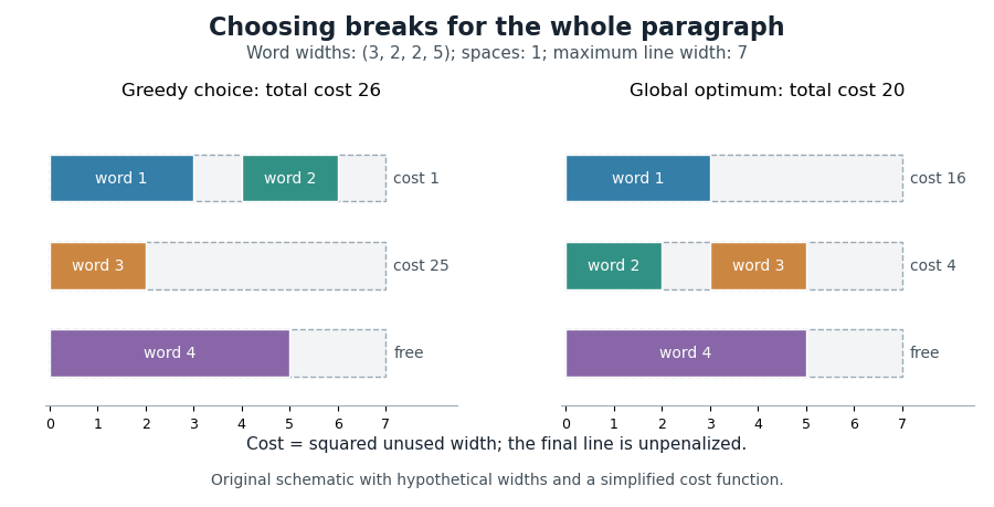
Dynamic programming makes the global choice systematic. Let be the minimum cost for the first words, and let include words through and their internal spaces. For feasible lines, set , except that for the final line. ThenPossible break positions form a directed acyclic graph; a feasible line is an edge, so the same calculation finds a shortest path from the start to the end of the paragraph.
Donald E. Knuth and Michael F. Plass developed a richer paragraph-wide method using boxes, adjustable glue and penalties. Their Knuth-Plass line-breaking algorithm accommodates typographic choices beyond the fixed spaces and squared costs in the illustrative model above.[ref]
Breaking paragraphs into lines by Donald E. Knuth and Michael F. Plass. 1981 paper, summary and introduction; paragraph-wide optimization and dynamic programming
A typesetting box is a piece of material treated as one unbreakable item at a given stage of line breaking. The simple paragraph model assigns it a width. A word already assembled from glyphs, or a small diagram placed within text, can be represented by such an item.[ref]
Breaking paragraphs into lines by Donald E. Knuth and Michael F. Plass. pp.1123–1125: boxes as rigid-width items
For example, three boxes of widths 8, 6 and 10 separated by two spaces of width 3 occupy . Keeping the boxes fixed while changing only the spaces is the model used by typesetting glue. If hyphenation makes an internal split available, the word must instead be represented with that discretionary break; a single indivisible box would hide the choice.
A box's width describes layout advance, which need not equal the exact ink extent of its glyphs. A more complete TeX box also has height and depth relative to a text baseline. These measurements allow boxes to be combined while maintaining baseline geometry.[ref] The CSS box model uses its own rules for content, padding, borders and margins; interpreting every CSS box as an indivisible paragraph item would lose those distinctions.
Typesetting glue represents adjustable space between pieces of typeset material. In a finite, single-order model, describe a glue item by a nominal width , stretch coefficient and shrink coefficient . A shared line adjustment ratio givesThus a negative reduces the gap. The coefficients describe relative flexibility; they need not be identical for all spaces. This model is a useful part of text justification.[ref]
Breaking paragraphs into lines by Donald E. Knuth and Michael F. Plass. pp.1123–1127: glue widths, stretch, shrink and adjustment ratios
For example, two nominal gaps of width 3 with stretch coefficients 1 and 3 become and when . Their total extra width is 2. With shrink coefficients 1 and 1, makes both gaps width 2. The same natural line can therefore reach different targets by using the appropriate coefficients.
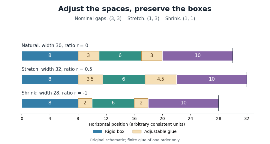
Proportional stretching and shrinking of typesetting glue
. Original finite-glue example: boxes of widths 8,6,10; two gaps with nominal width 3, stretch coefficients 1 and 3, and shrink coefficients 1 each. The generator computes the adjustment ratios and resulting widths. Details.TeX also distinguishes typesetting glue orders, so the finite model above does not describe every glue setting. In a horizontal line, typesetting glue changes gaps rather than stretching the outlines of the glyphs.
Text justification adjusts the contents of a line to occupy its available typesetting line width, often aligning both ends of the text. Changing word spacing is one method; permissible adjustments depend on the writing system. Typographic alignment more generally includes leaving the opposite edge ragged or centring a line.[ref]
CSS Text Module Level 3 by World Wide Web Consortium. §6: alignment versus justification; §6.4: script-sensitive expansion and compression
In an illustrative line with natural line width and target width , two equally flexible spaces can each gain 1. If their stretch coefficients are instead 1 and 3, proportional adjustment allocates the required extra 2 asBoth choices reach the same width; their internal spacing differs. Typesetting glue expresses that flexibility, and the line adjustment ratio computes the common proportional change.
Line breaking and text justification interact: a different break changes the number of spaces available to absorb the width difference. A good paragraph layout therefore considers spacing quality when choosing breaks, rather than merely stretching an already chosen set of lines. The Knuth-Plass line-breaking algorithm makes that interaction explicit.
Word spacing is the separation between adjacent words in a line of text. Its nominal value comes from the computer font and layout settings; text justification can adjust it through typesetting glue. Letter spacing instead changes spacing within the text's sequence of letters. A script without visible word separators needs a different spacing strategy from an English sentence.[ref]
CSS Text Module Level 3 by World Wide Web Consortium. §§6.4 and 7.1–7.2: script-dependent justification and word/letter spacing
Suppose three typesetting boxes have widths 8, 6 and 10, and the two intervening spaces each have width 3. The natural line width isAdding 1 to each space gives width 32. Adding 1 to every glyph advance would generally produce a different layout, because there need not be one glyph per word or per stored character. Word spacing must therefore be applied to the intended separators rather than inferred from a count of glyphs.
Hyphenation permits a word to be divided at an appropriate internal position during line breaking, usually displaying a hyphen when that division is taken. A hyphenation opportunity is a permitted choice, rather than an instruction to break every occurrence. The choice can help a narrow text paragraph fit without excessive word spacing.
A soft hyphen, Unicode U+00AD, marks such an optional position: in a suitable context,
ex followed by a soft hyphen and ample can display as example on one line or as ex- followed by ample on the next. The soft hyphen normally remains invisible when no split is taken. An always-visible hyphen already present in the word has different display behaviour.[ref]CSS Text Module Level 3 by World Wide Web Consortium. §5.3: conditional hyphens, visible hyphens and language-sensitive hyphenation
In CSS,
hyphens: manual uses explicit opportunities; hyphens: auto also permits opportunities supplied by a resource for the text's known language. The hyphenation resource and the line breaking algorithm answer different questions: where a split is linguistically allowed, and which allowed split best fits the layout. A discretionary break can also account for material inserted or replaced at the chosen split.[ref]CSS Text Module Level 3 by World Wide Web Consortium. §5.3: manual/auto values and content-language requirement
TeX is Donald E. Knuth's programmable system for typography, particularly mathematical typesetting. A document supplies text and instructions; TeX macros and TeX primitives build material whose dimensions determine the eventual page layout. Computer fonts supply glyphs and font metrics, while line breaking selects how a text paragraph is divided. The Knuth-Plass line-breaking algorithm is one of the system's central layout methods.[ref]
Breaking paragraphs into lines by Donald E. Knuth and Michael F. Plass. pp.1119–1122 and 1175–1176: paragraph optimization and development in TeX
A TeX format supplies a prepared collection of definitions. Plain TeX and LaTeX provide different document interfaces built on TeX technology. For example, in Plain TeX the input
$\sqrt{2}$\bye requests a square root expression, , and ends the document. The computer font, glyph positioning and mathematical typesetting rules determine the printed geometry; the source characters alone are not a picture of the result.The TeXbook by Donald E. Knuth is the system's user and reference manual. TeX source code by Donald E. Knuth exposes the implementation as a documented computer program, making the paragraph algorithm and its numerical conventions inspectable.[ref]
The TeXbook by Donald E. Knuth. Author’s official bibliography: Volume A as user/reference manual, Volume B as documented program
A text paragraph is a group of text treated as one unit for paragraph layout. Its line breaking may change when the available typesetting line width or computer font changes, while its underlying paragraph boundary remains the same. A line in the source file therefore need not be a line of displayed output.[ref]
CSS Text Module Level 3 by World Wide Web Consortium. §3: white-space processing, wrapping and preserved versus collapsed segment breaks
For example, a sequence of four typesetting boxes may occupy two lines in a narrow container and one line in a wider container. Reflow changes the grouping of boxes without requiring a new paragraph. In TeX,
\par ends the current paragraph; in HTML, a p element marks a paragraph. Those mechanisms let the layout system work with a semantic group instead of relying on the writer to insert each visible line break.The Knuth-Plass line-breaking algorithm uses this grouping to compare costs across the whole paragraph. Its typesetting demerits can depend on both individual lines and changes between neighbouring lines, which cannot be evaluated by inspecting each source line in isolation.
Mathematical typesetting arranges symbolic expressions in two dimensions. It must coordinate computer fonts, glyph positioning, typesetting boxes and text baselines while preserving the expression's visible structure. A typeset fraction positions its components above and below a bar; superscripts, subscripts, square roots and mathematical delimiters impose other geometric relationships.[ref]
MATH - The Mathematical Typesetting Table by Microsoft. Overview: hierarchical formulas, recursive layout and component boxes
For example,contains a superscript inside the upper component and a square root inside the lower component. Their dimensions help determine the height of the complete typeset fraction. A larger expression may then require larger surrounding mathematical delimiters. Laying out the smallest parts first makes this a recursive geometric construction.
An OpenType MATH table supplies font-specific information such as placement constants and suitable glyph variants. The table supplies data for layout; different implementations can use those data in different algorithms. TeX and LaTeX provide established authoring systems for expressing such mathematical structure.[ref]
MATH - The Mathematical Typesetting Table by Microsoft. Overview and MATH table structures: font data rather than a complete layout algorithm
Letter spacing, also called typographic tracking, adjusts spacing within a run of text. It is distinct from word spacing and from context-sensitive kerning. In CSS, the
letter-spacing property controls additional spacing, with rules that respect the writing system rather than blindly separating every stored character.[ref]Text in Cascading Style Sheets Level 2 Revision 2 by World Wide Web Consortium. §16.4: letter-spacing and distinction from kerning
[ref]CSS Text Module Level 3 by World Wide Web Consortium. §7.2: typographic character units and cursive scripts
A simple model illustrates the geometry. Suppose four already shaped units have combined advance , and three selected internal gaps each receive an extra . ThenThis is an explicitly chosen three-gap model. A glyph need not correspond to one stored character, so counting source characters is generally insufficient to determine those gaps. Text shaping, typographic ligatures and the script's joining behaviour must be considered when deciding where spacing may change.
Typographic alignment places a line's content relative to its available horizontal space. Common choices align its left edge, align its right edge, centre it or apply text justification. In CSS,
text-align specifies alignment within the line's container, rather than positioning the entire container in the page.[ref]Text in Cascading Style Sheets Level 2 Revision 2 by World Wide Web Consortium. §16.2: alignment within line boxes and text-align values
For a rigid line with natural line width , no indentation, and a left boundary at , the starting positions areThus and give starts 0, 8 and 16. These three choices preserve the internal word spacing. Text justification can instead change that spacing through typesetting glue so the content reaches the intended edges. The alignments therefore solve different geometric tasks even when the same words and computer font are used.
Pinned article: Introduction to the OurBigBook Project
Welcome to the OurBigBook Project! Our goal is to create the perfect publishing platform for STEM subjects, and get university-level students to write the best free STEM tutorials ever.
Everyone is welcome to create an account and play with the site: ourbigbook.com/go/register. We belive that students themselves can write amazing tutorials, but teachers are welcome too. You can write about anything you want, it doesn't have to be STEM or even educational. Silly test content is very welcome and you won't be penalized in any way. Just keep it legal!
Intro to OurBigBook
. Source. We have two killer features:
- topics: topics group articles by different users with the same title, e.g. here is the topic for the "Fundamental Theorem of Calculus" ourbigbook.com/go/topic/fundamental-theorem-of-calculusArticles of different users are sorted by upvote within each article page. This feature is a bit like:
- a Wikipedia where each user can have their own version of each article
- a Q&A website like Stack Overflow, where multiple people can give their views on a given topic, and the best ones are sorted by upvote. Except you don't need to wait for someone to ask first, and any topic goes, no matter how narrow or broad
This feature makes it possible for readers to find better explanations of any topic created by other writers. And it allows writers to create an explanation in a place that readers might actually find it.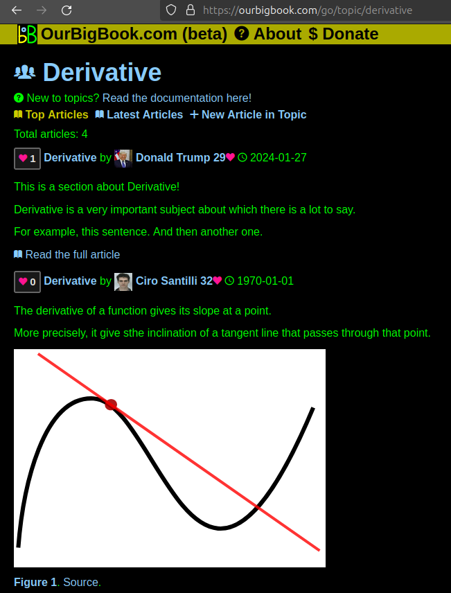
Figure 1. Screenshot of the "Derivative" topic page. View it live at: ourbigbook.com/go/topic/derivativeVideo 2. OurBigBook Web topics demo. Source. - local editing: you can store all your personal knowledge base content locally in a plaintext markup format that can be edited locally and published either:This way you can be sure that even if OurBigBook.com were to go down one day (which we have no plans to do as it is quite cheap to host!), your content will still be perfectly readable as a static site.
- to OurBigBook.com to get awesome multi-user features like topics and likes
- as HTML files to a static website, which you can host yourself for free on many external providers like GitHub Pages, and remain in full control

Figure 2. You can publish local OurBigBook lightweight markup files to either OurBigBook.com or as a static website.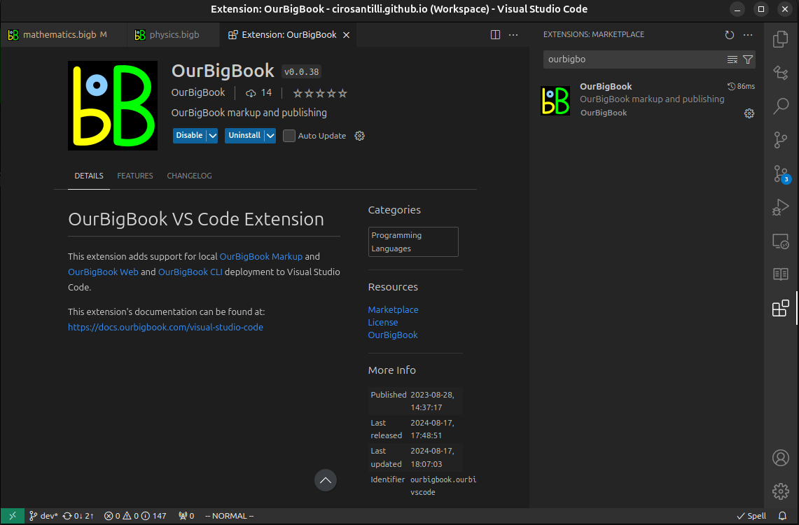
Figure 3. Visual Studio Code extension installation.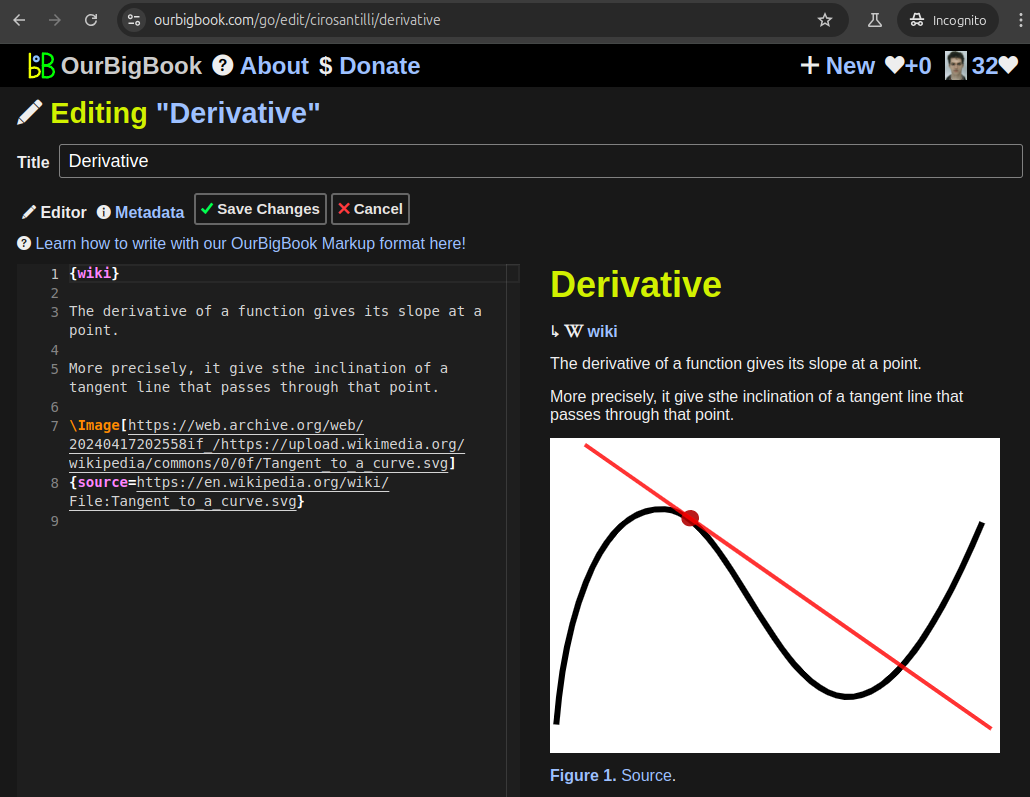
Figure 5. . You can also edit articles on the Web editor without installing anything locally. Video 3. Edit locally and publish demo. Source. This shows editing OurBigBook Markup and publishing it using the Visual Studio Code extension. 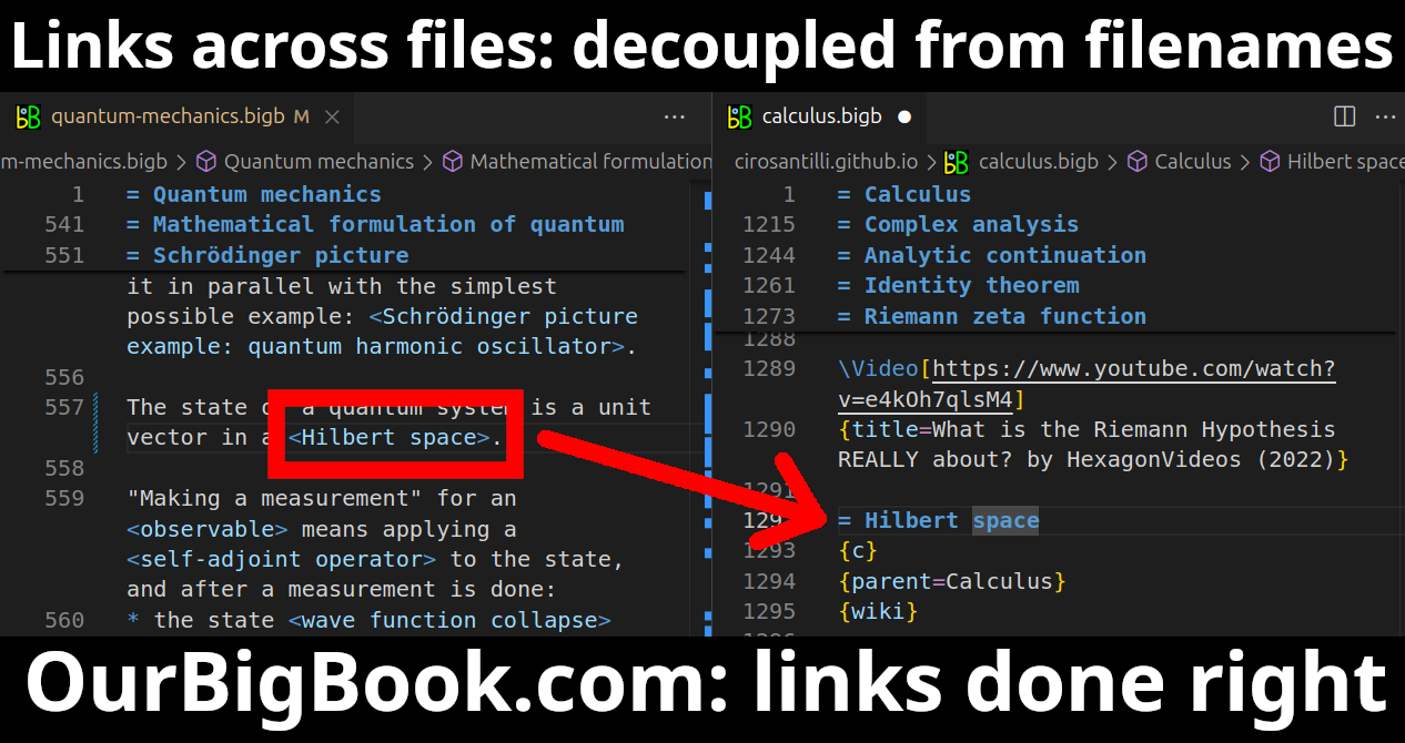
- Infinitely deep tables of contents:
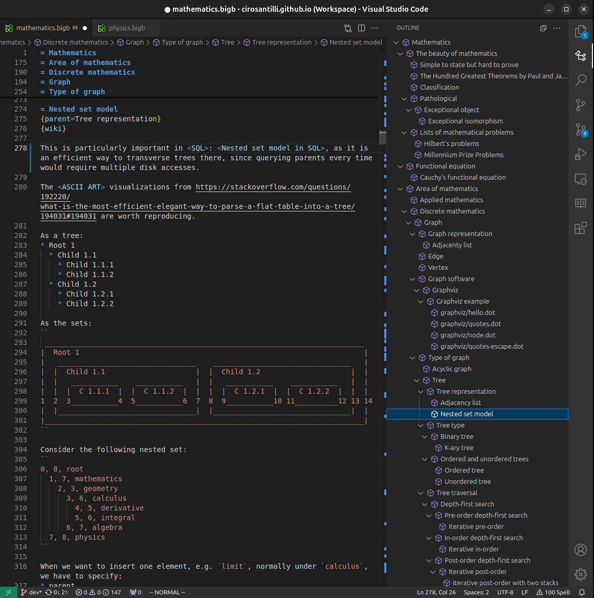
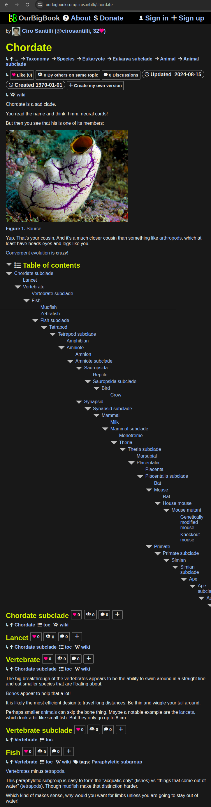


All our software is open source and hosted at: github.com/ourbigbook/ourbigbook
Further documentation can be found at: docs.ourbigbook.com
Feel free to reach our to us for any help or suggestions: docs.ourbigbook.com/#contact