Topics (384k) Articles (398k) Users (410) Discussions (242) Comments (383) Files (13k) New article

Microbial culture authentication checks whether cultured material has the identity and relevant properties claimed for it. Within a culture collection, it connects a named strain to observations of the actual material. Tests of phenotype, purity and genotype can supply complementary evidence; growth alone does not identify the organism.[ref]
Authentication of Prokaryotes at ATCC by ATCC. opening description; Morphology and purity; Genotypic characterization
ATCC describes comparisons at both the cell and colony level, biochemical characterization and sequence-based identification. Its account also explains that identifying some organisms or confirming a particular feature requires information beyond one commonly used marker.[ref]
Authentication of Prokaryotes at ATCC by ATCC. Morphology and purity; Biochemical analyses; Genotypic characterization, Genes of interest
A constructed coverage example makes the limit precise. Suppose a reference and an isolate agree at all one thousand positions examined in a hypothetical million-position genome. That establishes agreement at the tested positions, not at the remaining 999,000. Two preparations could share the tested sequence while differing elsewhere. Conversely, an observed difference needs interpretation in the context of assay quality and what kind of identity the comparison is intended to establish.
Purity is another distinct question. A result identifying the dominant sequence does not by itself exclude a second microorganism that the measurement fails to detect. The reference material, tested features and detection capability should therefore accompany an authentication claim.
The WFCC guidelines emphasize comparing a recovered strain with the originally deposited material and retaining supporting records.[ref]
Guidelines for the Establishment and Operation of Collections of Cultures of Microorganisms by the World Federation for Culture Collections. sections 8 and 11, authentication and documentation
Authentication supplies evidence about identity; microbial culture preservation maintains the material on which that evidence depends.A -dimensional face of the standard -cube is obtained by choosing coordinates to vary freely and fixing each of the other coordinates to either zero or one. It is therefore isometric to .
There arefaces of dimension : choose the free coordinates and then their complementary endpoint values. For the three-dimensional cube, this gives eight vertices, twelve edges and six square faces. The full cube is the unique -dimensional face. Some conventions also adjoin an empty face of dimension .
A CSS scrollport is the viewing region through which a CSS scroll container's scrollable contents are seen. The overflow specification identifies it with the container's padding box. A CSS scroll position determines the alignment of the larger contents within this region.[ref]
CSS Overflow Module Level 3 by World Wide Web Consortium. §2.3, Scrolling Overflow, scrollport and scroll position
Consider a stipulated two-dimensional example with a -by--pixel viewing region and contents occupying a -by--pixel rectangle. Use left-to-right horizontal coordinates, a top-left origin and no scrollbar-size complication. At scroll offset , the visible content rectangle isThe largest offsets that align its far edges with the contents' far edges are in this geometry. These coordinates describe a viewing alignment, not a change in the content's dimensions.
Box edges matter too. A box with content dimensions by CSS pixels and ten-pixel padding on every side has a -by- CSS padding box. Two-pixel borders then give a -by- CSS border box. Under the stated scrolling assumptions, the border dimensions are not the scrollport dimensions.
The scrollport is also distinct from the page's layout viewport. A small scrolling panel can have its own viewing region inside a larger page. Descendant DOM nodes remain in the document when their rendered contents lie outside that panel's current view.
Writing direction, layout alignment and scrolling APIs can affect origins and offset conventions. State those conventions before interpreting a number as a distance from the upper-left corner. The rectangle example supplies explicit conventions rather than imposing them on every possible CSS scroll container.
CSS scroll snapping adjusts a CSS scroll container's CSS scroll position to an eligible alignment of content. A target supplies a CSS scroll snap area; the container supplies a CSS snapport, derived from its CSS scrollport and adjusted by
scroll-padding. Aligning these regions defines candidate snap positions.[ref]For an own geometrical example, arrange three consecutive panels, each CSS pixels wide, in a horizontal strip. Give the container a -pixel scrollport, left-to-right coordinates, no gaps, no scroll padding or scroll margins, and no transforms. Aligning each panel's left edge with the viewing region's left edge gives candidate horizontal offsetsAt offset , the second panel occupies the view. At offset , its left edge is still pixels inside the view.
The container can request
overflow-x: auto; scroll-snap-type: x mandatory;, while each panel requests scroll-snap-align: start;. The declarations specify the snapping axis, strictness and target alignment; the example separately stipulates the panel layout. These declarations alone do not arrange three arbitrary elements into a strip.[ref]CSS Scroll Snap Module Level 1 by World Wide Web Consortium. §4.1, scroll-snap-type; §5.2, scroll-snap-align
With
mandatory, a container with a valid snap position must be snapped when scrolling has settled. With proximity, whether it snaps at the end of an operation is left to the user agent under the specified rules. Neither keyword prescribes a universal numerical distance threshold or a particular animation.[ref]CSS Scroll Snap Module Level 1 by World Wide Web Consortium. §4.1.2, strictness; §§3 and 6, snapping mechanics
The candidate geometry also does not uniquely determine which target an input gesture selects. Direction, intended endpoint and the user agent's selection behavior matter. Targets larger than the scrollport have special rules permitting access within the oversized region, so mandatory snapping is not a requirement to hide the middle of every large item.[ref]
CSS Scroll Snap Module Level 1 by World Wide Web Consortium. §5.2.2, oversized snapping boxes; §6.2, choosing snap positions
Useful snapping combines predictable content alignment with access to the content between those alignments.The device pixel ratio expresses the size of one CSS pixel relative to one physical device pixel. The CSSOM View Module by World Wide Web Consortium defines
window.devicePixelRatio as the current CSS pixel size divided by the output device's vertical pixel size, with page zoom included in the former:The numerator and denominator are physical lengths, so the ratio is dimensionless.[ref]At , a CSS pixel region corresponds to device pixels in a uniform mapping. The linear counts double, while the pixel count scales by . A raster drawing surface can therefore need four times as many stored pixels to supply one sample per device pixel while retaining the same layout size. An existing low-resolution image does not gain missing detail merely because the display has a larger ratio.
The ratio need not be an integer. A ratio such as means that a one-CSS pixel boundary need not align with the physical grid, so rasterization has to distribute coverage. Increasing page zoom changes the size of a CSS pixel and can change the reported ratio. Pinch zoom scales the visual view without redefining the layout pixel in the same way; it is a separate scale.[ref]
CSSOM View Module by World Wide Web Consortium. §2.2, Zooming, distinction between page zoom and visual-viewport scale; devicePixelRatio algorithm
Pixel density in pixels per physical inch and device pixel ratio consequently answer different questions: the former describes a physical grid, while the latter describes its mapping from the browser's layout scale.
Page zoom changes a browser page's layout scale by changing the physical size associated with a CSS pixel. The browser can consequently fit fewer layout units into the available display area and recompute line wrapping and other width-dependent layout. Pinch zoom, represented by the visual viewport scale, magnifies an already laid-out view instead.[ref]
CSSOM View Module by World Wide Web Consortium. §2.2, Zooming: page zoom affects initial viewport size while visual scale acts as a magnifying glass
For an illustrative fixed device width of 800 physical pixels, suppose the initial device pixel ratio is . The width corresponds to 400 CSS pixels. At page-zoom multiplier , with other scaling held fixed, each layout pixel spans four device pixels, so the available width is 200 CSS pixels:A box declared as
width: 100px still has that declared width, but its physical display width increases. A percentage-width box or a line of text can respond to the changed containing width instead.The device pixel ratio API includes the current page zoom when comparing a layout pixel with an output-device pixel. A scale caused by pinch zoom is tracked separately. Reading the ratio alone therefore does not reveal every magnification affecting what a user sees.[ref]
CSSOM View Module by World Wide Web Consortium. Window.devicePixelRatio algorithm, CSS pixel size at current page zoom; VisualViewport scale
These equations describe a uniform idealized mapping with fixed display geometry. Browser chrome, available viewport area and extra transforms can change a concrete measurement. The central distinction is which coordinate scale changes: layout is recomputed at a different CSS-to-device mapping under page zoom.
Pinch zoom magnifies a browser's visual view of a page while leaving its layout scale unchanged. The specification describes this through the visual viewport scale factor, which acts like a magnifying glass over the layout viewport. A pinch gesture is a common way to control the scale, but the same visual magnification can be triggered through other interface behavior.[ref]
CSSOM View Module by World Wide Web Consortium. §2.2, Zooming, visual-viewport scale and note on pinch gestures
For example, suppose the device shows 800 physical pixels across, with device pixel ratio and no initial visual magnification. The visible width is then 400 CSS pixels. At a visual scale , the same device width displays only 200 CSS pixels of that existing layout. The user can pan across the enlarged page. A paragraph laid out at a given CSS width does not acquire a new layout width merely because it is viewed through the magnification.
In this simple uniform mapping, a layout length spansdevice pixels. For CSS pixels, and , the displayed span is 400 device pixels. Additional transforms or browser interface geometry require their own accounting.
Page zoom instead changes the physical size of a layout CSS pixel and can affect layout and the reported device pixel ratio. Pinch zoom does not redefine that ratio in the same way. Combining the two scale factors silently can therefore produce incorrect pointer positions, image-resolution choices or measurements.[ref]
CSSOM View Module by World Wide Web Consortium. §2.2 and Window.devicePixelRatio algorithm; VisualViewport scale attribute
The layout viewport is the browser viewport used as a reference for laying out the document. Its dimensions help determine the available layout area and initial containing block. The visual viewport can display a magnified subregion of that layout, so visible width and layout width need not be equal.[ref]
CSSOM View Module by World Wide Web Consortium. Viewports and Zooming, distinction between layout and visual viewport
For an illustrative layout viewport width of 400 CSS pixels, a block filling half of a same-width containing block uses 200 pixels. A fixed-width block declared as
width: 600px can instead overflow that region. The viewport's width does not force every element or the whole scrollable document to have that width.At visual scale two, the user might see only 200 pixels of the existing 400-pixel layout. The half-width block remains 200 layout pixels wide. Increasing page zoom can instead reduce the width available in layout CSS pixels on a fixed physical display, potentially changing wrapping or width-dependent styling. The two operations alter different stages of the geometry.[ref]
A containing block and a viewport should not be conflated either. Nested elements can size relative to their own containing blocks; the initial document layout has its specified viewport relationship. When measuring a layout, state which viewport or containing block supplied a dimension and whether the reported units are CSS or device pixels. This prevents an overflow measurement, a visible screen region and a layout constraint from being treated as one number.
The visual viewport is the region of the laid-out page currently visible through a browser's view, described by its size, offset and scale. It can show only part of the layout viewport, especially during pinch zoom. The specification exposes this state through the
VisualViewport interface.[ref]CSSOM View Module by World Wide Web Consortium. Viewports and The VisualViewport Interface, size, offset and scale
For example, take a layout 400 CSS pixels wide on a display mapping two device pixels to each layout pixel. A visual magnification of two can show only 200 CSS pixels across the same 800-device-pixel area. Panning changes which interval of the layout is visible without requiring the layout itself to become 200 pixels wide.
A simple horizontal coordinate conversion illustrates the need for both offset and scale. If a point has coordinate relative to the layout viewport and the visual view starts at offset , then, with uniform mapping,where is the device pixel ratio and the visual scale. With , , and , the point appears 200 device pixels from the visual view's left edge. Additional transforms and browser geometry need separate treatment.
Page zoom can change the physical mapping of layout CSS pixels, whereas the visual viewport scale is tracked separately. A program placing an overlay or translating an interaction coordinate must therefore identify its coordinate origin and units before combining measurements.[ref]
CSSOM View Module by World Wide Web Consortium. Zooming; VisualViewport offsetLeft and scale; Window.devicePixelRatio
The reciprocal crystallographic metric matrix is the Gram matrix of the reciprocal lattice basis. With direct-basis matrix and the convention , the reciprocal-basis matrix is . Consequently,where is the direct crystallographic metric matrix. If direct lengths are in angstroms, the reciprocal metric entries have units of inverse squared angstroms.[ref]
For an original calculation, takeFor a Miller index column , the corresponding reciprocal vector is . Its squared magnitude determines the interplanar spacing:For this gives , so .
A binomial price tree lists the possible stock prices in the Cox--Ross--Rubinstein model. Starting at , each step multiplies the price by or , with . After steps and up moves,Constant multiplicative steps make the tree recombine: an up move followed by a down move reaches the same price as a down move followed by an up move. Thus level has prices despite possible paths.
For , , , the second-level prices are . With risk-free multiplier , the no-arbitrage up probability is . A European call with strike 100 pays at that level, so its model value is . This probability is determined by replication and discounting, not a forecast of the physical chance of an up move.[ref]
Option Pricing: A Simplified Approach by John C. Cox and others. Section 3, binomial replication and multiperiod valuation
Gossypium is the taxonomic genus of cotton plants, placed in Malvaceae. The genus name denotes a group of related species, while cotton can also refer to their harvested fibres or the resulting material. A taxonomic name and a material name consequently do not identify the same kind of object.[ref]
The fibres make a striking connection between plant diversity and cell mechanics. In the studied cultivated cotton, an individual fibre is an elongated cell growing from the seed coat plant epidermis. A 2001 study followed fluorescent tracer movement into these growing cells and related changing intercellular access to developmental stage.[ref]
The control of single-celled cotton fiber elongation by developmentally reversible gating of plasmodesmata and coordinated expression of sucrose and K+ transporters and expansin by Y. L. Ruan and others. Abstract and Figure1: single-cell fibres and changing tracer access
For an original classification example, a record might identify a specimen's taxonomic genus, measure the length of 100 sampled fibres and record how much material was harvested. Those are three distinct observations. A genus assignment does not fix every fibre's length, and a fibre measurement alone does not identify a species.
Comparisons within Gossypium should therefore keep taxonomic identity, developmental stage and measurement conditions explicit. The common word cotton does not guarantee that two samples have the same ancestry or cellular properties.
A symporter is a membrane protein coupling the movement of different substances toward the same side of a cell membrane. The favored movement of one substrate can help drive another against its own gradient, a form of secondary active transport. Same-direction transport does not by itself say whether the combined movement carries net charge.
A functional experiment identifies coupled transport rather than merely a promising sequence. The 1994 kidney-cotransporter study expressed cloned transporters in Xenopus laevis oocytes and tested their transport activity. Related proteins differed in their potassium requirement and inhibitor response, connecting molecular identity to distinct transport functions.[ref]
A deliberately simplified energy example uses two neutral solutes, and , coupled 1:1 from outside to inside. Assume dilute ideal solutions, a tenfold larger concentration of outside, and a fivefold larger concentration of inside. Their combined free energy change iswhich is negative. Favorable inward movement of can therefore pay for inward movement of against its concentration gradient. Charged substrates require additional electrical terms; the toy calculation is not a measured stoichiometry of the kidney transporters.
An antiporter is a membrane protein that couples movement of different substances in opposite directions across a cell membrane. In an idealized exchange cycle, one substrate moves inward while another moves outward. The ratio transported, or stoichiometry, depends on the transporter; opposite directions do not imply equal numbers or zero net electric charge.
NhaA provides a measured example. In a 1993 study, purified Escherichia coli NhaA was reconstituted in sodium-loaded membrane vesicles. Parallel measurements of sodium efflux and proton influx supported exchange of two protons for each sodium ion. An independent method based on the generated membrane electric potential difference and ion gradients agreed under the stated coupling assumptions.[ref]
The charge accounting is revealing. In the tested direction, two inward singly positive ions and one outward singly positive ion produce one net positive charge moving inward per exchange cycle. Thuswhere is the magnitude of the elementary charge. An antiporter can therefore be electrogenic. Directional exchange, charge balance and the energy available from an electrochemical gradient must be assessed separately.
A probabilistic invariance principle is a limit theorem saying that a suitably rescaled random process converges to a universal limiting process. A basic instance is the functional central limit theorem: many different microscopic increment laws produce the same limiting Brownian motion after centering and variance normalization.
Let be independent identically distributed random variables with mean zero and finite variance . Put , and interpolate the values linearly at times . The resulting random continuous function converges in distribution in , with its uniform norm, to standard Brownian motion.[ref]
Probability: Theory and Examples (fifth edition) by Rick Durrett. Theorem 8.1.4, Example 8.1.6, printed page 392; linearly interpolated random walk and its maximum
This is stronger than convergence at each fixed time: it controls continuous functionals of the whole path. For a simple symmetric random walk, the maximum satisfies, for ,using the Brownian reflection principle and the standard normal distribution function . For this is about . The maximum here is one-sided, rather than the maximum absolute displacement. Convergence of finite-dimensional distributions alone would not establish a path-space theorem; control of path fluctuations, expressed through tightness of probability measures, is also needed.
Parametric model uncertainty allows specified parameters to vary while retaining a chosen mathematical model structure. It records a nominal value and an allowed set, such as an interval, for each uncertain quantity. Repeated occurrences of the same physical parameter must remain linked. MathWorks's uncertain-real-parameter model explicitly represents nominal values, ranges and named repeated parameters.[ref]
An original RC circuit example uses the first-order transfer functionAssume every resistance/capacitance pair in those positive intervals is allowed. Since their product increases with either factor, the time constant has the exact rangeThe nominal product is1millisecond, so separate symmetric10percent component ranges give an asymmetric time-constant range of minus19percent to plus21percent. The angular frequency at which this model's magnitude falls to is , giving approximately to . Reciprocal conversion reverses the endpoints.
This family changes response speed while preserving the modeled DC gain . A guarantee of correct DC gain therefore does not establish a particular transient or bandwidth. Conversely, an extra pole from unmodeled dynamics is absent from every member of this first-order family, regardless of how widely and are allowed to vary.
Parameter dependencies can restrict the family further. If the same uncertain resistor appears in several coefficients, independently varying its appearances changes the physical model. The mass example in control model uncertainty derives one such coefficient relation. Parameter bounds are also not a probability distribution: an interval describes what must be covered, while probability assignments require additional information.
Robust stability and robust performance can then be assessed over this specified family. The result applies to the model structure and bounds actually supplied, not automatically to aging, temperature changes or other effects outside them.
Unmodeled dynamics are time-dependent behaviors omitted from the nominal model of a controlled plant or its interconnection. Examples include an omitted actuator lag, an additional flexible mode or a delay. They matter when the neglected behavior acts on time scales relevant to the controller. This differs from changing only the numerical parameters in a fixed equation model.
For an original example, a nominal plant satisfies , and state feedback control commands . The nominal prediction is , with decay rate . Now suppose the actual applied input follows a first-order actuator:Eliminating givesWith and in chosen consistent units, the exponents are : the actual response can oscillate while decaying, whereas the nominal model predicts a single exponential. The additional state changes the transient even though the nominal static command remains the same.
The omitted actuator also admits a frequency-domain description. Relative to an ideal actuator with gain1, its transfer function is . The corresponding multiplicative uncertainty isThe relative discrepancy is small when is small but approaches1 at high frequency. A low-frequency fit alone therefore need not justify a high-bandwidth design.
Dynamic uncertainty models can describe a family by bounds on its frequency response, with a shaping filter expressing which frequency ranges are poorly known. MathWorks's
ultidyn documentation describes this construction for uncertain linear time-invariant systems.[ref]ultidyn documentation in MATLAB. Description and uncertain-dynamics shaping-filter example
Such an uncertainty family must be chosen to cover the omitted behavior; its mere presence in a model does not prove that every physical discrepancy has been included. Pinned article: Introduction to the OurBigBook Project
Welcome to the OurBigBook Project! Our goal is to create the perfect publishing platform for STEM subjects, and get university-level students to write the best free STEM tutorials ever.
Everyone is welcome to create an account and play with the site: ourbigbook.com/go/register. We belive that students themselves can write amazing tutorials, but teachers are welcome too. You can write about anything you want, it doesn't have to be STEM or even educational. Silly test content is very welcome and you won't be penalized in any way. Just keep it legal!
Intro to OurBigBook
. Source. We have two killer features:
- topics: topics group articles by different users with the same title, e.g. here is the topic for the "Fundamental Theorem of Calculus" ourbigbook.com/go/topic/fundamental-theorem-of-calculusArticles of different users are sorted by upvote within each article page. This feature is a bit like:
- a Wikipedia where each user can have their own version of each article
- a Q&A website like Stack Overflow, where multiple people can give their views on a given topic, and the best ones are sorted by upvote. Except you don't need to wait for someone to ask first, and any topic goes, no matter how narrow or broad
This feature makes it possible for readers to find better explanations of any topic created by other writers. And it allows writers to create an explanation in a place that readers might actually find it.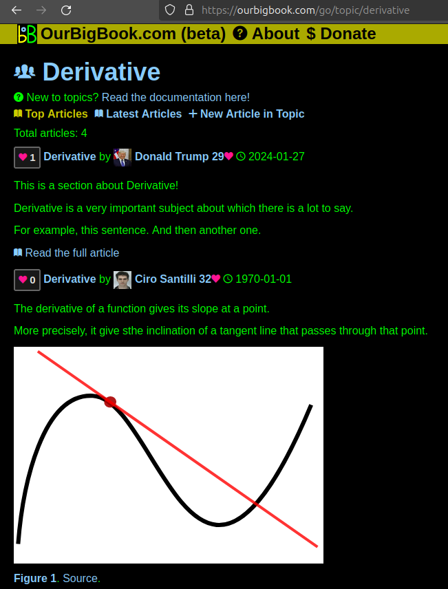
Figure 1. Screenshot of the "Derivative" topic page. View it live at: ourbigbook.com/go/topic/derivativeVideo 2. OurBigBook Web topics demo. Source. - local editing: you can store all your personal knowledge base content locally in a plaintext markup format that can be edited locally and published either:This way you can be sure that even if OurBigBook.com were to go down one day (which we have no plans to do as it is quite cheap to host!), your content will still be perfectly readable as a static site.
- to OurBigBook.com to get awesome multi-user features like topics and likes
- as HTML files to a static website, which you can host yourself for free on many external providers like GitHub Pages, and remain in full control

Figure 2. You can publish local OurBigBook lightweight markup files to either OurBigBook.com or as a static website.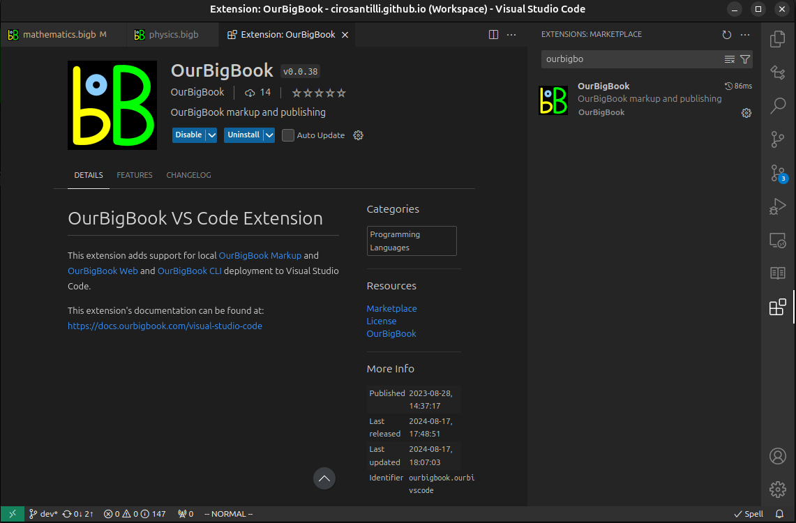
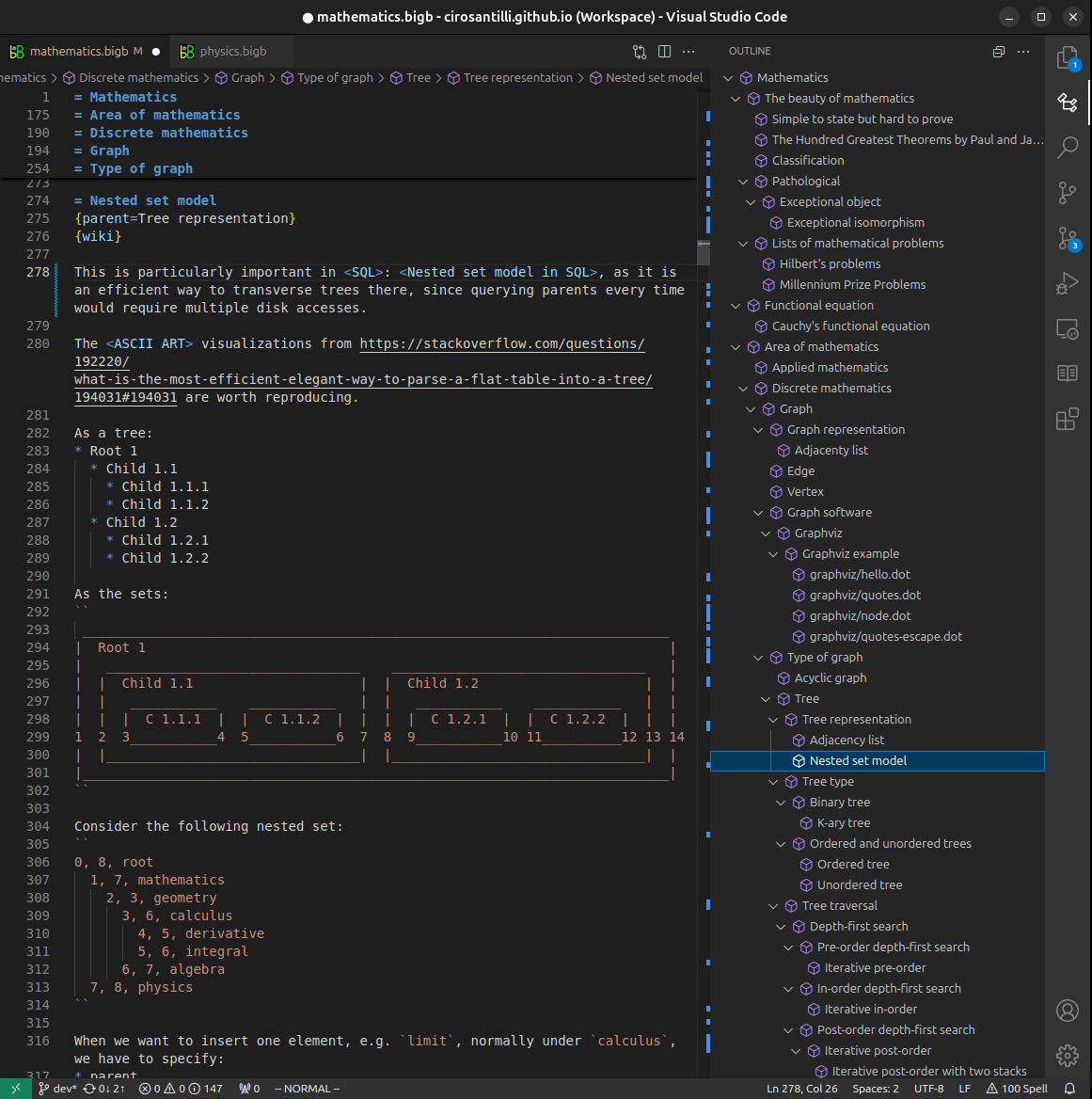
Figure 3. Visual Studio Code extension installation.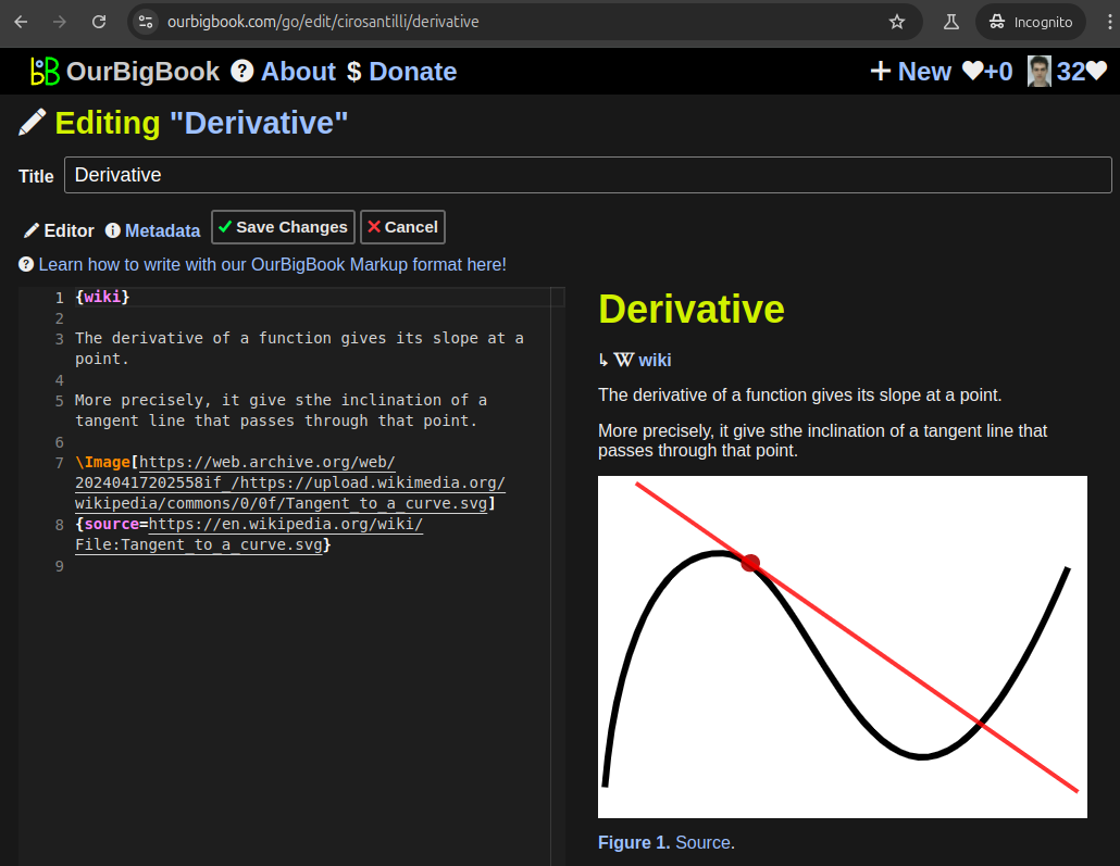
Figure 5. . You can also edit articles on the Web editor without installing anything locally. Video 3. Edit locally and publish demo. Source. This shows editing OurBigBook Markup and publishing it using the Visual Studio Code extension. 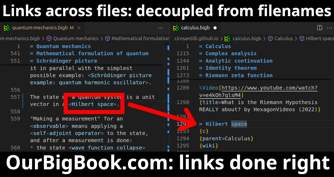
- Infinitely deep tables of contents:

All our software is open source and hosted at: github.com/ourbigbook/ourbigbook
Further documentation can be found at: docs.ourbigbook.com
Feel free to reach our to us for any help or suggestions: docs.ourbigbook.com/#contact